

SR Two Col 05
This module places a heading and an optional bleed image in the left column, with a separate richtext description in the right column.
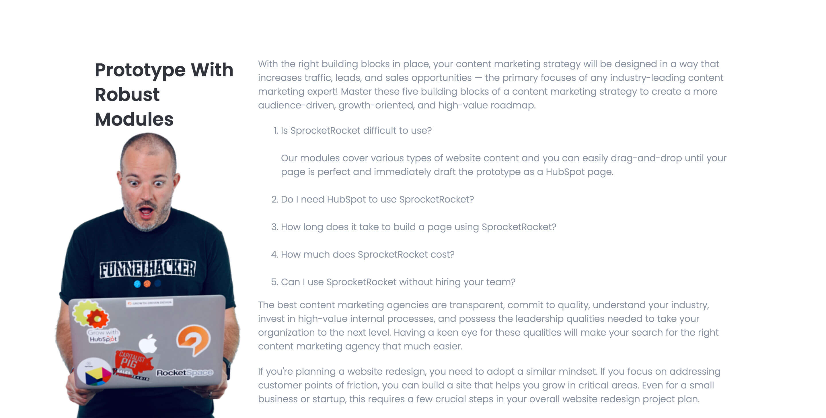
The bleed image sits beside the heading on desktop and drops below both columns on mobile, and the description can be styled as lead text for emphasis. Unlike the other two-col modules, it has no CTA button fields, so use it for straight text-and-visual pairing rather than a text-plus-button layout.
Use cases
- Text and image split section
- Mission statement with photo
- Editorial content block
- About us section with visual accent
- Long-form description with side image
Where it fits
- Included with: PRO
- Page sections: Content, Features, Media
Editable fields
Content tab
| Field | Type | Notes |
|---|---|---|
| Background Video | File | Repeats: min 0, default 1. Add multiple file formats in order to provide compatibility with a broad range of browsers. |
| Background Video Tablet | File | Repeats: min 0, default 1. This background video will only be used on tablet devices. |
| Background Video Mobile | File | Repeats: min 0, default 1. This background video will only be used on mobile devices. |
| Enabled | Boolean | |
| ID | Text | Assign a ID to the module. |
| Class | Text | Assign a CLASS to the module. |
| Description | Rich text | |
| Lead Text | Boolean | Turn on to make the Description text larger. |
| Feature Image | Image |
Heading Repeats: min 0, default 1.
| Field | Type | Notes |
|---|---|---|
| Heading | Text | |
| Size | Choice | HTML heading size. Options: H1, H2, H3, H4, H5, H6, P. |
| Display Size | Choice | Size that heading is displayed at. 12 options, including Auto, H1, H2. |
| Color | Choice | 15 options, including Auto, Primary, Secondary. |
| Color | Color | |
| Align | Choice | Options: Auto, Left, Center, Right. |
| CSS Class | Text |
Columns › Left Column Repeats: min 1, max 4, default 1. Columns follow a twelve column grid.
| Field | Type | Notes |
|---|---|---|
| Column Breakpoint | Choice | Options: None, Mobile, Tablet, Desktop, XL. |
| Column Width | Choice | 12 options, including 1, 2, 3. |
| Column Offset | Choice | 13 options, including 0, 1, 2. |
| Column Order | Number |
Columns › Right Column Repeats: min 1, max 4, default 1. Columns follow a twelve column grid.
| Field | Type | Notes |
|---|---|---|
| Column Breakpoint | Choice | Options: None, Mobile, Tablet, Desktop, XL. |
| Column Width | Choice | 12 options, including 1, 2, 3. |
| Column Offset | Choice | 13 options, including 0, 1, 2. |
| Column Order | Number |
Style tab
Change log
| Version | Change |
|---|---|
| 3.1.1 | Added column size options |
| 3.1.0 | Added responsive background options |
SR Two Col 04
This module renders a shared heading and description above a row of columns, each with its own media (image, video, embedded form, meeting scheduler, or lottie), a sub-heading, rich text, an optional icon feature list, and one CTA button.
SR Two Col 06
This module renders a two column layout with no images: a left column holding a heading and rich text description, and a right column with its own heading followed by a stacked list of up to nine text links.