

SR Gallery 02
This module renders an optional heading, rich text description, and up to six gallery images, each with its own color overlay and per-image column width, breakpoint, offset, and order settings.
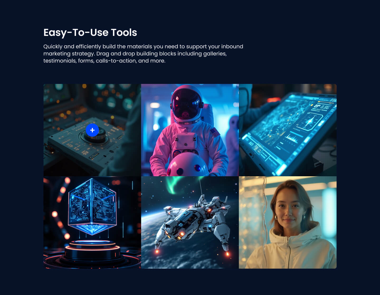
Pick it over SR Gallery 01 when you need an even, configurable grid instead of a fixed four-image asymmetric collage, or when your image count is not exactly four. It expects at least one gallery image and works best with the heading and description filled in to frame the set.
Use cases
- Product screenshot gallery
- Portfolio image grid
- Team event photo set
- Feature highlight images with overlay
- Before and after image set
- Flexible column image layout
Where it fits
- Included with: Stack
- Page sections: Gallery, Media, Content
Editable fields
Content tab
| Field | Type | Notes |
|---|---|---|
| Background Video | File | Repeats: min 0, default 1. Add multiple file formats in order to provide compatibility with a broad range of browsers. |
| Background Video Tablet | File | Repeats: min 0, default 1. This background video will only be used on tablet devices. |
| Background Video Mobile | File | Repeats: min 0, default 1. This background video will only be used on mobile devices. |
| Enabled | Boolean | |
| ID | Text | Assign a ID to the module. |
| Class | Text | Assign a CLASS to the module. |
| Description | Rich text | |
| Lead Text | Boolean | Turn on to make the Description text larger. |
Heading Repeats: min 0, default 1.
| Field | Type | Notes |
|---|---|---|
| Heading | Text | |
| Size | Choice | HTML heading size. Options: H1, H2, H3, H4, H5, H6, P. |
| Display Size | Choice | Size that heading is displayed at. 12 options, including Auto, H1, H2. |
| Color | Choice | 15 options, including Auto, Primary, Secondary. |
| Color | Color | |
| Align | Choice | Options: Auto, Left, Center, Right. |
| CSS Class | Text |
Gallery Images Repeats: min 1, max 100, default 6.
| Field | Type | Notes |
|---|---|---|
| Image | Image | |
| Overlay | Color |
Columns Repeats: min 1, max 4, default 1. Columns follow a twelve column grid.
| Field | Type | Notes |
|---|---|---|
| Column Breakpoint | Choice | Options: None, Mobile, Tablet, Desktop, XL. |
| Column Width | Choice | 12 options, including 1, 2, 3. |
| Column Offset | Choice | 13 options, including 0, 1, 2. |
| Column Order | Number |
Style tab
Change log
| Version | Change |
|---|---|
| 3.0.0 | Stardust update |
| 2.3.0 | Accessibility improvements |
| 2.2.1 | Added none column breakpoint for smaller screens |
| 2.2.0 | Added responsive background options |
| 2.1.0 | New lightbox library |
SR Gallery 01
This module renders a heading, optional rich text description, and a fixed asymmetric collage of four images with color overlays and a lightbox click to enlarge.
SR HTML
This module renders an optional heading and rich text description followed by a raw block of custom HTML that you supply directly.