

Theme settings overview
Control shared styles across pages that use the Sprocket Rocket theme.
Theme settings hold the design defaults used by Sprocket Rocket modules. Set these before building many pages so new modules start with the correct brand styles.
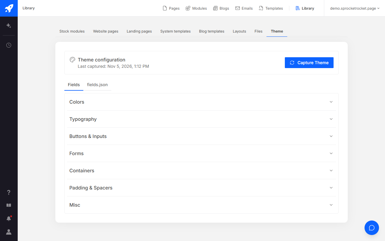
Changes can affect every page using the theme. Preview representative website, landing, blog, and system pages before publishing a large settings change.
Sprocket Rocket AI can change the brand settings for you: colors, body and heading fonts, heading sizes and weights, the base font size, buttons, and the corner radius. It previews the change on one page first. Open the Theme brand change card, select Review, and choose Apply to theme, Discard, or Keep previewing. Settings someone changed in HubSpot's theme editor are left alone, and the review names them. Organization owners and admins can Undo an applied brand. Brand styles meant for one page only stay on that page and don't change the theme. See Change the theme brand.
Each settings page lists the settings in that group, using the labels from the Sprocket Rocket theme's fields.json file. Change theme settings in HubSpot's theme editor. The Theme tab in the installation's Library shows the captured values but is read-only.
Colors
Set the shared brand and interface colors.
Typography
Choose fonts, sizes, weights, and line heights.
Buttons & inputs
Style buttons, inputs, sizes, and interactive states.
Forms
Style inputs, labels, errors, and submit buttons.
Containers
Set the default, small, and large content widths.
Padding and spacers
Set module padding and spacer sizes.
Misc
Set the featured image, shared radius, card background, and jQuery option.