

SR Cards Filter 02
This module renders a heading, optional rich text description, a single tag filter bar, and a grid of up to 7 image and rich text cards, with an optional load more button that reveals additional cards beyond the initial count.
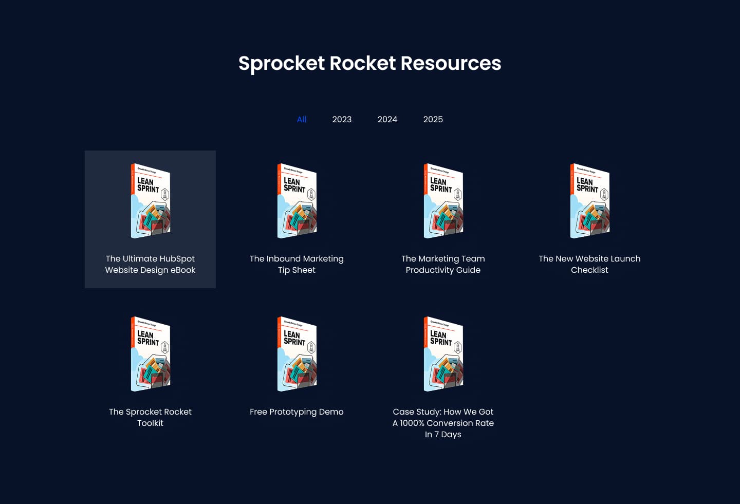
Choose this over SR Cards Filter 01 when each whole card should act as a clickable tile with a hover color swap on background and text, rather than showing a logo, title, and separate link per card with dropdown filtering. It expects an image and short rich text per card plus a link on the card itself, and works best for image-led resource grids like case studies, blog roundups, or news items where a simple tag filter is enough.
Use cases
- Case study grid with tag filter
- Blog roundup with load more
- News item tiles linking out
- Image-led resource library
- Clickable card grid with hover states
- Filterable content grid by category
Where it fits
- Included with: PRO
- Page sections: Resources, Blog, Gallery
Editable fields
Content tab
| Field | Type | Notes |
|---|---|---|
| Background Video | File | Repeats: min 0, default 1. Add multiple file formats in order to provide compatibility with a broad range of browsers. |
| Background Video Tablet | File | Repeats: min 0, default 1. This background video will only be used on tablet devices. |
| Background Video Mobile | File | Repeats: min 0, default 1. This background video will only be used on mobile devices. |
| Enabled | Boolean | |
| ID | Text | Assign a ID to the module. |
| Class | Text | Assign a CLASS to the module. |
| Description | Rich text | |
| Lead Text | Boolean | Turn on to make the Description text larger. |
| Show Load More Button | Boolean | |
| Number of Card to Show | Number | |
| Button Style | Choice | 26 options, including Primary, Secondary, Tertiary. |
| Button Text | Text |
Heading Repeats: min 0, default 1.
| Field | Type | Notes |
|---|---|---|
| Heading | Text | |
| Size | Choice | HTML heading size. Options: H1, H2, H3, H4, H5, H6, P. |
| Display Size | Choice | Size that heading is displayed at. 12 options, including Auto, H1, H2. |
| Color | Choice | 15 options, including Auto, Primary, Secondary. |
| Color | Color | |
| Align | Choice | Options: Auto, Left, Center, Right. |
| CSS Class | Text |
Filters
| Field | Type | Notes |
|---|---|---|
| Title | Text | |
| Tags | Text | Repeats: default 3. |
Column Repeats: min 0, default 7.
| Field | Type | Notes |
|---|---|---|
| Image | Image | |
| Text | Rich text | |
| Tags | Text | Repeats: default 1. |
| Link | Link | |
| Background Color Hover | Color | Background color when hovering over the card with link. |
| Text Color Hover | Color | Text color when hovering over the card with link. |
Column Size Repeats: min 1, max 4, default 2. Columns follow a twelve column grid.
| Field | Type | Notes |
|---|---|---|
| Column Breakpoint | Choice | Options: None, Mobile, Tablet, Desktop, XL. |
| Column Width | Choice | 12 options, including 1, 2, 3. |
Style tab
Change log
| Version | Change |
|---|---|
| 4.0.1 | Fixed loading more items bug |
| 4.0.0 | Stardust update |
| 3.3.0 | Removed isotope.js dependency |
| 3.2.3 | Swapped column text to richtext |
| 3.2.2 | Functionality for URL update based on filter selection |
| 3.2.1 | Fixed filtering bug |
| 3.2.0 | Accessibility improvements |
| 3.1.2 | Added none column breakpoint for smaller screens |
| 3.1.1 | Fixed image loading issue |
| 3.1.0 | Added responsive background options |
| 3.0.3 | Added new Link options |
| 3.0.2 | Added new Link options |
| 3.0.1 | Added Regex replace filter to filter out special characters in the classes to prevent the module from breaking |
| 3.0.0 | Remove jQuery dependency |
| 2.0.2 | Filter now works on items hidden by load more button |
| 2.0.1 | Responsiveness issues |
SR Cards Filter 01
This module renders a heading, optional rich text description, up to two tag-based filter dropdowns, and a filterable grid of up to 8 cards, each with a logo, a hover logo swap, title, link, tags, and optional description text.
SR Cards Flip 01
Renders a heading with optional description above a row of up to six cards, each showing an image, a card heading, and short description on the front face.