

SR Cards Pricing 01
This module renders a heading, optional description, and a row of three pricing cards, each showing a plan name, a price with optional prefix and suffix, a rich text feature list, an optional featured badge, and one CTA button.
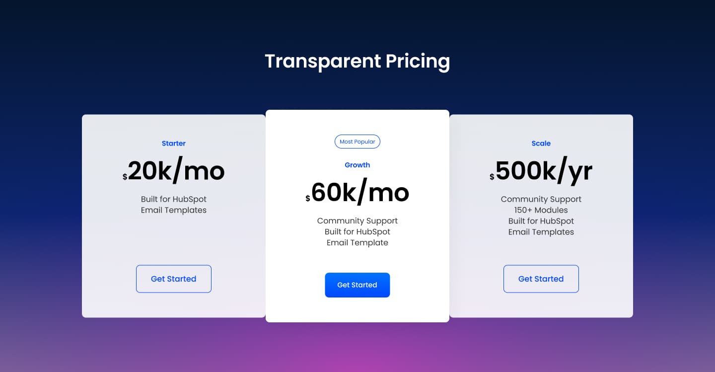
Pick it over SR Cards Pricing 02 when you want a rich text feature area instead of a fixed set of short feature lines, and pick it over SR Cards Pricing 03 when you need several comparable tiers side by side rather than one spotlighted plan with a separate feature checklist. Any card can be marked featured to visually stand out as the recommended tier.
Use cases
- Three-tier pricing table
- Monthly plan comparison
- Recommended plan highlight
- Saas subscription tiers
- Side by side package pricing
Where it fits
- Included with: PRO
- Page sections: Pricing, Comparison, CTA
Editable fields
Content tab
| Field | Type | Notes |
|---|---|---|
| Background Video | File | Repeats: min 0, default 1. Add multiple file formats in order to provide compatibility with a broad range of browsers. |
| Background Video Tablet | File | Repeats: min 0, default 1. This background video will only be used on tablet devices. |
| Background Video Mobile | File | Repeats: min 0, default 1. This background video will only be used on mobile devices. |
| Enabled | Boolean | |
| ID | Text | Assign a ID to the module. |
| Class | Text | Assign a CLASS to the module. |
| Description | Rich text | |
| Lead Text | Boolean | Turn on to make the Description text larger. |
Heading Repeats: min 0, default 1.
| Field | Type | Notes |
|---|---|---|
| Heading | Text | |
| Size | Choice | HTML heading size. Options: H1, H2, H3, H4, H5, H6, P. |
| Display Size | Choice | Size that heading is displayed at. 12 options, including Auto, H1, H2. |
| Color | Choice | 15 options, including Auto, Primary, Secondary. |
| Color | Color | |
| Align | Choice | Options: Auto, Left, Center, Right. |
| CSS Class | Text |
Column Repeats: min 1, max 4, default 3.
| Field | Type | Notes |
|---|---|---|
| Name | Text | |
| Price Prefix | Text | |
| Price | Text | |
| Price Suffix | Text | |
| Text | Rich text | |
| Featured Text | Text |
Column › CTA Repeats: min 0, default 1.
| Field | Type | Notes |
|---|---|---|
| CTA Type | Choice | Options: HubSpot CTA, HubSpot Payment, Button, Modal. |
| CTA Style | Choice | 26 options, including Primary, Secondary, Tertiary. |
| CTA | CTA | |
| Button Text | Text | |
| Modal Target | Text | |
| Link | Link | |
| Payment link | Payment | |
| Checkout behavior | Choice | Options: Open in a new tab, Sliding overlay. |
| CTA Size | Choice | Options: Small, Default, Large. |
| Add icon | Boolean |
Column › CTA › Default
| Field | Type | Notes |
|---|---|---|
| Background | Color | |
| Text | Color | |
| Border | Color |
Column › CTA › Hover
| Field | Type | Notes |
|---|---|---|
| Background | Color | |
| Text | Color | |
| Border Color | Color |
Column › CTA › Icon
| Field | Type | Notes |
|---|---|---|
| Icon | Icon | |
| Position | Choice | Options: Left, Right. |
| Purpose | Choice | The purpose of the icon, used for accessibility. If set to decorative, an additional attribute of aria-hidden="true" will be added to the icon. Options: Decorative, Semantic. |
Style tab
Change log
| Version | Change |
|---|---|
| 3.0.0 | Stardust update |
| 2.1.0 | Added responsive background options |
| 2.0.2 | Added new Link options |
| 2.0.1 | Added card styles |
SR Cards Logos 01
This module renders a heading and description above a row of three logo cards, each with a small logo image, a title, a short description, and an optional link.
SR Cards Pricing 02
This module renders a shared heading and rich text description above three fixed pricing cards, each with its own subheading, up to seven short feature lines, and a dedicated CTA button.