

SR FAQ 01
This module renders a heading and description on the left with a set of FAQ cards on the right, each card showing a question and rich text answer.
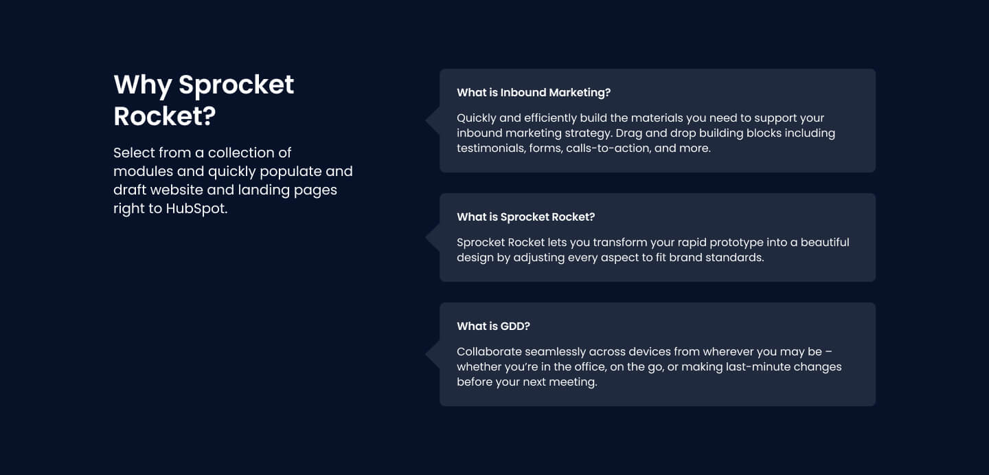
On mobile the cards become a swipeable slider with pagination dots, while desktop shows a fixed number of cards with an optional load more button to reveal the rest. Pick this over the other card modules when the content is question and answer pairs rather than blog posts, categories, logos, or features.
Use cases
- Frequently asked questions block
- Pricing page faq
- Product support q&a
- Swipeable faq slider on mobile
- Expandable faq list with load more
Where it fits
- Included with: Core
- Page sections: FAQ, Content, Resources
Editable fields
Content tab
| Field | Type | Notes |
|---|---|---|
| Background Video | File | Repeats: min 0, default 1. Add multiple file formats in order to provide compatibility with a broad range of browsers. |
| Background Video Tablet | File | Repeats: min 0, default 1. This background video will only be used on tablet devices. |
| Background Video Mobile | File | Repeats: min 0, default 1. This background video will only be used on mobile devices. |
| Enabled | Boolean | |
| ID | Text | Assign a ID to the module. |
| Class | Text | Assign a CLASS to the module. |
| Description | Rich text | |
| Lead Text | Boolean | Turn on to make the Description text larger. |
| Number of Items to Show | Number | Use this to only show a certain number of items. |
Heading Repeats: min 0, default 1.
| Field | Type | Notes |
|---|---|---|
| Heading | Text | |
| Size | Choice | HTML heading size. Options: H1, H2, H3, H4, H5, H6, P. |
| Display Size | Choice | Size that heading is displayed at. 12 options, including Auto, H1, H2. |
| Color | Choice | 15 options, including Auto, Primary, Secondary. |
| Color | Color | |
| Align | Choice | Options: Auto, Left, Center, Right. |
| CSS Class | Text |
CTA Repeats: min 0, default 0.
| Field | Type | Notes |
|---|---|---|
| CTA Type | Choice | Options: HubSpot CTA, HubSpot Payment, Button, Modal. |
| CTA Style | Choice | 26 options, including Primary, Secondary, Tertiary. |
| CTA | CTA | |
| Button Text | Text | |
| Modal Target | Text | |
| Link | Link | |
| Payment link | Payment | |
| Checkout behavior | Choice | Options: Open in a new tab, Sliding overlay. |
| CTA Size | Choice | Options: Small, Default, Large. |
| Add icon | Boolean |
CTA › Default
| Field | Type | Notes |
|---|---|---|
| Background | Color | |
| Text | Color | |
| Border | Color |
CTA › Hover
| Field | Type | Notes |
|---|---|---|
| Background | Color | |
| Text | Color | |
| Border Color | Color |
CTA › Icon
| Field | Type | Notes |
|---|---|---|
| Icon | Icon | |
| Position | Choice | Options: Left, Right. |
| Purpose | Choice | The purpose of the icon, used for accessibility. If set to decorative, an additional attribute of aria-hidden="true" will be added to the icon. Options: Decorative, Semantic. |
FAQ Repeats: min 1, default 1.
| Field | Type | Notes |
|---|---|---|
| FAQ Question | Text | |
| FAQ Answer | Rich text |
Load More Button
| Field | Type | Notes |
|---|---|---|
| Button Text | Text | |
| Button Style | Choice | 25 options, including Primary, Secondary, Tertiary. |
Style tab
Change log
| Version | Change |
|---|---|
| 4.0.0 | Stardust updates fixes |
| 3.2.0 | Accessibility improvements |
| 3.1.0 | Added responsive background options |
| 3.0.1 | Added new Link options |
| 3.0.0 | Added card style fields |
SR Events 01
This module renders a heading with description above a row of up to three event cards, each with its own subheading, a start date and time, an optional end date, and a link to register or learn more.
SR Pricing 01
This module renders a full comparison-style pricing table with a heading and description, a table title, up to four plan columns with price, prefix, suffix and a CTA button each, and up to two feature rows with tooltips shown across all columns.