

SR Pricing 02
This module renders a two-column layout with an intro heading and description on the left, a secondary heading and description above the cards, and exactly two pricing cards on the right, each with a plan name, price, CTA button, and four feature list items.
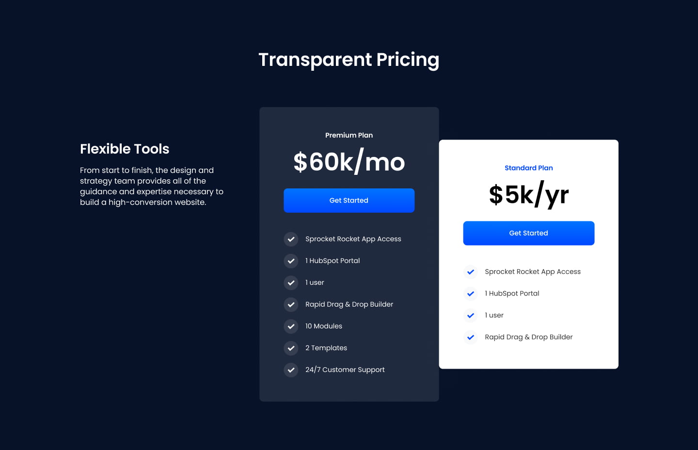
Pick it over SR Pricing 01 or 03 when you have exactly two plans to compare and want a side note or context column next to the cards instead of a full-width comparison table or a three-card grid. One card can be highlighted with a custom gradient background and text color to draw attention to a recommended plan.
Use cases
- Two-tier pricing comparison
- Basic vs premium plan cards
- Side-by-side pricing with context column
- Highlighted recommended plan
- Simple pricing page with two options
Where it fits
- Included with: PRO
- Page sections: Pricing, Comparison
Editable fields
Content tab
| Field | Type | Notes |
|---|---|---|
| Background Video | File | Repeats: min 0, default 1. Add multiple file formats in order to provide compatibility with a broad range of browsers. |
| Background Video Tablet | File | Repeats: min 0, default 1. This background video will only be used on tablet devices. |
| Background Video Mobile | File | Repeats: min 0, default 1. This background video will only be used on mobile devices. |
| Enabled | Boolean | |
| ID | Text | Assign a ID to the module. |
| Class | Text | Assign a CLASS to the module. |
| Description | Rich text | |
| Lead Text | Boolean | Turn on to make the Description text larger. |
| Pricing Description | Rich text | |
| Lead Text | Boolean | Turn on to make the Description text larger. |
Heading Repeats: min 0, default 1.
| Field | Type | Notes |
|---|---|---|
| Heading | Text | |
| Size | Choice | HTML heading size. Options: H1, H2, H3, H4, H5, H6, P. |
| Display Size | Choice | Size that heading is displayed at. 12 options, including Auto, H1, H2. |
| Color | Choice | 15 options, including Auto, Primary, Secondary. |
| Color | Color | |
| Align | Choice | Options: Auto, Left, Center, Right. |
| CSS Class | Text |
Pricing Heading Repeats: min 0, default 1.
| Field | Type | Notes |
|---|---|---|
| Heading | Text | |
| Size | Choice | HTML heading size. Options: H1, H2, H3, H4, H5, H6, P. |
| Display Size | Choice | Size that heading is displayed at. 12 options, including Auto, H1, H2. |
| Color | Choice | 15 options, including Auto, Primary, Secondary. |
| Color | Color | |
| Align | Choice | Options: Auto, Left, Center, Right. |
| CSS Class | Text |
Column Repeats: min 1, max 3, default 2.
| Field | Type | Notes |
|---|---|---|
| Highlight Plan | Boolean | |
| Card Gradient From | Color | |
| Card Gradient To | Color | |
| Text Color | Color |
Column › Pricing Name Repeats: default 1.
| Field | Type | Notes |
|---|---|---|
| Heading | Text | |
| Size | Choice | HTML heading size. Options: H1, H2, H3, H4, H5, H6, P. |
| Display Size | Choice | Size that heading is displayed at. 12 options, including Auto, H1, H2. |
| Color | Choice | 15 options, including Auto, Primary, Secondary. |
| Color | Color | |
| Align | Choice | Options: Auto, Left, Center, Right. |
| CSS Class | Text |
Column › Price Repeats: default 1.
| Field | Type | Notes |
|---|---|---|
| Heading | Text | |
| Size | Choice | HTML heading size. Options: H1, H2, H3, H4, H5, H6, P. |
| Display Size | Choice | Size that heading is displayed at. 12 options, including Auto, H1, H2. |
| Color | Choice | 15 options, including Auto, Primary, Secondary. |
| Color | Color | |
| Align | Choice | Options: Auto, Left, Center, Right. |
| CSS Class | Text |
Column › CTA Repeats: min 0, default 1.
| Field | Type | Notes |
|---|---|---|
| CTA Type | Choice | Options: HubSpot CTA, HubSpot Payment, Button, Modal. |
| CTA Style | Choice | 26 options, including Primary, Secondary, Tertiary. |
| CTA | CTA | |
| Button Text | Text | |
| Modal Target | Text | |
| Link | Link | |
| Payment link | Payment | |
| Checkout behavior | Choice | Options: Open in a new tab, Sliding overlay. |
| CTA Size | Choice | Options: Small, Default, Large. |
| Add icon | Boolean |
Column › CTA › Default
| Field | Type | Notes |
|---|---|---|
| Background | Color | |
| Text | Color | |
| Border | Color |
Column › CTA › Hover
| Field | Type | Notes |
|---|---|---|
| Background | Color | |
| Text | Color | |
| Border Color | Color |
Column › CTA › Icon
| Field | Type | Notes |
|---|---|---|
| Icon | Icon | |
| Position | Choice | Options: Left, Right. |
| Purpose | Choice | The purpose of the icon, used for accessibility. If set to decorative, an additional attribute of aria-hidden="true" will be added to the icon. Options: Decorative, Semantic. |
Column › Features Repeats: min 1, max 6, default 4.
| Field | Type | Notes |
|---|---|---|
| Feature | Rich text |
Column › Features › Icon
| Field | Type | Notes |
|---|---|---|
| Icon Type | Choice | Options: Icon, Image. |
| Image | Image | |
| Icon | Icon | |
| Icon Color | Color | |
| Icon Background | Color | Set opacity to 0 to disable the background. |
| Icon Size | Number | |
| Purpose | Choice | The purpose of the icon, used for accessibility. If set to decorative, an additional attribute of aria-hidden="true" will be added to the icon. Options: Decorative, Semantic. |
Columns › Content Repeats: min 1, max 4, default 1. Columns follow a twelve column grid.
| Field | Type | Notes |
|---|---|---|
| Column Breakpoint | Choice | Options: None, Mobile, Tablet, Desktop, XL. |
| Column Width | Choice | 12 options, including 1, 2, 3. |
| Column Offset | Choice | 13 options, including 0, 1, 2. |
| Column Order | Number |
Columns › Pricing Repeats: min 1, max 4, default 1. Columns follow a twelve column grid.
| Field | Type | Notes |
|---|---|---|
| Column Breakpoint | Choice | Options: None, Mobile, Tablet, Desktop, XL. |
| Column Width | Choice | 12 options, including 1, 2, 3. |
| Column Offset | Choice | 13 options, including 0, 1, 2. |
| Column Order | Number |
Style tab
Change log
| Version | Change |
|---|---|
| 4.0.0 | Stardust update |
| 3.2.1 | Column breakpoint fix |
| 3.2.0 | Accessibility improvements |
| 3.1.0 | Added responsive background options |
| 3.0.1 | Added new Link options |
| 3.0.0 | Rebuilt with new features |
SR Pricing 01
This module renders a full comparison-style pricing table with a heading and description, a table title, up to four plan columns with price, prefix, suffix and a CTA button each, and up to two feature rows with tooltips shown across all columns.
SR Pricing 03
This module renders a heading, optional description, an optional monthly/annual price toggle, and a row of exactly three pricing cards, each with a name, price, description, up to four features, and one or two buttons.