

SR Tabs Slider 01
This module renders a heading and rich text description above an image slider with 3 slides, each just a plain image with its own corner radius, plus optional dots, arrows, and autoplay.
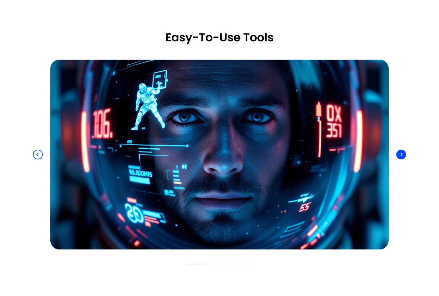
Pick it over SR Tabs Slider 02 when you want a simple rotating photo gallery with no per-slide text, attribution, or CTA button. It expects one image per slide and works best for visual showcases rather than quoted stories or case studies.
Use cases
- Rotating product photo gallery
- Office or culture photo slider
- Simple image carousel under a heading
- Showcase of workspace or facility photos
- Visual portfolio slider without captions
Where it fits
- Included with: PRO
- Page sections: Gallery, Media, Content
Editable fields
Content tab
| Field | Type | Notes |
|---|---|---|
| Background Video | File | Repeats: min 0, default 1. Add multiple file formats in order to provide compatibility with a broad range of browsers. |
| Background Video Tablet | File | Repeats: min 0, default 1. This background video will only be used on tablet devices. |
| Background Video Mobile | File | Repeats: min 0, default 1. This background video will only be used on mobile devices. |
| Enabled | Boolean | |
| ID | Text | Assign a ID to the module. |
| Class | Text | Assign a CLASS to the module. |
| Description | Rich text | |
| Lead Text | Boolean | Turn on to make the Description text larger. |
| Dots | Boolean | |
| Arrows | Boolean | |
| Autoplay | Boolean | |
| Autoplay Speed | Number |
Heading Repeats: min 0, default 1.
| Field | Type | Notes |
|---|---|---|
| Heading | Text | |
| Size | Choice | HTML heading size. Options: H1, H2, H3, H4, H5, H6, P. |
| Display Size | Choice | Size that heading is displayed at. 12 options, including Auto, H1, H2. |
| Color | Choice | 15 options, including Auto, Primary, Secondary. |
| Color | Color | |
| Align | Choice | Options: Auto, Left, Center, Right. |
| CSS Class | Text |
Slides Repeats: min 1, default 3.
| Field | Type | Notes |
|---|---|---|
| Slide Image | Image | Recommended size: 2220x1480px. |
| Image Corner Radius | Number | Set the corner radius of the image. |
Style tab
Change log
| Version | Change |
|---|---|
| 5.0.0 | Stardust update |
| 4.3.0 | Accessibility improvements |
| 4.2.0 | Added responsive background options |
| 4.1.1 | Included slider styles dependecies |
| 4.1.0 | Added slider styles |
| 4.0.0 | Removed jQuery |
SR Tabs Horizontal 02
Renders a vertical stack of three colored tab buttons in a left column next to a right-hand content panel that swaps a heading and rich text block on click.
SR Tabs Slider 02
This module renders a heading, description, and optional CTA row above a slider of 4 default slides, each pairing an image with rich text content, a name and title attribution line, and its own CTA button.