This module features a combination of Logos, Menus, CTAs, and optional Top bar. Supports up to 3 levels of navigation with an option for mega menu.
SR Navigation 01 is a Global module ideally used for creating navigational links to pages, content and other resources on your website.
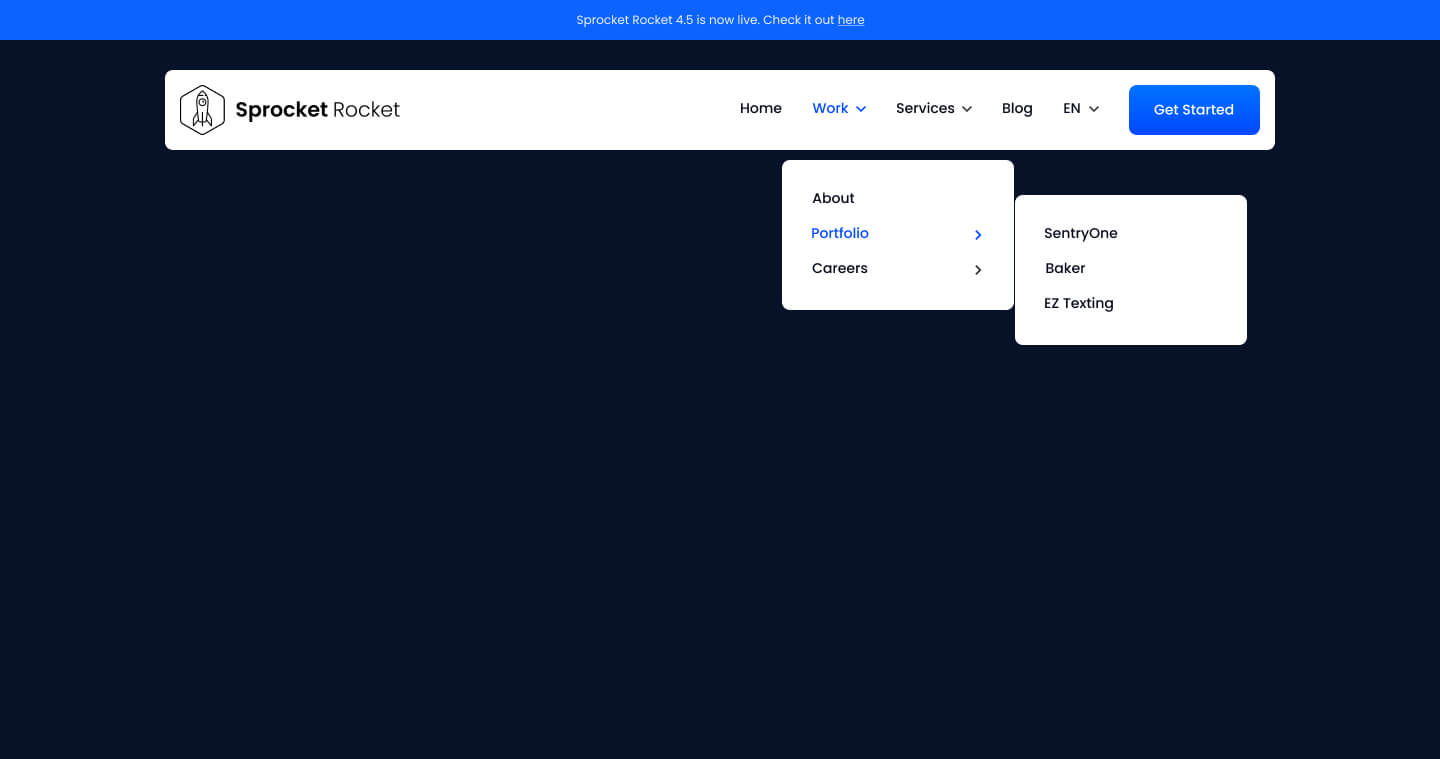
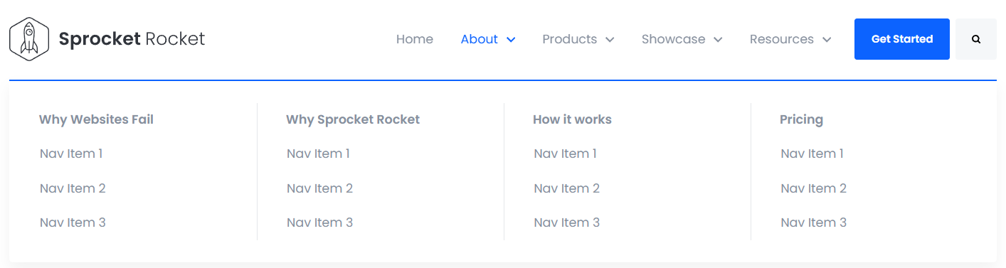
This module has the option to display the menu as a Mega Menu. Turn it on under Settings -> Mega Menu
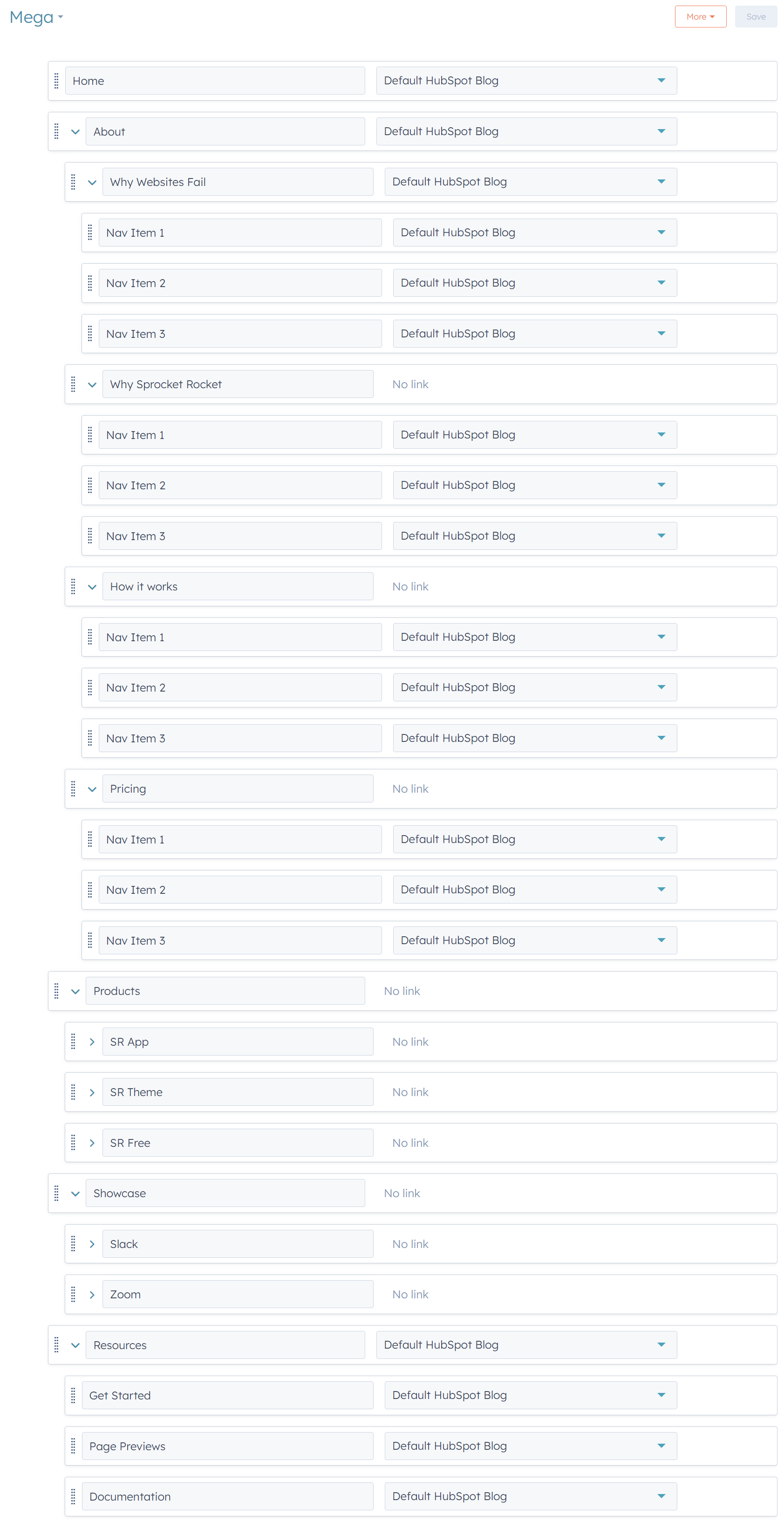
Menu Menu Setup
To setup the mega menu structure correctly follow this format
- Item 1 (
4 Columns)
- Sub Link Column 1
- Menu Item 1
- Menu Item 2
- Menu Item 3
- Sub Link Column 2
- Menu Item 1
- Menu Item 2
- Menu Item 3
- Sub Link Column 3
- Menu Item 1
- Menu Item 2
- Menu Item 3
- Sub Link Column 4
- Menu Item 1
- Menu Item 2
- Menu Item 3
- Sub Link Column 1
- Item 2 (
3 Columns)
- Sub Link Column 1
- Menu Item 1
- Menu Item 2
- Menu Item 3
- Sub Link Column 2
- Menu Item 1
- Menu Item 2
- Menu Item 3
- Sub Link Column 3
- Menu Item 1
- Menu Item 2
- Menu Item 3
- Sub Link Column 1
- Item 3 (
2 Columns)
- Sub Link Column 1
- Menu Item 1
- Menu Item 2
- Menu Item 3
- Sub Link Column 2
- Menu Item 1
- Menu Item 2
- Menu Item 3
- Sub Link Column 1
- Item 4 (
Display as regular dropdown)
- Menu Item 1
- Menu Item 2
- Menu Item 3
Image for reference
Page Specific Settings
This allows you to customize navigation elements for specific pages on your website. By selecting a page and defining its settings, you can tailor navigation, logos, menus, and other elements to suit the unique needs of that page. The are multiple options to customize navigation based on different criteria:
-
By Page Type:
- You can apply specific settings to a variety of predefined page types such as standard website pages, landing pages, blog listings, and more. This allows you to create consistent navigation experiences across similar types of pages.
-
By Language:
- Customize navigation elements based on language settings using letter language codes. This ensures that your site can cater to users in different regions with localized navigation features.
-
By Choosing Specific Pages:
- Directly select individual pages where you want to override default navigation settings. This gives you the flexibility to tailor the navigation for unique page requirements, such as a homepage or a special promotional page.