SR Five Col 01
This module is available on these plans: PRO
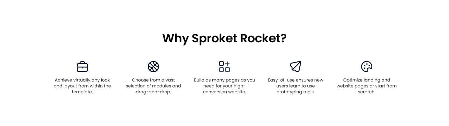
SR Five Col 01 is a versatile module ideal for presenting text content. It combines headers, descriptions, optional visuals, and call-to-actions (CTAs) to create a structured and engaging layout. Perfect for descriptions or discussions, the module allows for the inclusion of supportive visuals to illustrate key features. Additionally, it offers flexibility in layout design with the capability to create multiple columns of varying sizes, providing a customizable and dynamic multi-column format.