
SR Two Col 08
This module renders a shared heading and description above two fixed-width card columns, each with its own image, small heading, description text, and one CTA button, where each card carries its own gradient, solid color, or custom background with white text by default.
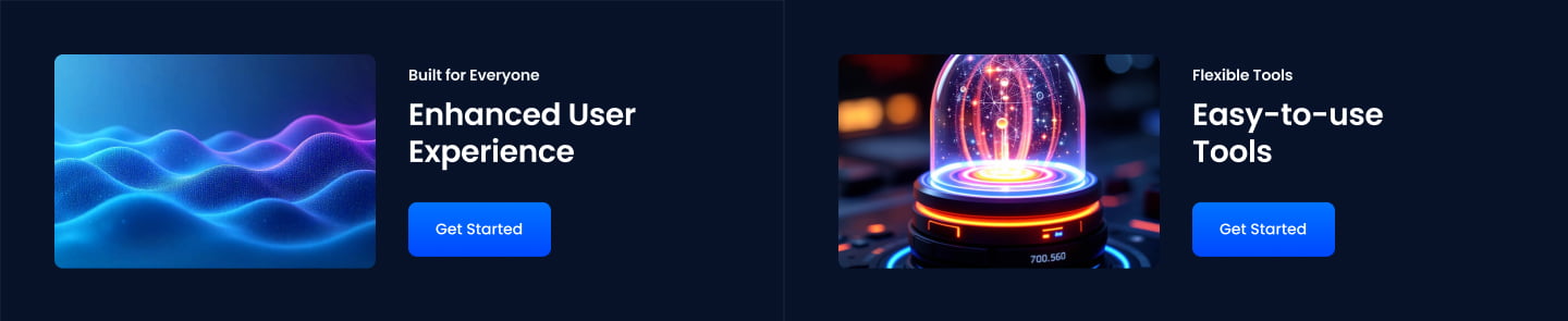
Pick this over the other two-column modules when both sides need to look like distinct colored promo panels rather than plain text and image blocks, since none of the siblings give each column its own background treatment. Provide an image for each column and keep button text short, since the two cards sit side by side at equal width by default.
Use cases
- Two promo cards side by side
- Gradient panel comparison
- Colored feature cards with buttons
- Product tier promo blocks
- Two offer highlights with cta
Where it fits
- Included with: PRO
- Page sections: Features, Benefits, CTA
Editable fields
Content tab
| Field | Type | Notes |
|---|---|---|
| Background Video | File | Repeats: min 0, default 1. Add multiple file formats in order to provide compatibility with a broad range of browsers. |
| Background Video Tablet | File | Repeats: min 0, default 1. This background video will only be used on tablet devices. |
| Background Video Mobile | File | Repeats: min 0, default 1. This background video will only be used on mobile devices. |
| Enabled | Boolean | |
| ID | Text | Assign a ID to the module. |
| Class | Text | Assign a CLASS to the module. |
| Description | Rich text | |
| Lead Text | Boolean | Turn on to make the Description text larger. |
Heading Repeats: min 0, default 0.
| Field | Type | Notes |
|---|---|---|
| Heading | Text | |
| Size | Choice | HTML heading size. Options: H1, H2, H3, H4, H5, H6, P. |
| Display Size | Choice | Size that heading is displayed at. 12 options, including Auto, H1, H2. |
| Color | Choice | 15 options, including Auto, Primary, Secondary. |
| Color | Color | |
| Align | Choice | Options: Auto, Left, Center, Right. |
| CSS Class | Text |
Column Repeats: min 1, max 2, default 2.
| Field | Type | Notes |
|---|---|---|
| Column Image | Image | |
| Image Corner Radius | Number | |
| Description | Rich text |
Column › Column Styles
| Field | Type | Notes |
|---|---|---|
| Background Option | Choice | Options: Color, Custom, Gradient. |
| Background Color | Choice | 14 options, including Primary, Secondary, Tertiary. |
| Background Gradient From | Color | |
| Background Gradient To | Color | |
| Background Custom | Color | |
| Text Color | Choice | Set to Auto to use the default text color. Set to Custom to set a custom text color. 15 options, including Auto, Primary, Secondary. |
| Text Color | Color | |
| Column Vertical Alignment | Choice | Options: Top, Center, Bottom, Stretch. |
Column › Column Styles › Padding
| Field | Type | Notes |
|---|---|---|
| Top | Number | |
| Bottom | Number | |
| Left | Number | |
| Right | Number | |
| Units | Choice | Options: px, rem, vw, %. |
Column › Column Styles › Columns › Image Repeats: min 1, max 4, default 1. Columns follow a twelve column grid.
| Field | Type | Notes |
|---|---|---|
| Column Breakpoint | Choice | Options: None, Mobile, Tablet, Desktop, XL. |
| Column Width | Choice | 12 options, including 1, 2, 3. |
| Column Offset | Choice | 13 options, including 0, 1, 2. |
| Column Order | Number |
Column › Column Styles › Columns › Content Repeats: min 1, max 4, default 1. Columns follow a twelve column grid.
| Field | Type | Notes |
|---|---|---|
| Column Breakpoint | Choice | Options: Mobile, Tablet, Desktop, XL. |
| Column Width | Choice | 12 options, including 1, 2, 3. |
| Column Offset | Choice | 13 options, including 0, 1, 2. |
| Column Order | Number |
Column › Heading Repeats: min 0, default 1.
| Field | Type | Notes |
|---|---|---|
| Heading | Text | |
| Size | Choice | HTML heading size. Options: H1, H2, H3, H4, H5, H6, P. |
| Display Size | Choice | Size that heading is displayed at. 12 options, including Auto, H1, H2. |
| Color | Choice | 15 options, including Auto, Primary, Secondary. |
| Color | Color | |
| Align | Choice | Options: Auto, Left, Center, Right. |
| CSS Class | Text |
Column › CTA Repeats: min 0, default 1.
| Field | Type | Notes |
|---|---|---|
| CTA Type | Choice | Options: HubSpot CTA, HubSpot Payment, Button, Modal. |
| CTA Style | Choice | 26 options, including Primary, Secondary, Tertiary. |
| CTA | CTA | |
| Button Text | Text | |
| Modal Target | Text | |
| Link | Link | |
| Payment link | Payment | |
| Checkout behavior | Choice | Options: Open in a new tab, Sliding overlay. |
| CTA Size | Choice | Options: Small, Default, Large. |
| Add icon | Boolean |
Column › CTA › Default
| Field | Type | Notes |
|---|---|---|
| Background | Color | |
| Text | Color | |
| Border | Color |
Column › CTA › Hover
| Field | Type | Notes |
|---|---|---|
| Background | Color | |
| Text | Color | |
| Border Color | Color |
Column › CTA › Icon
| Field | Type | Notes |
|---|---|---|
| Icon | Icon | |
| Position | Choice | Options: Left, Right. |
| Purpose | Choice | The purpose of the icon, used for accessibility. If set to decorative, an additional attribute of aria-hidden="true" will be added to the icon. Options: Decorative, Semantic. |
Style tab
Change log
| Version | Change |
|---|---|
| 3.0.0 | Stardust update |
| 2.1.0 | Added responsive background options |
| 2.0.1 | Added new Link options |
SR Two Col 07
This module renders an optional shared heading, description, and CTAs above a two-column row where each of the two columns holds its own media block (image, video, form, meeting scheduler, or lottie), a sub-heading, rich text, up to four icon features, and its own CTA button.
SR Two Col 10
This module renders a full-height media column (image or video) beside a content column that holds a heading, rich text description, and one CTA button, with the media side switchable to left or right.