SR Tabs Split Screen 01
This module is available on these plans: PRO, Stack
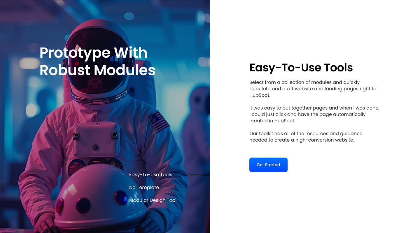
SR Tabs Split Screen 01 is perfect for displaying inter-connected topics using a split-screen layout with large images, texts, and buttons.
This module leverages a split-screen format to effectively present related information. Whether you’re highlighting features, explaining detailed concepts, or showcasing products, the combination of visuals and text ensures that your content is engaging and easy to navigate.