

SR Job Listing 01
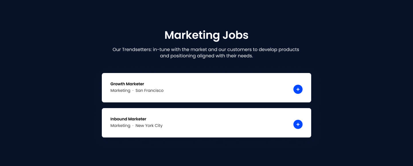
This module renders a heading above a repeatable list of job listing cards, each showing a title, category, and location with an Apply Now button that opens a modal containing a job heading, richtext job description, and either a direct application link or a close action.
Pick it over the FAQ, testimonial, or media-focused tab siblings when the content is actual career postings that need a modal-based apply flow, not text panels, image galleries, or quoted content. Each listing needs its own richtext job description, and if direct_link is enabled it needs a working application URL.
Use cases
- Open job listings
- Careers page postings
- Apply now modal for roles
- Marketing team job openings
- Hiring board with department and city
Where it fits
- Included with: Stack
- Page sections: Content, CTA
Editable fields
Content tab
| Field | Type | Notes |
|---|---|---|
| Background Video | File | Repeats: min 0, default 1. Add multiple file formats in order to provide compatibility with a broad range of browsers. |
| Background Video Tablet | File | Repeats: min 0, default 1. This background video will only be used on tablet devices. |
| Background Video Mobile | File | Repeats: min 0, default 1. This background video will only be used on mobile devices. |
| Enabled | Boolean | |
| ID | Text | Assign a ID to the module. |
| Class | Text | Assign a CLASS to the module. |
| Description | Rich text | |
| Lead Text | Boolean | Turn on to make the Description text larger. |
Heading Repeats: min 0, default 1.
| Field | Type | Notes |
|---|---|---|
| Heading | Text | |
| Size | Choice | HTML heading size. Options: H1, H2, H3, H4, H5, H6, P. |
| Display Size | Choice | Size that heading is displayed at. 12 options, including Auto, H1, H2. |
| Color | Choice | 15 options, including Auto, Primary, Secondary. |
| Color | Color | |
| Align | Choice | Options: Auto, Left, Center, Right. |
| CSS Class | Text |
Listing Repeats: default 2.
| Field | Type | Notes |
|---|---|---|
| Title | Text | |
| Category | Text | |
| Location | Text | |
| Job Text | Rich text | |
| Open in Modal | Boolean | |
| Job Link | Link |
Listing › Heading Repeats: min 0, default 1.
| Field | Type | Notes |
|---|---|---|
| Heading | Text | |
| Size | Choice | HTML heading size. Options: H1, H2, H3, H4, H5, H6, P. |
| Display Size | Choice | Size that heading is displayed at. 12 options, including Auto, H1, H2. |
| Color | Choice | 15 options, including Auto, Primary, Secondary. |
| Color | Color | |
| Align | Choice | Options: Auto, Left, Center, Right. |
| CSS Class | Text |
Listing › Apply Button
| Field | Type | Notes |
|---|---|---|
| CTA Type | Choice | Options: HubSpot CTA, Button, None. |
| CTA Style | Choice | 26 options, including Primary, Secondary, Tertiary. |
| CTA | CTA | |
| Button Text | Text | |
| Link | Link |
Listing › Close Button
| Field | Type | Notes |
|---|---|---|
| CTA Type | Choice | Options: Button, Modal, None. |
| CTA Style | Choice | 26 options, including Primary, Secondary, Tertiary. |
| Button Text | Text |
Style tab
Change log
| Version | Change |
|---|---|
| 5.0.0 | Stardust update |
| 4.2.2 | Fixed text alignment issue |
| 4.2.1 | Fixed missing fields |
| 4.2.0 | Accessibility improvements |
| 4.1.0 | Added responsive background options |
| 4.0.2 | Fixed typo in modal styles group label |
| 4.0.1 | Added new Link options |
| 4.0.0 | Added card styles |
SR Two Col TOC 01
This module renders a sticky left-hand table of contents next to a right-hand content area of up to 7 anchor-linked sections, where each section holds one content block such as rich text, an image, a video, a quote, a CTA, or raw HTML.
SR Locations 01
This module renders a heading, optional description, and a world map background with clickable dots pulled from a HubDB table, one dot per row.