

SR Tabs Accordion 01
This module renders a two-column layout with a heading and description on the left and up to six expandable accordion items on the right, each with a label and rich text answer.
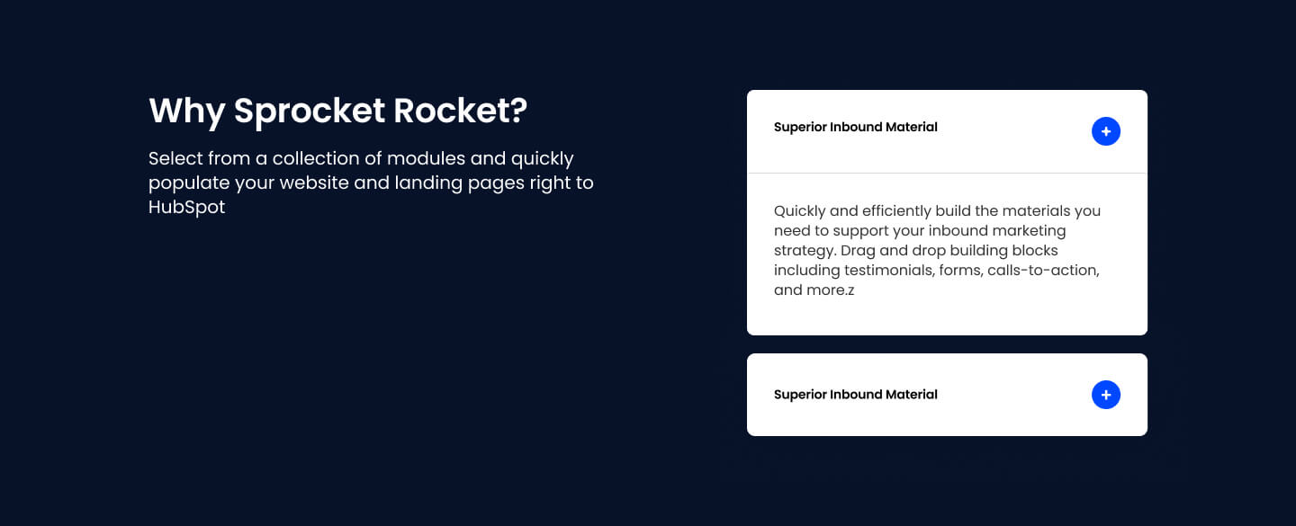
Choose this over SR Tabs Accordion 02 when you want one single accordion list rather than multiple side by side grouped columns, and when you need a load more button to reveal additional items beyond an initial visible count. It suits straightforward FAQ or quick fact lists paired with intro copy rather than topic split product breakdowns.
Use cases
- Simple faq list with intro text
- Expandable quick facts sidebar
- Load more faq items
- Single column collapsible list
- Product benefits with expandable details
- Support questions with sticky intro
Where it fits
- Included with: Core
- Page sections: FAQ, Content, Features
Editable fields
Content tab
| Field | Type | Notes |
|---|---|---|
| Background Video | File | Repeats: min 0, default 1. Add multiple file formats in order to provide compatibility with a broad range of browsers. |
| Background Video Tablet | File | Repeats: min 0, default 1. This background video will only be used on tablet devices. |
| Background Video Mobile | File | Repeats: min 0, default 1. This background video will only be used on mobile devices. |
| Enabled | Boolean | |
| ID | Text | Assign a ID to the module. |
| Class | Text | Assign a CLASS to the module. |
| Description | Rich text | |
| Lead Text | Boolean | Turn on to make the Description text larger. |
| Close Inactive Accordions | Boolean | Only shows the active Accordion. |
| Accordions to show | Number | Number of Accordions to show on load. |
| Load More Button Style | Choice | 26 options, including Primary, Secondary, Tertiary. |
| Load More Button Text | Text |
Heading Repeats: min 0, default 1.
| Field | Type | Notes |
|---|---|---|
| Heading | Text | |
| Size | Choice | HTML heading size. Options: H1, H2, H3, H4, H5, H6, P. |
| Display Size | Choice | Size that heading is displayed at. 12 options, including Auto, H1, H2. |
| Color | Choice | 15 options, including Auto, Primary, Secondary. |
| Color | Color | |
| Align | Choice | Options: Auto, Left, Center, Right. |
| CSS Class | Text |
Accordion Item Repeats: min 1, default 6.
| Field | Type | Notes |
|---|---|---|
| Accordion Label | Text | |
| Accordion Content | Rich text | |
| Expanded | Boolean |
Columns
| Field | Type | Notes |
|---|---|---|
| Sticky Content | Boolean |
Columns › Content Repeats: min 1, max 4, default 1. Columns follow a twelve column grid.
| Field | Type | Notes |
|---|---|---|
| Column Breakpoint | Choice | Options: None, Mobile, Tablet, Desktop, XL. |
| Column Width | Choice | 12 options, including 1, 2, 3. |
| Column Offset | Choice | 13 options, including 0, 1, 2. |
| Column Order | Number |
Columns › Accordions Repeats: min 1, max 4, default 1. Columns follow a twelve column grid.
| Field | Type | Notes |
|---|---|---|
| Column Breakpoint | Choice | Options: None, Mobile, Tablet, Desktop, XL. |
| Column Width | Choice | 12 options, including 1, 2, 3. |
| Column Offset | Choice | 13 options, including 0, 1, 2. |
| Column Order | Number |
Style tab
Change log
| Version | Change |
|---|---|
| 5.0.1 | Fixed functionality where the height conflicted with animations |
| 5.0.0 | Stardust update |
| 4.2.1 | Column breakpoint fix |
| 4.2.0 | Accessibility improvements |
| 4.1.0 | Added responsive background options |
| 4.0.1 | Fixed functionality to open more than one tab |
| 4.0.0 | Removed jQuery |
SR Tabs 02
This module renders a heading, optional description, and a card containing up to five tabs, where each tab reveals one or two side-by-side columns of image, video, or lottie media paired with a heading, rich text, and CTAs.
SR Tabs Accordion 02
This module renders a heading and description above one or more accordion columns, each with its own subheading and up to three collapsible items that show a label and rich text answer.