

SR Events 01
This module renders a heading with description above a row of up to three event cards, each with its own subheading, a start date and time, an optional end date, and a link to register or learn more.
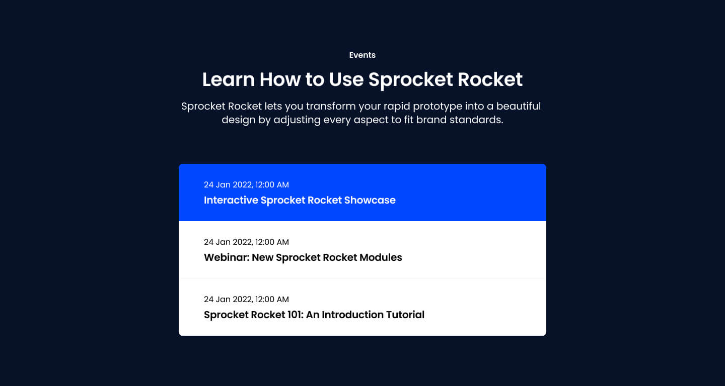
Pick it over the sr-cards siblings when dates and times are the main data point on the card rather than images, blog metadata, categories, or logos. It expects real datetime values for each event and can auto-hide events whose date has already passed.
Use cases
- Upcoming webinar list
- Conference schedule preview
- Workshop dates with registration links
- Product launch event countdown
- Three-event promo row
Where it fits
- Included with: Stack
- Page sections: Events
Editable fields
Content tab
| Field | Type | Notes |
|---|---|---|
| Background Video | File | Repeats: min 0, default 1. Add multiple file formats in order to provide compatibility with a broad range of browsers. |
| Background Video Tablet | File | Repeats: min 0, default 1. This background video will only be used on tablet devices. |
| Background Video Mobile | File | Repeats: min 0, default 1. This background video will only be used on mobile devices. |
| Enabled | Boolean | |
| ID | Text | Assign a ID to the module. |
| Class | Text | Assign a CLASS to the module. |
| Description | Rich text | |
| Lead Text | Boolean | Turn on to make the Description text larger. |
| Hide past events | Boolean |
Heading Repeats: min 0, default 2.
| Field | Type | Notes |
|---|---|---|
| Heading | Text | |
| Heading Size | Choice | HTML heading size. Options: H1, H2, H3, H4, H5, H6, P. |
| Heading Display Size | Choice | Size that heading is displayed at. 12 options, including Auto, H1, H2. |
| Heading Color | Choice | 15 options, including Auto, Primary, Secondary. |
| Heading Color | Color | |
| Heading Align | Choice | Options: Auto, Left, Center, Right. |
| CSS Class | Text |
Events Repeats: default 3.
| Field | Type | Notes |
|---|---|---|
| Event Date | Datetime | |
| Date Format | Text | custom pattern following Unicode LDML. |
| End Date | Boolean | |
| Event End Date | Datetime | |
| Date Format | Text | custom pattern following Unicode LDML. |
| Event Link | Link | |
| Text Align | Choice | Options: Auto, Left, Center, Right. |
| Text Color | Choice | 15 options, including Auto, Primary, Secondary. |
| Text Color | Color | |
| Background Color | Choice | 15 options, including Auto, Primary, Secondary. |
| Background Color | Color |
Events › Heading Repeats: min 0, default 1.
| Field | Type | Notes |
|---|---|---|
| Heading | Text | |
| Heading Size | Choice | HTML heading size. Options: H1, H2, H3, H4, H5, H6, P. |
| Heading Display Size | Choice | Size that heading is displayed at. 12 options, including Auto, H1, H2. |
| Heading Color | Choice | 15 options, including Auto, Primary, Secondary. |
| Heading Color | Color | |
| Heading Align | Choice | Options: Auto, Left, Center, Right. |
| CSS Class | Text |
Style tab
Change log
| Version | Change |
|---|---|
| 2.0.0 | Stardust update |
| 1.2.0 | Accessibility improvements |
| 1.1.0 | Added responsive background options |
| 1.0.0 | Added module |
SR Event Listing 01
Renders a heading and description above a row of up to three event or trip cards, each with an image, a length field, location, a regular price and struck-through promo price, a star rating, a subheading, body text, and a details button.
SR FAQ 01
This module renders a heading and description on the left with a set of FAQ cards on the right, each card showing a question and rich text answer.