View Live

SR Hero Two Col 01

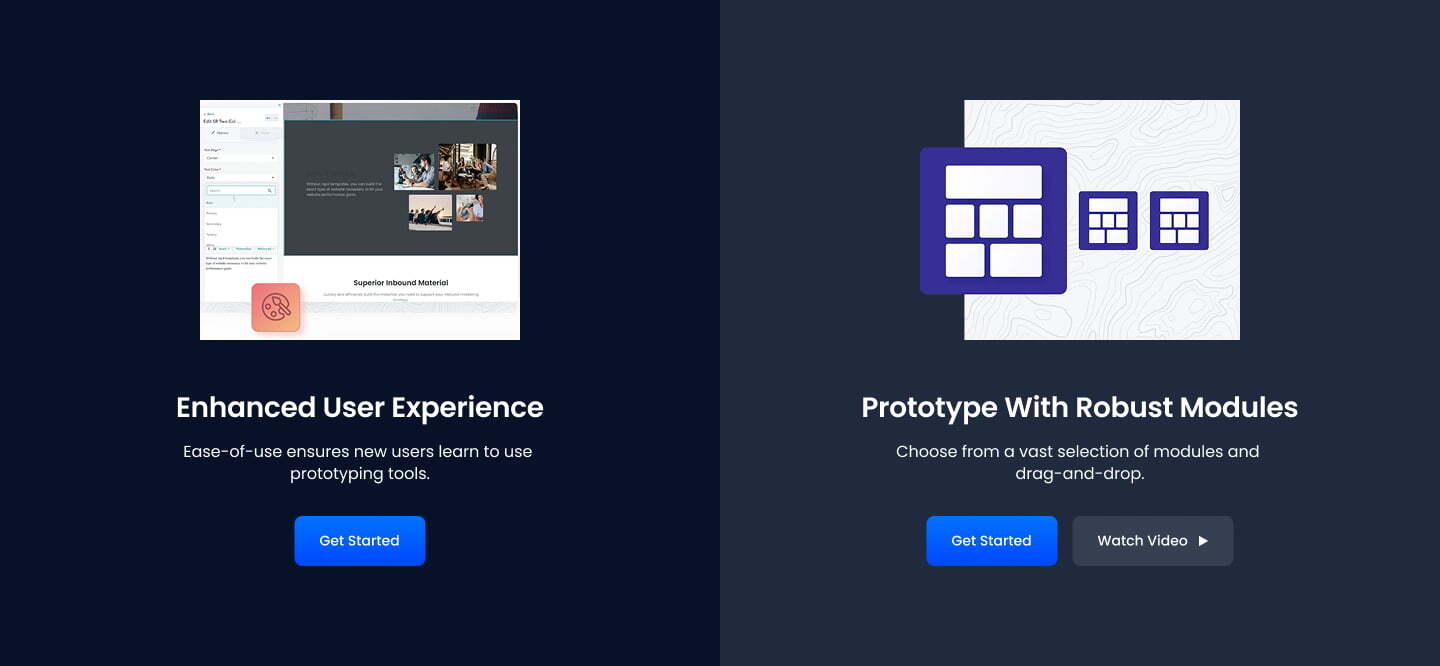
This module is a combination of headers, subheaders, cards, images, and buttons

An ideal use case for SR Hero Two Col 01 is showcasing products on your pages with a CTA to convert your visitors.

sr-hero-two-col-01

Module Settings

Layout choice

Page Full Width

Container Width choice

Minimum Narrow Wide Maximum

Grid Margins TOGGLE
Left Column GROUP
    Design Settings GROUP
        Background Option CHOICE

        Image Video Color Custom Gradient

        Column Size TEXT
Image IMAGE

Headings

Heading Text
Size Choice

H1 H2 H3 H4 H5 H6 P

Display Size CHOICE

H1 H2 H3 H4 H5 H6 P XL XXL XXXL

Color CHOICE

Auto Primary Secondary Tertiary White Black Dark Light Success Info Warning Danger Custom

Align: CHOICE

Left Center Right

CSS Class Text

Description Rich Text
Lead Text Toggle

Buttons

CTA Type Choice

Hubspot CTA Button Modal

CTA Style CHOICE

Primary Secondary Tertiary White Black Dark Light Success Info Warning Danger Outline Primary Outline Secondary Outline Tertiary Outline White Outline Black Outline Dark Outline Light Outline Success Outline Info Outline Warning Outline Danger Custom None

Button Text text
Link URL
CTA Size Choice

Small Default Large

Add Icon Toggle
Icon Position Choice
Left Right

Media Type CHOICE

Image Video None

Text Align CHOICE

Auto Left Center Right 

Text Color CHOICE

Auto Primary Secondary Tertiary White Black Dark Light Success Info Warning Danger Custom


Right Column GROUP
    Design Settings GROUP
        Background Option CHOICE

        Image Video Color Custom Gradient

        Column Size TEXT
Image IMAGE

Headings

Heading Text
Size Choice

H1 H2 H3 H4 H5 H6 P

Display Size CHOICE

H1 H2 H3 H4 H5 H6 P XL XXL XXXL

Color CHOICE

Auto Primary Secondary Tertiary White Black Dark Light Success Info Warning Danger Custom

Align: CHOICE

Left Center Right

CSS Class Text

Description Rich Text
Lead Text Toggle

Buttons

CTA Type Choice

Hubspot CTA Button Modal

CTA Style CHOICE

Primary Secondary Tertiary White Black Dark Light Success Info Warning Danger Outline Primary Outline Secondary Outline Tertiary Outline White Outline Black Outline Dark Outline Light Outline Success Outline Info Outline Warning Outline Danger Custom None

Button Text text
Link URL
CTA Size Choice

Small Default Large

Add Icon Toggle
Icon Position Choice
Left Right

Media Type CHOICE

Image Video None

Text Align CHOICE

Auto Left Center Right 

Text Color CHOICE

Auto Primary Secondary Tertiary White Black Dark Light Success Info Warning Danger Custom

See it Live

Sprocket Rocket Module page- You can see the module used live