

SR Footer 04
This footer renders a logo, an optional one-line slogan or heading above the nav, a single flat menu, copyright richtext, up to 5 social icons, and an optional back-to-top button with configurable icon and colors.
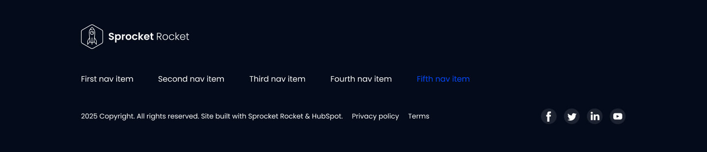
Pick it over sr-footer-01 and sr-footer-02, which need a two-tier menu with parent and child links, and pick it over sr-footer-03 when you want the extra heading line and a scroll-to-top control alongside the single-level nav. It expects a short slogan, a simple flat menu, and at least one social icon so the hover color states have something to show.
Use cases
- Simple site footer with slogan
- Flat menu footer with social icons
- Footer with back to top button
- Footer for sites with no nested nav
- Short tagline above footer nav
Where it fits
- Included with: Free
- Page sections: Footer
Editable fields
Content tab
| Field | Type | Notes |
|---|---|---|
| Background Video | File | Repeats: min 0, default 1. Add multiple file formats in order to provide compatibility with a broad range of browsers. |
| Background Video Tablet | File | Repeats: min 0, default 1. This background video will only be used on tablet devices. |
| Background Video Mobile | File | Repeats: min 0, default 1. This background video will only be used on mobile devices. |
| Enabled | Boolean | |
| ID | Text | Assign a ID to the module. |
| Class | Text | Assign a CLASS to the module. |
| Logo | Image | Recommended Minimum Size: 440x102px. |
| Logo Link | Link | |
| Logo Align | Choice | Options: Auto, Left, Center, Right. |
| Show Menu | Boolean | |
| Menu | Menu | |
| Menu Align | Choice | Options: Auto, Left, Center, Right. |
| Menu Depth | Number | |
| Copyright | Rich text | |
| Enable Back To Top Button | Boolean |
Slogan Repeats: min 0, default 0.
| Field | Type | Notes |
|---|---|---|
| Heading | Text | |
| Size | Choice | Options: H1, H2, H3, H4, H5, H6, P. |
| Display Size | Choice | 12 options, including Auto, H1, H2. |
| Color | Choice | 15 options, including Auto, Primary, Secondary. |
| Color | Color | |
| Align | Choice | Options: Auto, Left, Center, Right. |
| CSS Class | Text |
Social Icons Repeats: min 0, default 5.
| Field | Type | Notes |
|---|---|---|
| Type | Choice | Options: Icon, Image. |
| Icon | Icon | |
| Custom Icon | Image | |
| Link | Link | |
| Aria Label | Text | The aria-label attribute is used on links that have no accessible name to give it meaning to screen readers. |
| Background Color | Color | |
| Icon Color | Color | |
| Background Color Hover | Color | |
| Icon Color Hover | Color | |
| Purpose | Choice | The purpose of the icon, used for accessibility. If set to decorative, an additional attribute of aria-hidden="true" will be added to the icon. Options: Decorative, Semantic. |
Back To Top Button
| Field | Type | Notes |
|---|---|---|
| Button Color | Choice | 12 options, including Primary, Secondary, Tertiary. |
| Button Color | Color | |
| Icon | Icon | |
| Icon Color | Choice | 12 options, including Primary, Secondary, Tertiary. |
| Icon Color | Color | |
| Page Target | Text | |
| Purpose | Choice | The purpose of the icon, used for accessibility. If set to decorative, an additional attribute of aria-hidden="true" will be added to the icon. Options: Decorative, Semantic. |
Style tab
Change log
| Version | Change |
|---|---|
| 7.0.1 | Added menu align option |
| 7.0.0 | Stardust update |
| 6.2.1 | Social Icon styles fix |
| 6.2.0 | Accessibility improvements |
| 6.1.0 | Added responsive background options |
| 6.0.3 | Added aria labels to social media links |
| 6.0.2 | Minor CSS Fixes |
| 6.0.1 | Minor CSS Fixes |
| 6.0.0 | Converted to Non-global module |
| 5.1.2 | Added new Link options |
| 5.1.1 | Added image option to social icons |
| 5.1.0 | Added menu depth option |
| 5.0.3 | Social Icons Color Fixes |
| 5.0.2 | Footer Improvements |
SR Footer 03
This footer renders a logo with an optional link, an optional short heading or slogan beside it, a single flat navigation menu, up to five social icons, small print copyright text, and an optional back-to-top button.
SR Footer Min 01
This module renders a single minimal footer block from one free-form richtext field, with configurable container width and alignment but no menus, logos, or social icon repeaters.