

SR One Col Media 02
Renders a heading and description above one or more media columns (default two), each column holding an image, video, form, or lottie animation plus its own subheading, rich text, and a CTA button.
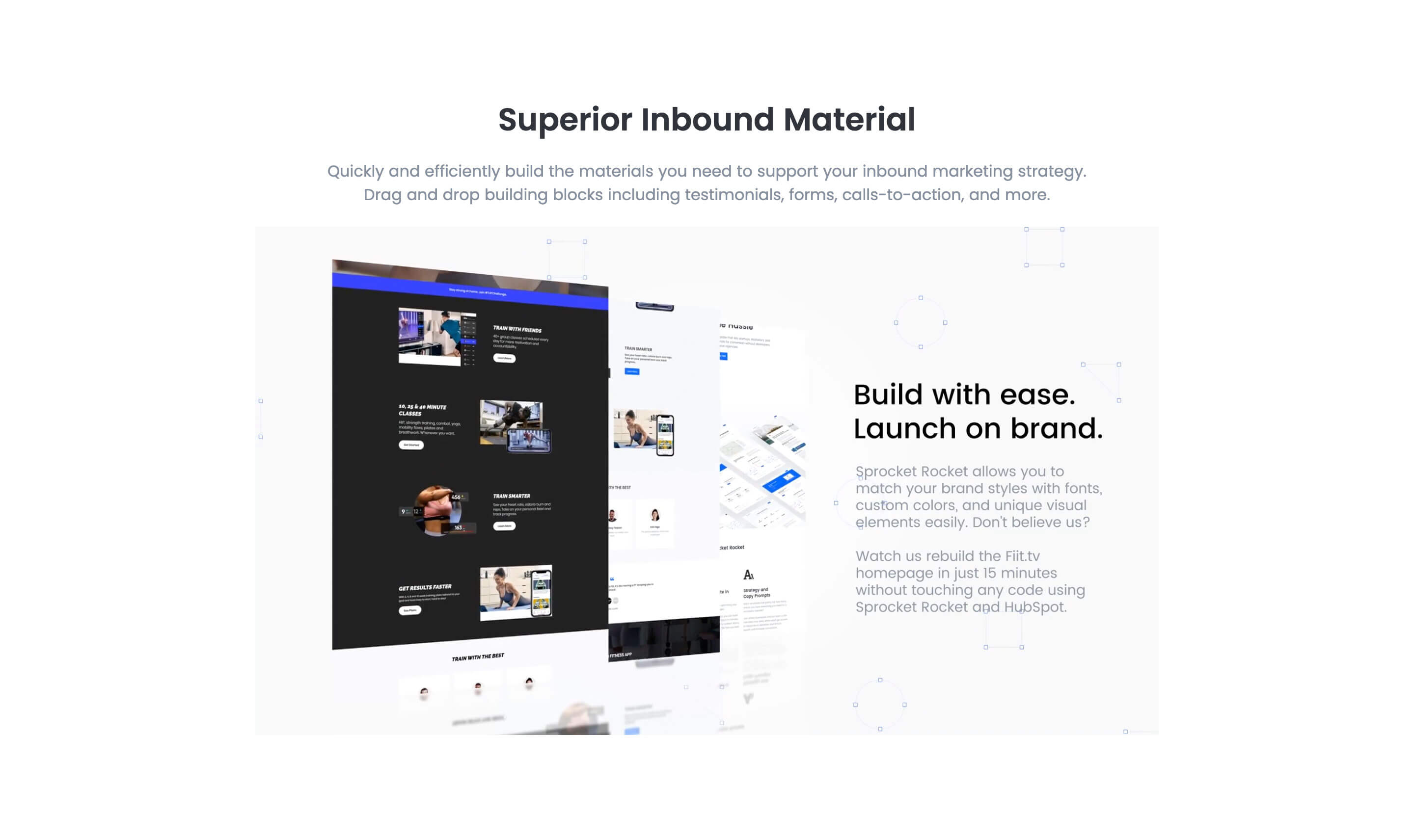
Choose this over SR One Col Media 01 when you want the option to use the column image as a full background with a color overlay, or when you need video styling controls like accent color and autoplay on top of the same media-plus-text layout. Each column can be resized and reordered independently, so it works for both a single wide media block and a side by side media and text split.
Use cases
- Product screenshot with overlay text
- Video demo with call to action
- Image background panel with heading
- Lead capture form beside product image
- Feature highlight with lottie animation
- Two column media and text split
Where it fits
- Included with: PRO
- Page sections: Media, Content, Features
Editable fields
Content tab
| Field | Type | Notes |
|---|---|---|
| Background Video | File | Repeats: min 0, default 1. Add multiple file formats in order to provide compatibility with a broad range of browsers. |
| Background Video Tablet | File | Repeats: min 0, default 1. This background video will only be used on tablet devices. |
| Background Video Mobile | File | Repeats: min 0, default 1. This background video will only be used on mobile devices. |
| Enabled | Boolean | |
| ID | Text | Assign a ID to the module. |
| Class | Text | Assign a CLASS to the module. |
| Description | Rich text | |
| Lead Text | Boolean | Turn on to make the Description text larger. |
| Use Image as Background | Boolean | Makes the Column's image the background. Requires media type to be IMAGE. |
| Column Vertical Align | Choice | Options: Auto, Top, Center, Bottom, Stretch. |
Heading Repeats: min 0, default 0.
| Field | Type | Notes |
|---|---|---|
| Heading | Text | |
| Size | Choice | HTML heading size. Options: H1, H2, H3, H4, H5, H6, P. |
| Display Size | Choice | Size that heading is displayed at. 12 options, including Auto, H1, H2. |
| Color | Choice | 15 options, including Auto, Primary, Secondary. |
| Color | Color | |
| Align | Choice | Options: Auto, Left, Center, Right. |
| CSS Class | Text |
Column Repeats: default 2.
| Field | Type | Notes |
|---|---|---|
| Media Type | Choice | Options: Image, Video, Form, Lottie, None. |
| Add to Lightbox | Boolean | Enable this toggle to add this image to a lightbox pop-up. |
| Overlay Color | Color | |
| Image | Image | |
| Image Corner Radius | Number | |
| Image Link | Link | |
| Lottie Embed Code | Text | How to add LottieFiles. |
| Content | Rich text | |
| Lead Text | Boolean | Turn on to make the content text larger. |
| Text Align | Choice | Options: Auto, Left, Center, Right. |
| Text Color | Choice | 14 options, including Auto, Primary, Secondary. |
| Custom Column Size | Boolean | |
| CSS Class | Text | Assign a CLASS to the column. |
Column › Video
| Field | Type | Notes |
|---|---|---|
| Video type | Choice | Options: Embed, HTML Video, HubSpot Video. |
| HubSpot Video | Video player | |
| Embed | Embed | |
| Custom Thumbnail | Image | |
| Video File | File | Repeats: default 1. Add multiple file formats in order to provide compatibility with a broad range of browsers. |
| Video Poster | Image | |
| Show Controls | Boolean | |
| Autoplay | Boolean | |
| Loop | Boolean | |
| Muted | Boolean | |
| Video Accent | Choice | Add a design accent behind your video. Options: None, Design 1, Design 2, Design 3. |
| Video Accent Color | Choice | 11 options, including Primary, Secondary, Tertiary. |
| Custom Accent Color | Color |
Column › Video › Style Options
| Field | Type | Notes |
|---|---|---|
| Play button color | Color |
Column › Video › Placeholder text
| Field | Type | Notes |
|---|---|---|
| Video placeholder title | Text | |
| Video placeholder description | Text |
Column › Form
| Field | Type | Notes |
|---|---|---|
| Enabled | Boolean | |
| Lazy Load | Boolean | To use this feature, you must have either Marketing Hub or Content Hub Professional or Enterprise, and you need to enable the "Set as raw HTML" option in the form settings. |
| Form Height | Number | Used to set a minimum height for the form, this prevents layout shifts when the form loads. |
| Description | Rich text | |
| Lead Text | Boolean | Turn on to make the Description text larger. |
| Form | Form | |
| Send form notifications to specified email addresses instead of the form defaults | Boolean | |
| Email Addresses | ||
| Salesforce campaign | Salesforcecampaign |
Column › Form › Styles
| Field | Type | Notes |
|---|---|---|
| Background Color | Color | |
| Text Color | Choice | Set to Auto to use the default text color. Set to Custom to set a custom text color. 15 options, including Auto, Primary, Secondary. |
| Text Color | Color | |
| Hide Field Labels | Boolean |
Column › Form › Styles › Button
| Field | Type | Notes |
|---|---|---|
| Style | Choice | 25 options, including Primary, Secondary, Tertiary. |
| Size | Choice | Options: Small, Default, Large. |
| Align | Choice | Options: Auto, Left, Center, Right. |
| Full Width | Boolean |
Column › Form › Styles › Padding
| Field | Type | Notes |
|---|---|---|
| Top | Number | |
| Bottom | Number | |
| Left | Number | |
| Right | Number |
Column › Form › Styles › Border
| Field | Type | Notes |
|---|---|---|
| Style | Choice | Options: Gradient One, Gradient Two, None, Solid, Dotted, Dashed, Double. |
| Color | Color | |
| Width | Number | |
| Radius | Number | |
| Top | Boolean | |
| Bottom | Boolean | |
| Left | Boolean | |
| Right | Boolean |
Column › Form › Heading Repeats: min 0, default 1.
| Field | Type | Notes |
|---|---|---|
| Heading | Text | |
| Heading Size | Choice | HTML heading size. Options: H1, H2, H3, H4, H5, H6, P. |
| Heading Display Size | Choice | Size that heading is displayed at. 12 options, including Auto, H1, H2. |
| Heading Color | Choice | 15 options, including Auto, Primary, Secondary. |
| Heading Color | Color | |
| Heading Align | Choice | Options: Auto, Left, Center, Right. |
| CSS Class | Text |
Column › Heading Repeats: min 0, default 1.
| Field | Type | Notes |
|---|---|---|
| Heading | Text | |
| Size | Choice | HTML heading size. Options: H1, H2, H3, H4, H5, H6, P. |
| Display Size | Choice | Size that heading is displayed at. 12 options, including Auto, H1, H2. |
| Color | Choice | 15 options, including Auto, Primary, Secondary. |
| Color | Color | |
| Align | Choice | Options: Auto, Left, Center, Right. |
| CSS Class | Text |
Column › CTA Repeats: min 0, default 1.
| Field | Type | Notes |
|---|---|---|
| CTA Type | Choice | Options: HubSpot CTA, HubSpot Payment, Button, Modal. |
| CTA Style | Choice | 26 options, including Primary, Secondary, Tertiary. |
| CTA | CTA | |
| Button Text | Text | |
| Modal Target | Text | |
| Link | Link | |
| Payment link | Payment | |
| Checkout behavior | Choice | Options: Open in a new tab, Sliding overlay. |
| CTA Size | Choice | Options: Small, Default, Large. |
| Add icon | Boolean |
Column › CTA › Default
| Field | Type | Notes |
|---|---|---|
| Background | Color | |
| Text | Color | |
| Border | Color |
Column › CTA › Hover
| Field | Type | Notes |
|---|---|---|
| Background | Color | |
| Text | Color | |
| Border Color | Color |
Column › CTA › Icon
| Field | Type | Notes |
|---|---|---|
| Icon | Icon | |
| Position | Choice | Options: Left, Right. |
| Purpose | Choice | The purpose of the icon, used for accessibility. If set to decorative, an additional attribute of aria-hidden="true" will be added to the icon. Options: Decorative, Semantic. |
Column › Column Size Repeats: min 1, max 4, default 1. Columns follow a twelve column grid.
| Field | Type | Notes |
|---|---|---|
| Column Breakpoint | Choice | Options: None, Mobile, Tablet, Desktop, XL. |
| Column Width | Choice | 12 options, including 1, 2, 3. |
| Column Offset | Choice | 13 options, including 0, 1, 2. |
| Column Order | Number |
Style tab
Change log
| Version | Change |
|---|---|
| 7.3.7 | Fixed column text color bug |
| 7.3.6 | Lottie js fix |
| 7.3.5 | Deprecated ability to set custom button styles |
| 7.3.4 | Added ability to set custom button styles |
| 7.3.2 | Added ability to use new HS form |
| 7.3.1 | Column breakpoint fix |
| 7.3.0 | Accessibility improvements |
| 7.2.1 | Updated lottie js |
| 7.2.0 | Added responsive background options |
| 7.1.0 | Introduced a lazy loading feature for forms |
| 7.0.1 | Added new Link options |
| 7.0.0 | Added columns styles, Added 'Form' as media option, Removed jQuery dependencies |
| 6.0.2 | Removed column image link when image is used as background |
| 6.0.1 | Fixed video playing issues when design 2 is selected |
SR One Col Media 01
Renders a single flexible column with a top heading and description, paired with one media block (video, image, form, meeting scheduler, or lottie), plus a subheading, rich text, a repeater of icon feature blocks, and a repeater of CTA buttons within that column.
SR Three Col 01
Renders a section heading and optional description above a row of three columns, each with its own media slot (image, video, form, or lottie), a subheading, rich text, and a button or CTA.