

SR Offer Two Col 02
This module renders a two column layout with a single image on one side and an embedded HubSpot form on the other, where the form block itself includes its own heading and rich text description rather than relying on separate page copy.
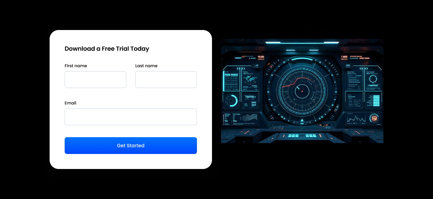
Pick it over sr-offer-two-col-01 and sr-offer-two-col-03 when the pitch text should live inside the form module and you only need one image, not standalone copy sitting beside the form. If no image is added the form expands to fill the full width, and it requires a connected HubSpot form.
Use cases
- Ebook download form with image
- Free trial signup with product shot
- Webinar registration form
- Gated content offer with photo
- Newsletter signup with side image
- Demo request form with visual
Where it fits
- Included with: PRO
- Page sections: Form, CTA, Content
Editable fields
Content tab
| Field | Type | Notes |
|---|---|---|
| Background Video | File | Repeats: min 0, default 1. Add multiple file formats in order to provide compatibility with a broad range of browsers. |
| Background Video Tablet | File | Repeats: min 0, default 1. This background video will only be used on tablet devices. |
| Background Video Mobile | File | Repeats: min 0, default 1. This background video will only be used on mobile devices. |
| Enabled | Boolean | |
| ID | Text | Assign a ID to the module. |
| Class | Text | Assign a CLASS to the module. |
| Image | Image | |
| Image Corner Radius | Number |
Form
| Field | Type | Notes |
|---|---|---|
| Enabled | Boolean | |
| Lazy Load | Boolean | To use this feature, you must have either Marketing Hub or Content Hub Professional or Enterprise, and you need to enable the "Set as raw HTML" option in the form settings. |
| Form Height | Number | Used to set a minimum height for the form, this prevents layout shifts when the form loads. |
| Description | Rich text | |
| Lead Text | Boolean | Turn on to make the Description text larger. |
| Form | Form | |
| Send form notifications to specified email addresses instead of the form defaults | Boolean | |
| Email Addresses | ||
| Salesforce campaign | Salesforcecampaign |
Form › Styles
| Field | Type | Notes |
|---|---|---|
| Background Color | Color | |
| Text Color | Choice | Set to Auto to use the default text color. Set to Custom to set a custom text color. 15 options, including Auto, Primary, Secondary. |
| Text Color | Color | |
| Hide Field Labels | Boolean |
Form › Styles › Fields
| Field | Type | Notes |
|---|---|---|
| Style | Choice | Options: Default, Custom. |
| Height | Number | |
| Background Color | Color | |
| Border Color | Color | |
| Size | Number | |
| Radius | Number | |
| Focus | Color | |
| Field Color | Color | |
| Placeholder | Color |
Form › Styles › Button
| Field | Type | Notes |
|---|---|---|
| Style | Choice | 25 options, including Primary, Secondary, Tertiary. |
| Size | Choice | Options: Small, Default, Large. |
| Align | Choice | Options: Auto, Left, Center, Right. |
| Full Width | Boolean |
Form › Styles › Padding
| Field | Type | Notes |
|---|---|---|
| Top | Number | |
| Bottom | Number | |
| Left | Number | |
| Right | Number |
Form › Styles › Border
| Field | Type | Notes |
|---|---|---|
| Style | Choice | Options: Gradient One, Gradient Two, None, Solid, Dotted, Dashed, Double. |
| Color | Color | |
| Width | Number | |
| Radius | Number | |
| Top | Boolean | |
| Bottom | Boolean | |
| Left | Boolean | |
| Right | Boolean |
Form › Styles › Shadow
| Field | Type | Notes |
|---|---|---|
| Shadow | Boolean | |
| Horizontal | Number | A positive value puts the shadow on the right side of the box, a negative value puts the shadow on the left side of the box. |
| Vertical | Number | The vertical offset of the shadow. A positive value puts the shadow below the box, a negative value puts the shadow above the box. |
| Blur | Number | The blur radius. The higher the number, the more blurred the shadow will be. |
| Spread | Number | The spread radius. A positive value increases the size of the shadow, a negative value decreases the size of the shadow. |
| Inset | Boolean | Changes the shadow to an inner shadow. |
| Color | Color | The color of the shadow. |
Form › Heading Repeats: min 0, default 1.
| Field | Type | Notes |
|---|---|---|
| Heading | Text | |
| Heading Size | Choice | HTML heading size. Options: H1, H2, H3, H4, H5, H6, P. |
| Heading Display Size | Choice | Size that heading is displayed at. 12 options, including Auto, H1, H2. |
| Heading Color | Choice | 15 options, including Auto, Primary, Secondary. |
| Heading Color | Color | |
| Heading Align | Choice | Options: Auto, Left, Center, Right. |
| CSS Class | Text |
Style tab
Change log
| Version | Change |
|---|---|
| 3.0.0 | Stardust update |
| 2.3.2 | Added ability to set custom button styles |
| 2.3.1 | Added ability to use new HS form |
| 2.3.0 | Accessibility improvements |
| 2.2.0 | Added responsive background options |
| 2.1.0 | Introduced a lazy loading feature for forms |
SR Offer Two Col 01
This module renders a two column offer with a heading, rich text description, optional CTA buttons, and a side image in one column, plus an embedded HubSpot form stacked below the copy in the other column.
SR Offer Two Col 03
This module renders a two column layout with a heading and rich text description on the left and an embedded HubSpot form on the right, and the form itself carries its own heading and description text.