

SR Offer Bar 07
This offer bar renders a top heading and description, a row of up to four stat blocks each with a large number-style heading and caption, and a centered HubSpot form below with an information line underneath.
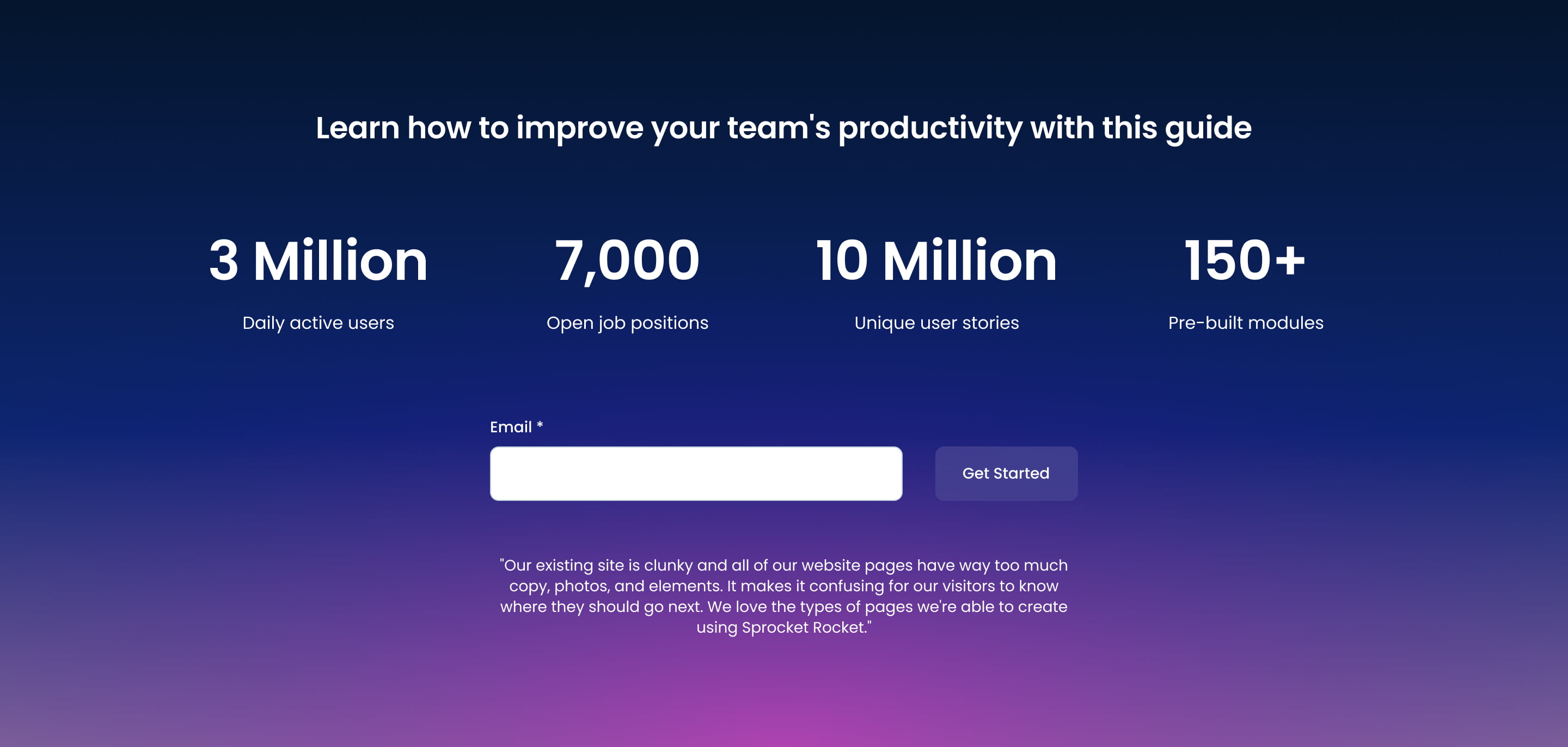
Pick it over the other offer bars when you need both credibility stats and an inline form on the same bar, since none of the other siblings combine a multi-stat row with an embedded form. It requires a connected form and works best with real numbers like user counts, downloads, or customer totals.
Use cases
- Signup bar with usage stats
- Download form with proof numbers
- Newsletter bar backed by user counts
- Trial signup with adoption metrics
- Lead capture bar with social proof stats
Where it fits
- Included with: PRO
- Page sections: CTA, Stats, Form
Editable fields
Content tab
| Field | Type | Notes |
|---|---|---|
| Background Video | File | Repeats: min 0, default 1. Add multiple file formats in order to provide compatibility with a broad range of browsers. |
| Background Video Tablet | File | Repeats: min 0, default 1. This background video will only be used on tablet devices. |
| Background Video Mobile | File | Repeats: min 0, default 1. This background video will only be used on mobile devices. |
| Enabled | Boolean | |
| ID | Text | Assign a ID to the module. |
| Class | Text | Assign a CLASS to the module. |
| Description | Rich text | |
| Lead Text | Boolean | Turn on to make the Description text larger. |
| Information | Rich text |
Heading Repeats: min 0, default 1.
| Field | Type | Notes |
|---|---|---|
| Heading | Text | |
| Size | Choice | HTML heading size. Options: H1, H2, H3, H4, H5, H6, P. |
| Display Size | Choice | Size that heading is displayed at. 12 options, including Auto, H1, H2. |
| Color | Choice | 15 options, including Auto, Primary, Secondary. |
| Color | Color | |
| Align | Choice | Options: Auto, Left, Center, Right. |
| CSS Class | Text |
Feature Repeats: min 0, max 4, default 4.
| Field | Type | Notes |
|---|---|---|
| Description | Rich text | |
| Lead Text | Boolean | Turn on to make the Description text larger. |
Feature › Heading Repeats: min 0, default 1.
| Field | Type | Notes |
|---|---|---|
| Heading | Text | |
| Size | Choice | HTML heading size. Options: H1, H2, H3, H4, H5, H6, P. |
| Display Size | Choice | Size that heading is displayed at. 12 options, including Auto, H1, H2. |
| Color | Choice | 15 options, including Auto, Primary, Secondary. |
| Color | Color | |
| Align | Choice | Options: Auto, Left, Center, Right. |
| CSS Class | Text |
Form
| Field | Type | Notes |
|---|---|---|
| Enabled | Boolean | |
| Description | Rich text | |
| Lead Text | Boolean | Turn on to make the Description text larger. |
| Form | Form | |
| Send form notifications to specified email addresses instead of the form defaults | Boolean | |
| Email Addresses | ||
| Salesforce campaign | Salesforcecampaign |
Form › Styles
| Field | Type | Notes |
|---|---|---|
| Background Color | Color | |
| Text Color | Choice | Set to Auto to use the default text color. Set to Custom to set a custom text color. 15 options, including Auto, Primary, Secondary. |
| Text Color | Color | |
| Hide Field Labels | Boolean |
Form › Styles › Fields
| Field | Type | Notes |
|---|---|---|
| Style | Choice | Options: Default, Custom. |
| Height | Number | |
| Background Color | Color | |
| Border Color | Color | |
| Size | Number | |
| Radius | Number | |
| Focus | Color | |
| Field Color | Color | |
| Placeholder | Color |
Form › Styles › Button
| Field | Type | Notes |
|---|---|---|
| Style | Choice | 25 options, including Primary, Secondary, Tertiary. |
| Size | Choice | Options: Small, Default, Large. |
| Align | Choice | Options: Auto, Left, Center, Right. |
| Full Width | Boolean |
Form › Styles › Padding
| Field | Type | Notes |
|---|---|---|
| Top | Number | |
| Bottom | Number | |
| Left | Number | |
| Right | Number |
Form › Styles › Border
| Field | Type | Notes |
|---|---|---|
| Style | Choice | Options: Gradient One, Gradient Two, None, Solid, Dotted, Dashed, Double. |
| Color | Color | |
| Width | Number | |
| Radius | Number | |
| Top | Boolean | |
| Bottom | Boolean | |
| Left | Boolean | |
| Right | Boolean |
Form › Styles › Shadow
| Field | Type | Notes |
|---|---|---|
| Shadow | Boolean | |
| Horizontal | Number | A positive value puts the shadow on the right side of the box, a negative value puts the shadow on the left side of the box. |
| Vertical | Number | The vertical offset of the shadow. A positive value puts the shadow below the box, a negative value puts the shadow above the box. |
| Blur | Number | The blur radius. The higher the number, the more blurred the shadow will be. |
| Spread | Number | The spread radius. A positive value increases the size of the shadow, a negative value decreases the size of the shadow. |
| Inset | Boolean | Changes the shadow to an inner shadow. |
| Color | Color | The color of the shadow. |
Form › Heading Repeats: min 0, default 0.
| Field | Type | Notes |
|---|---|---|
| Heading | Text | |
| Heading Size | Choice | HTML heading size. Options: H1, H2, H3, H4, H5, H6, P. |
| Heading Display Size | Choice | Size that heading is displayed at. 12 options, including Auto, H1, H2. |
| Heading Color | Choice | 15 options, including Auto, Primary, Secondary. |
| Heading Color | Color | |
| Heading Align | Choice | Options: Auto, Left, Center, Right. |
| CSS Class | Text |
Style tab
Change log
| Version | Change |
|---|---|
| 3.0.0 | Stardust update |
| 2.3.2 | Added ability to set custom button styles |
| 2.3.1 | Added ability to use new HS form |
| 2.3.0 | Accessibility improvements |
| 2.2.0 | Added responsive background options |
| 2.1.0 | Introduced a lazy loading feature for forms |
| 2.0.1 | Minor tweaks |
SR Offer Bar 06
This module renders a single-row offer bar with a small bling image, one heading, a rich text description, and one CTA button placed in a narrow right column, using a configurable left/right column split (default 9/3) with adjustable vertical alignment.
SR Offer Bar 08
This module renders a bordered card split into two columns, a heading with description and one CTA button on one side, and a date-driven countdown counter on the other.