

SR Tabs Horizontal 01
This module renders a horizontal tab set with up to five tabs, each nav button showing a small image (with optional hover image swap), title, subtitle and icon, next to a two-column detail panel with a heading, rich text, and a rounded side image.
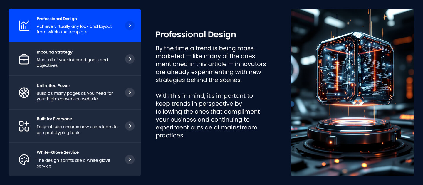
Pick this over SR Tabs Horizontal 02 when you want image-driven tab triggers and a dedicated side image in every panel, rather than plain colored card buttons with text-only content. Each tab needs its own nav image, icon and side image to avoid empty visual gaps in the layout.
Use cases
- Product feature tabs with icons
- Service overview with visual tab nav
- Step-by-step process with side images
- Software feature tour
- Tabbed benefits showcase with photos
Where it fits
- Included with: Stack
- Page sections: Features, Content, Benefits
Editable fields
Content tab
| Field | Type | Notes |
|---|---|---|
| Enabled | Boolean | |
| ID | Text | Assign a ID to the module. |
| Class | Text | Assign a CLASS to the module. |
Tab Item Repeats: default 5.
| Field | Type | Notes |
|---|---|---|
| Tab Title | Text | |
| Tab Subtitle | Text | |
| Tab Image | Image | |
| Tab Active Image | Image | |
| Icon | Icon | |
| Purpose | Choice | The purpose of the icon, used for accessibility. If set to decorative, an additional attribute of aria-hidden="true" will be added to the icon. Options: Decorative, Semantic. |
| Description | Rich text | |
| Lead Text | Boolean | Turn on to make the Description text larger. |
| Tab Side Image | Image | |
| Image Corner Radius | Number |
Tab Item › Styles › Background
| Field | Type | Notes |
|---|---|---|
| Default | Color | |
| Active | Color |
Tab Item › Styles › Heading
| Field | Type | Notes |
|---|---|---|
| Default | Color | |
| Active | Color |
Tab Item › Styles › Content
| Field | Type | Notes |
|---|---|---|
| Default | Color | |
| Active | Color |
Tab Item › Heading Repeats: min 0, default 0.
| Field | Type | Notes |
|---|---|---|
| Heading | Text | |
| Size | Choice | HTML heading size. Options: H1, H2, H3, H4, H5, H6, P. |
| Display Size | Choice | Size that heading is displayed at. 12 options, including Auto, H1, H2. |
| Color | Choice | 15 options, including Auto, Primary, Secondary. |
| Color | Color | |
| Align | Choice | Options: Auto, Left, Center, Right. |
| CSS Class | Text |
Style tab
Change log
| Version | Change |
|---|---|
| 5.0.0 | Stardust update |
| 4.2.1 | Tab title alignment fix |
| 4.2.0 | Accessibility improvements |
| 4.1.0 | Updated macros style dependencies |
| 4.0.0 | Removed jQuery |
| 3.0.2 | Active tab fixes |
| 3.0.1 | Tab module updates |
SR Tabs Accordion 02
This module renders a heading and description above one or more accordion columns, each with its own subheading and up to three collapsible items that show a label and rich text answer.
SR Tabs Horizontal 02
Renders a vertical stack of three colored tab buttons in a left column next to a right-hand content panel that swaps a heading and rich text block on click.