
SR Two Col 02
This module renders a shared heading and description above two columns, each with its own media slot (image, video, embedded form, or lottie), a sub-heading, rich text body, an optional feature list, and one CTA button.
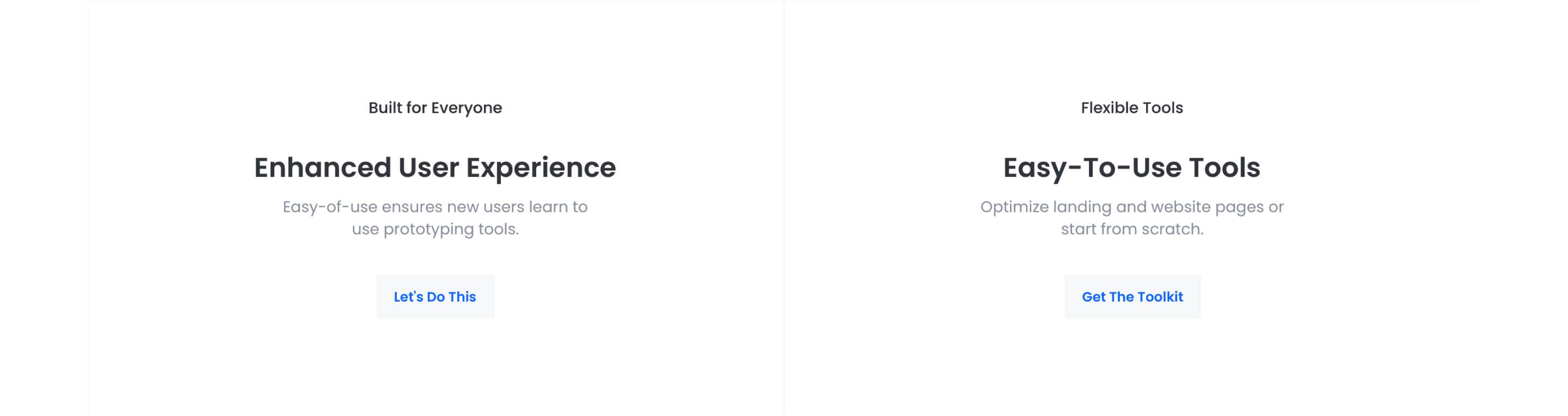
Pick it over sr-two-col-01 when you need the image to double as a full column background with a color overlay, or when the two columns should not be even halves, since each column can set its own width, breakpoint, offset, and order plus a top, center, bottom, or stretch vertical alignment. It expects an image, video source, or form for whichever media type each column uses, and any offset or width settings should be checked at each breakpoint since columns can be reordered independently.
Use cases
- Image background column with overlay text
- Asymmetric two column feature layout
- Video next to product description
- Form beside descriptive copy
- Offset promo column with cta button
- Stacked feature list next to media
Where it fits
- Included with: PRO
- Page sections: Features, Content, Media
Editable fields
Content tab
| Field | Type | Notes |
|---|---|---|
| Background Video | File | Repeats: min 0, default 1. Add multiple file formats in order to provide compatibility with a broad range of browsers. |
| Background Video Tablet | File | Repeats: min 0, default 1. This background video will only be used on tablet devices. |
| Background Video Mobile | File | Repeats: min 0, default 1. This background video will only be used on mobile devices. |
| Enabled | Boolean | |
| ID | Text | Assign a ID to the module. |
| Class | Text | Assign a CLASS to the module. |
| Description | Rich text | |
| Lead Text | Boolean | Turn on to make the Description text larger. |
| Use Image as Background | Boolean | Makes the Column's image the background. Requires media type to be IMAGE. |
| Column Vertical Align | Choice | Options: Auto, Top, Center, Bottom, Stretch. |
Heading Repeats: min 0, default 0.
| Field | Type | Notes |
|---|---|---|
| Heading | Text | |
| Size | Choice | HTML heading size. Options: H1, H2, H3, H4, H5, H6, P. |
| Display Size | Choice | Size that heading is displayed at. 12 options, including Auto, H1, H2. |
| Color | Choice | 15 options, including Auto, Primary, Secondary. |
| Color | Color | |
| Align | Choice | Options: Auto, Left, Center, Right. |
| CSS Class | Text |
Column Repeats: default 2.
| Field | Type | Notes |
|---|---|---|
| Media Type | Choice | Options: Image, Video, Form, Lottie, None. |
| Add to Lightbox | Boolean | Enable this toggle to add this image to a lightbox pop-up. |
| Overlay Color | Color | |
| Image | Image | |
| Image Corner Radius | Number | |
| Image Link | Link | |
| Lottie Embed Code | Text | How to add LottieFiles. |
| Content | Rich text | |
| Lead Text | Boolean | Turn on to make the content text larger. |
| Text Align | Choice | Options: Auto, Left, Center, Right. |
| Text Color | Choice | 14 options, including Auto, Primary, Secondary. |
| Custom Column Size | Boolean | |
| CSS Class | Text | Assign a CLASS to the column. |
Column › Video
| Field | Type | Notes |
|---|---|---|
| Video type | Choice | Options: Embed, HTML Video, HubSpot Video. |
| HubSpot Video | Video player | |
| Embed | Embed | |
| Custom Thumbnail | Image | |
| Video File | File | Repeats: default 1. Add multiple file formats in order to provide compatibility with a broad range of browsers. |
| Video Poster | Image | |
| Show Controls | Boolean | |
| Autoplay | Boolean | |
| Loop | Boolean | |
| Muted | Boolean | |
| Video Accent | Choice | Add a design accent behind your video. Options: None, Design 1, Design 2, Design 3. |
| Video Accent Color | Choice | 11 options, including Primary, Secondary, Tertiary. |
| Custom Accent Color | Color |
Column › Video › Style Options
| Field | Type | Notes |
|---|---|---|
| Play button color | Color |
Column › Video › Placeholder text
| Field | Type | Notes |
|---|---|---|
| Video placeholder title | Text | |
| Video placeholder description | Text |
Column › Form
| Field | Type | Notes |
|---|---|---|
| Enabled | Boolean | |
| Lazy Load | Boolean | To use this feature, you must have either Marketing Hub or Content Hub Professional or Enterprise, and you need to enable the "Set as raw HTML" option in the form settings. |
| Form Height | Number | Used to set a minimum height for the form, this prevents layout shifts when the form loads. |
| Description | Rich text | |
| Lead Text | Boolean | Turn on to make the Description text larger. |
| Form | Form | |
| Send form notifications to specified email addresses instead of the form defaults | Boolean | |
| Email Addresses | ||
| Salesforce campaign | Salesforcecampaign |
Column › Form › Styles
| Field | Type | Notes |
|---|---|---|
| Background Color | Color | |
| Text Color | Choice | Set to Auto to use the default text color. Set to Custom to set a custom text color. 15 options, including Auto, Primary, Secondary. |
| Text Color | Color | |
| Hide Field Labels | Boolean |
Column › Form › Styles › Button
| Field | Type | Notes |
|---|---|---|
| Style | Choice | 25 options, including Primary, Secondary, Tertiary. |
| Size | Choice | Options: Small, Default, Large. |
| Align | Choice | Options: Auto, Left, Center, Right. |
| Full Width | Boolean |
Column › Form › Styles › Padding
| Field | Type | Notes |
|---|---|---|
| Top | Number | |
| Bottom | Number | |
| Left | Number | |
| Right | Number |
Column › Form › Styles › Border
| Field | Type | Notes |
|---|---|---|
| Style | Choice | Options: Gradient One, Gradient Two, None, Solid, Dotted, Dashed, Double. |
| Color | Color | |
| Width | Number | |
| Radius | Number | |
| Top | Boolean | |
| Bottom | Boolean | |
| Left | Boolean | |
| Right | Boolean |
Column › Form › Heading Repeats: min 0, default 1.
| Field | Type | Notes |
|---|---|---|
| Heading | Text | |
| Heading Size | Choice | HTML heading size. Options: H1, H2, H3, H4, H5, H6, P. |
| Heading Display Size | Choice | Size that heading is displayed at. 12 options, including Auto, H1, H2. |
| Heading Color | Choice | 15 options, including Auto, Primary, Secondary. |
| Heading Color | Color | |
| Heading Align | Choice | Options: Auto, Left, Center, Right. |
| CSS Class | Text |
Column › Heading Repeats: min 0, default 1.
| Field | Type | Notes |
|---|---|---|
| Heading | Text | |
| Size | Choice | HTML heading size. Options: H1, H2, H3, H4, H5, H6, P. |
| Display Size | Choice | Size that heading is displayed at. 12 options, including Auto, H1, H2. |
| Color | Choice | 15 options, including Auto, Primary, Secondary. |
| Color | Color | |
| Align | Choice | Options: Auto, Left, Center, Right. |
| CSS Class | Text |
Column › Features Repeats: default 0.
| Field | Type | Notes |
|---|---|---|
| Description | Rich text | |
| Lead Text | Boolean | Turn on to make the Description text larger. |
Column › Features › Icon
| Field | Type | Notes |
|---|---|---|
| Icon Type | Choice | Options: Icon, Image, Custom, None. |
| Image | Image | |
| Icon | Icon | |
| Icon Color | Color | |
| Icon Background | Color | Set opacity to 0 to disable the background. |
| HTML | Text | |
| Icon Size | Number | |
| Purpose | Choice | The purpose of the icon, used for accessibility. If set to decorative, an additional attribute of aria-hidden="true" will be added to the icon. Options: Decorative, Semantic. |
Column › Features › Heading Repeats: default 1.
| Field | Type | Notes |
|---|---|---|
| Heading | Text | |
| Size | Choice | HTML heading size. Options: H1, H2, H3, H4, H5, H6, P. |
| Display Size | Choice | Size that heading is displayed at. 12 options, including Auto, H1, H2. |
| Color | Choice | 15 options, including Auto, Primary, Secondary. |
| Color | Color | |
| Align | Choice | Options: Auto, Left, Center, Right. |
| CSS Class | Text |
Column › CTA Repeats: min 0, default 1.
| Field | Type | Notes |
|---|---|---|
| CTA Type | Choice | Options: HubSpot CTA, HubSpot Payment, Button, Modal. |
| CTA Style | Choice | 26 options, including Primary, Secondary, Tertiary. |
| CTA | CTA | |
| Button Text | Text | |
| Modal Target | Text | |
| Link | Link | |
| Payment link | Payment | |
| Checkout behavior | Choice | Options: Open in a new tab, Sliding overlay. |
| CTA Size | Choice | Options: Small, Default, Large. |
| Add icon | Boolean |
Column › CTA › Default
| Field | Type | Notes |
|---|---|---|
| Background | Color | |
| Text | Color | |
| Border | Color |
Column › CTA › Hover
| Field | Type | Notes |
|---|---|---|
| Background | Color | |
| Text | Color | |
| Border Color | Color |
Column › CTA › Icon
| Field | Type | Notes |
|---|---|---|
| Icon | Icon | |
| Position | Choice | Options: Left, Right. |
| Purpose | Choice | The purpose of the icon, used for accessibility. If set to decorative, an additional attribute of aria-hidden="true" will be added to the icon. Options: Decorative, Semantic. |
Column › Column Size Repeats: min 1, max 4, default 1. Columns follow a twelve column grid.
| Field | Type | Notes |
|---|---|---|
| Column Breakpoint | Choice | Options: None, Mobile, Tablet, Desktop, XL. |
| Column Width | Choice | 12 options, including 1, 2, 3. |
| Column Offset | Choice | 13 options, including 0, 1, 2. |
| Column Order | Number |
Style tab
Change log
| Version | Change |
|---|---|
| 7.4.3 | Fixed featured heading custom color visibility |
| 7.4.2 | Fixed column text color bug |
| 7.4.1 | Stardust update |
| 7.4.0 | Added features section |
| 7.3.5 | Deprecated ability to set custom button styles |
| 7.3.4 | Added ability to set custom button styles |
| 7.3.3 | Fixed default column size option |
| 7.3.2 | Added ability to use new HS form |
| 7.3.1 | Column breakpoint fix |
| 7.3.0 | Accessibility improvements |
| 7.2.1 | Updated lottie js |
| 7.2.0 | Added responsive background options |
| 7.1.0 | Introduced a lazy loading feature for forms |
| 7.0.1 | Added new Link options |
| 7.0.0 | Added columns styles, Added form media option, Removed jQuery dependencies |
| 6.0.2 | Removed column image link when image is used as background |
| 6.0.1 | Fixed video playing issues when design 2 is selected |
SR Two Col 01
This module renders a shared heading and description above two equal-width columns, each with its own media slot (image, video, embedded form, or lottie animation), a sub-heading, rich text body, an optional feature list, and one CTA button.
SR Two Col 03
Renders an optional shared heading and description above a row of columns, where each column carries its own media block (image, video, embedded form, meeting scheduler, or lottie), a sub-heading, rich text, an optional icon feature list, and a single CTA button.