

SR Cards Testimonial Slider 04
This module renders a shared heading and description above a slider of up to six testimonial cards, each with its own media item (image, video, or lottie), its own heading, quote body text, and an author name and title.
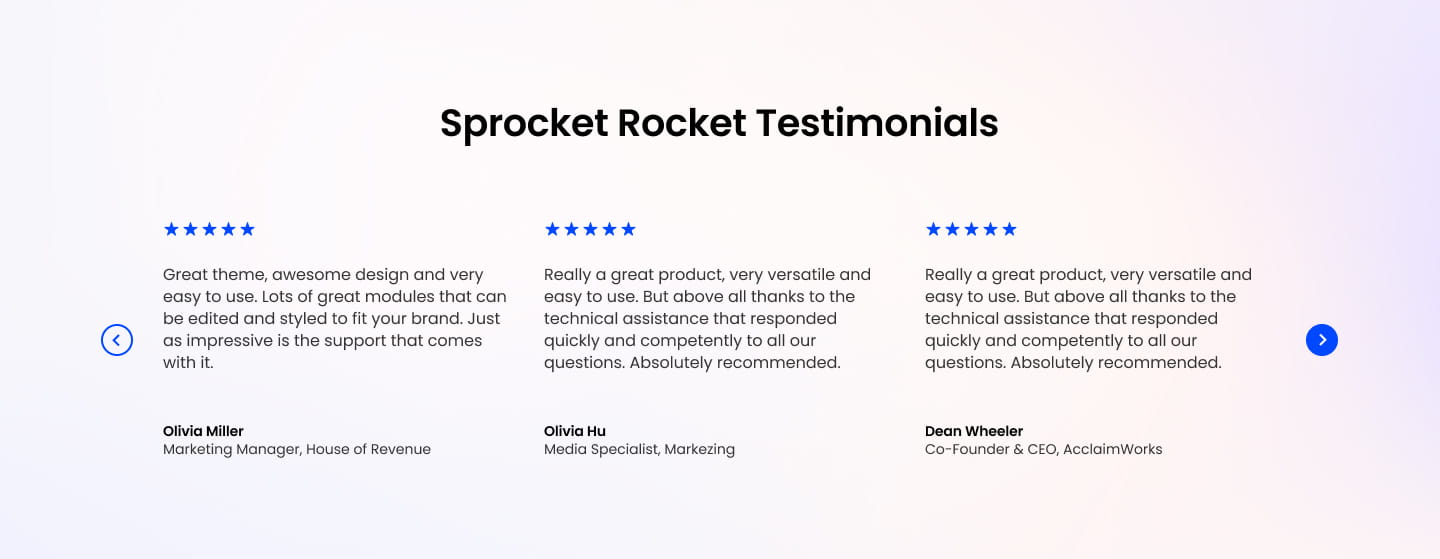
Choose this over sliders 01, 02, 03, and 05 when each testimonial needs a different media type or its own headline, since those siblings only support images, icons, or skip per-slide headings entirely. Fill in at least one slide with author details, and keep media types consistent across slides if you want the slider to look even.
Use cases
- Video testimonial carousel
- Mixed media customer quotes
- Per-slide headline testimonials
- Case study slider with lottie animation
- Founder quote with custom heading per slide
Where it fits
- Included with: Core
- Page sections: Testimonials, Proof, Content
Editable fields
Content tab
| Field | Type | Notes |
|---|---|---|
| Background Video | File | Repeats: min 0, default 1. Add multiple file formats in order to provide compatibility with a broad range of browsers. |
| Background Video Tablet | File | Repeats: min 0, default 1. This background video will only be used on tablet devices. |
| Background Video Mobile | File | Repeats: min 0, default 1. This background video will only be used on mobile devices. |
| Enabled | Boolean | |
| ID | Text | Assign a ID to the module. |
| Class | Text | Assign a CLASS to the module. |
| Description | Rich text | |
| Lead Text | Boolean | Turn on to make the Description text larger. |
| Dots | Boolean | |
| Arrows | Boolean | |
| Autoplay | Boolean | |
| Autoplay Speed | Number | In seconds. |
Heading Repeats: min 0, default 1.
| Field | Type | Notes |
|---|---|---|
| Heading | Text | |
| Size | Choice | HTML heading size. Options: H1, H2, H3, H4, H5, H6, P. |
| Display Size | Choice | Size that heading is displayed at. 12 options, including Auto, H1, H2. |
| Color | Choice | 13 options, including Auto, Primary, Secondary. |
| Color | Color | |
| Align | Choice | Options: Auto, Left, Center, Right. |
| CSS Class | Text |
Slides Repeats: min 1, default 6.
| Field | Type | Notes |
|---|---|---|
| Media Type | Choice | Options: Image, Video, Lottie, None. |
| Add to Lightbox | Boolean | Enable this toggle to add this image to a lightbox pop-up. |
| Image | Image | |
| Media Corner Radius | Number | |
| Image Link | Link | |
| Banner Image | Boolean | |
| Banner Height | Number | |
| Full Width Image | Boolean | Stretch image to full width of the column. |
| Lottie Embed Code | Text | How to add LottieFiles. |
| Content | Rich text | |
| Author Name | Text | |
| Author Title | Text |
Slides › Video
| Field | Type | Notes |
|---|---|---|
| Video type | Choice | Options: Embed, HTML Video, HubSpot Video. |
| HubSpot Video | Video player | |
| Embed | Embed | |
| Custom Thumbnail | Image | |
| Video File | File | Repeats: default 1. Add multiple file formats in order to provide compatibility with a broad range of browsers. |
| Video Poster | Image | |
| Show Controls | Boolean | |
| Play Button Color | Color | |
| Play Button Background Color | Color | |
| Autoplay | Boolean | |
| Loop | Boolean | |
| Muted | Boolean | |
| Video Accent | Choice | Add a design accent behind your video. Options: None, Design 1, Design 2, Design 3. |
| Video Accent Color | Choice | 11 options, including Primary, Secondary, Tertiary. |
| Custom Accent Color | Color |
Slides › Video › Style Options
| Field | Type | Notes |
|---|---|---|
| Play button color | Color |
Slides › Video › Placeholder text
| Field | Type | Notes |
|---|---|---|
| Video placeholder title | Text | |
| Video placeholder description | Text |
Slides › Heading Repeats: default 0.
| Field | Type | Notes |
|---|---|---|
| Heading | Text | |
| Size | Choice | HTML heading size. Options: H1, H2, H3, H4, H5, H6, P. |
| Display Size | Choice | Size that heading is displayed at. 12 options, including Auto, H1, H2. |
| Color | Choice | 13 options, including Auto, Primary, Secondary. |
| Color | Color | |
| Align | Choice | Options: Auto, Left, Center, Right. |
| CSS Class | Text |
Style tab
Change log
| Version | Change |
|---|---|
| 2.1.0 | Removed form and meeting media types |
| 2.0.2 | Lottie js fix |
| 2.0.1 | Fixed background issue |
| 2.0.0 | Stardust update |
| 1.3.0 | Accessibility improvements |
| 1.2.1 | Added responsive background options |
| 1.2.0 | Included slider styles dependecies |
| 1.1.0 | Added slider styles |
| 1.0.3 | Fix missing heading tag |
| 1.0.2 | Minor Fixes |
| 1.0.1 | Fixed improper sized slider dots |
SR Cards Testimonial Slider 03
This module renders a single offset card holding a slider of up to three testimonial slides, each pairing an optional icon or custom svg mark with a rich text quote, an author photo, name, and title.
SR Cards Testimonial Slider 05
This module renders a shared heading and description above a slider of exactly three testimonial cards, each with an optional icon or custom svg mark, a rich text review, a reviewer name and role, and a square headshot image.