

SR Offer Bar 01
This offer bar renders a two-column layout with an optional image on the left and a heading, rich text description, and an embedded HubSpot form on the right.
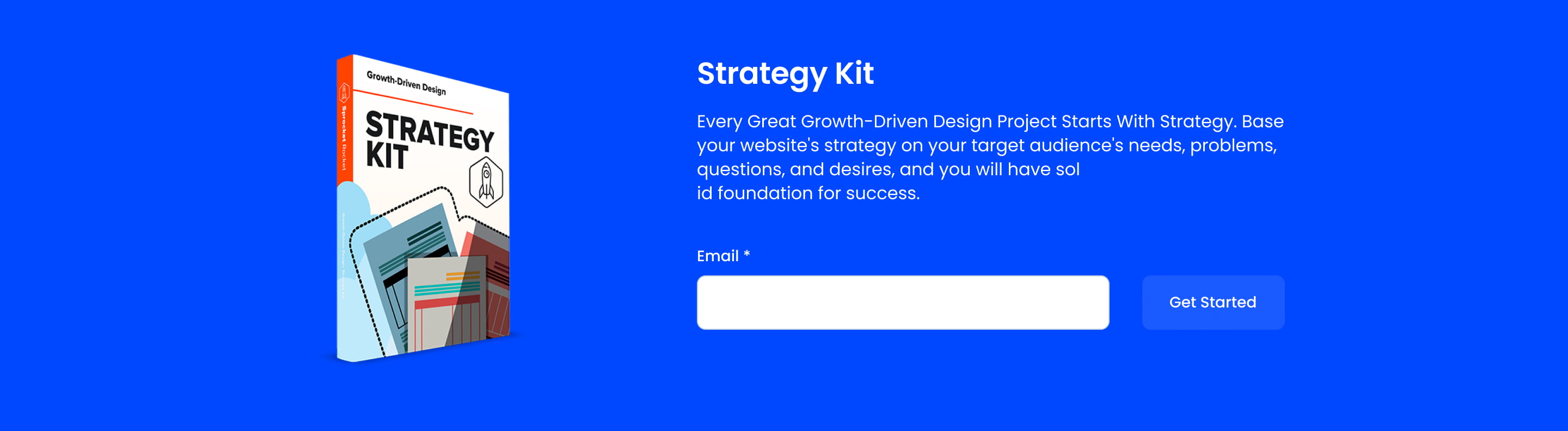
Pick it over the other offer bars when you need an actual inline form rather than a CTA button, and when you want a plain supporting image next to the copy instead of a background image, decorative rings, stats, or a countdown timer. It expects a connected form to display correctly and works best when an image is supplied to fill the left column.
Use cases
- Lead capture strip with photo
- Free trial signup bar
- Strategy kit download offer
- Newsletter signup with product image
- Gated content request form
Where it fits
- Included with: PRO
- Page sections: Form, CTA, Hero
Editable fields
Content tab
| Field | Type | Notes |
|---|---|---|
| Background Video | File | Repeats: min 0, default 1. Add multiple file formats in order to provide compatibility with a broad range of browsers. |
| Background Video Tablet | File | Repeats: min 0, default 1. This background video will only be used on tablet devices. |
| Background Video Mobile | File | Repeats: min 0, default 1. This background video will only be used on mobile devices. |
| Enabled | Boolean | |
| ID | Text | Assign a ID to the module. |
| Class | Text | Assign a CLASS to the module. |
| Image | Image | Recommended size: 320x600px. |
| Description | Rich text | |
| Lead Text | Boolean | Turn on to make the Description text larger. |
| Column Vertical Align | Choice | Options: Top, Center, Bottom, Stretch. |
Heading Repeats: min 0, default 1.
| Field | Type | Notes |
|---|---|---|
| Heading | Text | |
| Size | Choice | HTML heading size. Options: H1, H2, H3, H4, H5, H6, P. |
| Display Size | Choice | Size that heading is displayed at. 12 options, including Auto, H1, H2. |
| Color | Choice | 15 options, including Auto, Primary, Secondary. |
| Color | Color | |
| Align | Choice | Options: Auto, Left, Center, Right. |
| CSS Class | Text |
Form
| Field | Type | Notes |
|---|---|---|
| Enabled | Boolean | |
| Description | Rich text | |
| Lead Text | Boolean | Turn on to make the Description text larger. |
| Form | Form | |
| Send form notifications to specified email addresses instead of the form defaults | Boolean | |
| Email Addresses | ||
| Salesforce campaign | Salesforcecampaign |
Form › Styles
| Field | Type | Notes |
|---|---|---|
| Background Color | Color | |
| Text Color | Choice | Set to Auto to use the default text color. Set to Custom to set a custom text color. 15 options, including Auto, Primary, Secondary. |
| Text Color | Color | |
| Hide Field Labels | Boolean |
Form › Styles › Fields
| Field | Type | Notes |
|---|---|---|
| Style | Choice | Options: Default, Custom. |
| Height | Number | |
| Background Color | Color | |
| Border Color | Color | |
| Size | Number | |
| Radius | Number | |
| Focus | Color | |
| Field Color | Color | |
| Placeholder | Color |
Form › Styles › Button
| Field | Type | Notes |
|---|---|---|
| Style | Choice | 25 options, including Primary, Secondary, Tertiary. |
| Size | Choice | Options: Small, Default, Large. |
| Align | Choice | Options: Auto, Left, Center, Right. |
| Full Width | Boolean |
Form › Styles › Padding
| Field | Type | Notes |
|---|---|---|
| Top | Number | |
| Bottom | Number | |
| Left | Number | |
| Right | Number |
Form › Styles › Border
| Field | Type | Notes |
|---|---|---|
| Style | Choice | Options: Gradient One, Gradient Two, None, Solid, Dotted, Dashed, Double. |
| Color | Color | |
| Width | Number | |
| Radius | Number | |
| Top | Boolean | |
| Bottom | Boolean | |
| Left | Boolean | |
| Right | Boolean |
Form › Styles › Shadow
| Field | Type | Notes |
|---|---|---|
| Shadow | Boolean | |
| Horizontal | Number | A positive value puts the shadow on the right side of the box, a negative value puts the shadow on the left side of the box. |
| Vertical | Number | The vertical offset of the shadow. A positive value puts the shadow below the box, a negative value puts the shadow above the box. |
| Blur | Number | The blur radius. The higher the number, the more blurred the shadow will be. |
| Spread | Number | The spread radius. A positive value increases the size of the shadow, a negative value decreases the size of the shadow. |
| Inset | Boolean | Changes the shadow to an inner shadow. |
| Color | Color | The color of the shadow. |
Form › Heading Repeats: min 0, default 0.
| Field | Type | Notes |
|---|---|---|
| Heading | Text | |
| Heading Size | Choice | HTML heading size. Options: H1, H2, H3, H4, H5, H6, P. |
| Heading Display Size | Choice | Size that heading is displayed at. 12 options, including Auto, H1, H2. |
| Heading Color | Choice | 15 options, including Auto, Primary, Secondary. |
| Heading Color | Color | |
| Heading Align | Choice | Options: Auto, Left, Center, Right. |
| CSS Class | Text |
Columns › Image Repeats: min 1, max 4, default 1. Columns follow a twelve column grid.
| Field | Type | Notes |
|---|---|---|
| Column Breakpoint | Choice | Options: None, Mobile, Tablet, Desktop, XL. |
| Column Width | Choice | 12 options, including 1, 2, 3. |
| Column Offset | Choice | 13 options, including 0, 1, 2. |
| Column Order | Number |
Columns › Content Repeats: min 1, max 4, default 1. Columns follow a twelve column grid.
| Field | Type | Notes |
|---|---|---|
| Column Breakpoint | Choice | Options: None, Mobile, Tablet, Desktop, XL. |
| Column Width | Choice | 12 options, including 1, 2, 3. |
| Column Offset | Choice | 13 options, including 0, 1, 2. |
| Column Order | Number |
Style tab
Change log
| Version | Change |
|---|---|
| 4.0.0 | Stardust update |
| 3.3.3 | Added ability to set custom button styles |
| 3.3.2 | Added ability to use new HS form |
| 3.3.1 | Column breakpoint fix |
| 3.3.0 | Accessibility improvements |
| 3.2.0 | Added responsive background options |
| 3.1.0 | Introduced a lazy loading feature for forms |
| 3.0.2 | Added column options |
| 3.0.1 | Added choice to adjust column vertical align |
SR Gated Content 01
This module renders a scroll-triggered popup modal with an optional image, a heading, a rich text description, and an embedded HubSpot form for lead capture.
SR Offer Bar 02
This offer bar renders a two-column strip with an optional small bling image, one heading, a rich text description, and a single CTA button in the right column, using an 8/4 width split by default.