

SR Event Details 01
This module renders a single listing page with a heading, description, and a large featured image overlaid with metadata such as length, location, star rating, and price.
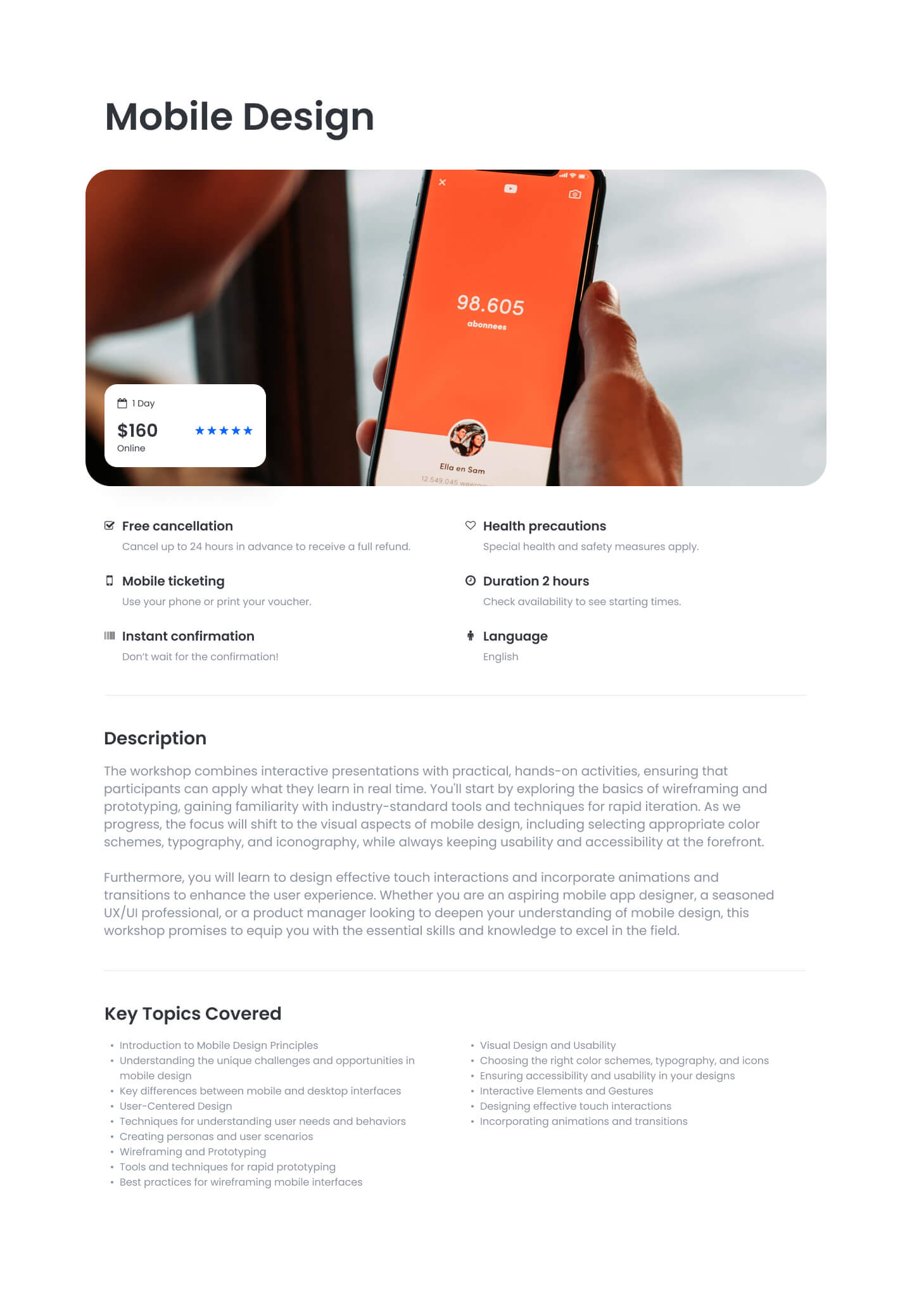
Below the image it shows up to six feature items with icons and short labels, followed by up to five expandable detail sections each with their own heading, body copy, and CTAs. Choose it over the card grid and comparison siblings when you need one deep-dive page for a trip, course, room, or venue rather than a repeating set of cards.
Use cases
- Single tour or trip listing page
- Course detail page with price and duration
- Venue or rental listing with amenities
- Travel package overview with itinerary sections
- Hotel room detail with rating and features
Where it fits
- Included with: Stack
- Page sections: Content, Events, Features
Editable fields
Content tab
| Field | Type | Notes |
|---|---|---|
| Background Video | File | Repeats: min 0, default 1. Add multiple file formats in order to provide compatibility with a broad range of browsers. |
| Background Video Tablet | File | Repeats: min 0, default 1. This background video will only be used on tablet devices. |
| Background Video Mobile | File | Repeats: min 0, default 1. This background video will only be used on mobile devices. |
| Enabled | Boolean | |
| ID | Text | Assign a ID to the module. |
| Class | Text | Assign a CLASS to the module. |
| Description | Rich text | |
| Lead Text | Boolean | Turn on to make the Description text larger. |
| Image | Image | |
| Image Corner Radius | Number | |
| Length | Text | |
| Location | Text | |
| Price | Text | |
| Promo Price | Text |
Heading Repeats: min 0, default 1.
| Field | Type | Notes |
|---|---|---|
| Heading | Text | |
| Size | Choice | HTML heading size. Options: H1, H2, H3, H4, H5, H6, P. |
| Display Size | Choice | Size that heading is displayed at. 12 options, including Auto, H1, H2. |
| Color | Choice | 15 options, including Auto, Primary, Secondary. |
| Color | Color | |
| Align | Choice | Options: Auto, Left, Center, Right. |
| CSS Class | Text |
Stars
| Field | Type | Notes |
|---|---|---|
| Stars | Number | |
| Color | Color |
Listing Features Repeats: default 6.
| Field | Type | Notes |
|---|---|---|
| Description | Rich text | |
| Lead Text | Boolean | Turn on to make the Description text larger. |
Listing Features › Icon
| Field | Type | Notes |
|---|---|---|
| Icon Type | Choice | Options: Icon, Image. |
| Image | Image | |
| Icon | Icon | |
| Icon Color | Color | |
| Icon Background | Color | Set opacity to 0 to disable the background. |
| Icon Size | Number | |
| Purpose | Choice | The purpose of the icon, used for accessibility. If set to decorative, an additional attribute of aria-hidden="true" will be added to the icon. Options: Decorative, Semantic. |
Listing Features › Heading Repeats: default 1.
| Field | Type | Notes |
|---|---|---|
| Heading | Text | |
| Size | Choice | HTML heading size. Options: H1, H2, H3, H4, H5, H6, P. |
| Display Size | Choice | Size that heading is displayed at. 12 options, including Auto, H1, H2. |
| Color | Choice | 15 options, including Auto, Primary, Secondary. |
| Color | Color | |
| Align | Choice | Options: Auto, Left, Center, Right. |
| CSS Class | Text |
Listing Sections › Heading Repeats: min 0, default 1.
| Field | Type | Notes |
|---|---|---|
| Heading | Text | |
| Size | Choice | HTML heading size. Options: H1, H2, H3, H4, H5, H6, P. |
| Display Size | Choice | Size that heading is displayed at. 12 options, including Auto, H1, H2. |
| Color | Choice | 15 options, including Auto, Primary, Secondary. |
| Color | Color | |
| Align | Choice | Options: Auto, Left, Center, Right. |
| CSS Class | Text |
Listing Sections › Section Items Repeats: min 1, max 3, default 1.
| Field | Type | Notes |
|---|---|---|
| Description | Rich text | |
| Lead Text | Boolean |
Listing Sections › Section Items › Heading Repeats: min 0.
| Field | Type | Notes |
|---|---|---|
| Heading | Text | |
| Size | Choice | HTML heading size. Options: H1, H2, H3, H4, H5, H6, P. |
| Display Size | Choice | Size that heading is displayed at. 12 options, including Auto, H1, H2. |
| Color | Choice | 15 options, including Auto, Primary, Secondary. |
| Color | Color | |
| Align | Choice | Options: Auto, Left, Center, Right. |
| CSS Class | Text |
Listing Sections › Section Items › CTA Repeats: min 0.
| Field | Type | Notes |
|---|---|---|
| CTA Type | Choice | Options: HubSpot CTA, HubSpot Payment, Button, Modal. |
| CTA Style | Choice | 26 options, including Primary, Secondary, Tertiary. |
| CTA | CTA | |
| Button Text | Text | |
| Modal Target | Text | |
| Link | Link | |
| Payment link | Payment | |
| Checkout behavior | Choice | Options: Open in a new tab, Sliding overlay. |
| CTA Size | Choice | Options: Small, Default, Large. |
| Add icon | Boolean |
Listing Sections › Section Items › CTA › Default
| Field | Type | Notes |
|---|---|---|
| Background | Color | |
| Text | Color | |
| Border | Color |
Listing Sections › Section Items › CTA › Hover
| Field | Type | Notes |
|---|---|---|
| Background | Color | |
| Text | Color | |
| Border Color | Color |
Listing Sections › Section Items › CTA › Icon
| Field | Type | Notes |
|---|---|---|
| Icon | Icon | |
| Position | Choice | Options: Left, Right. |
| Purpose | Choice | The purpose of the icon, used for accessibility. If set to decorative, an additional attribute of aria-hidden="true" will be added to the icon. Options: Decorative, Semantic. |
Style tab
Change log
| Version | Change |
|---|---|
| 2.0.1 | Fixed featured heading custom color visibility |
| 2.0.0 | Stardust update |
| 1.2.0 | Accessibility improvements |
| 1.1.0 | Added responsive background options |
| 1.0.0 | Added module |
SR Case Studies Slider 02
This module renders a heading and description above a slider of case study cards, defaulting to 3 slides, each with a decorative icon, an image, rich text quote or summary copy, an author name and title, and a linked CTA button.
SR Event Listing 01
Renders a heading and description above a row of up to three event or trip cards, each with an image, a length field, location, a regular price and struck-through promo price, a star rating, a subheading, body text, and a details button.