

SR Two Col TOC 01
This module renders a sticky left-hand table of contents next to a right-hand content area of up to 7 anchor-linked sections, where each section holds one content block such as rich text, an image, a video, a quote, a CTA, or raw HTML.
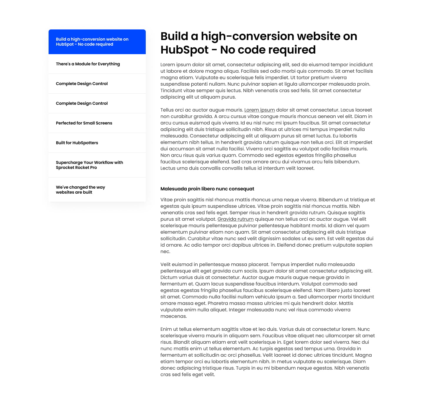
Pick it over the other two-column and one-column modules when readers need to jump between several named topics via in-page navigation rather than scroll through one continuous layout. It works best for long-form pages like FAQs, glossaries, or multi-part guides, and on mobile the left nav collapses into a dropdown so the jump links still work.
Use cases
- Long-form faq page
- Glossary of terms
- Multi-part how-to guide
- Policy or legal document with sections
- Product documentation page
- Onboarding guide with jump links
Where it fits
- Included with: PRO
- Page sections: FAQ, Resources, Content
Editable fields
Content tab
| Field | Type | Notes |
|---|---|---|
| Background Video | File | Repeats: min 0, default 1. Add multiple file formats in order to provide compatibility with a broad range of browsers. |
| Background Video Tablet | File | Repeats: min 0, default 1. This background video will only be used on tablet devices. |
| Background Video Mobile | File | Repeats: min 0, default 1. This background video will only be used on mobile devices. |
| Enabled | Boolean | |
| ID | Text | Assign a ID to the module. |
| Class | Text | Assign a CLASS to the module. |
Sections Repeats: default 7.
| Field | Type | Notes |
|---|---|---|
| Title | Text |
Sections › Item Repeats: min 1, default 1.
| Field | Type | Notes |
|---|---|---|
| Item Type | Choice | Options: Rich Text, Image, Video, Quote, CTA, HTML. |
| Image | Image | |
| Image Link | Link | |
| Image Align | Choice | Options: Left, Center, Right. |
| Rich Text | Rich text | |
| CTA Align | Choice | Options: Left, Center, Right. |
| Name | Text | |
| Title | Text | |
| Image | Image | |
| Quote | Rich text | |
| HTML | Text |
Sections › Item › Video
| Field | Type | Notes |
|---|---|---|
| Video type | Choice | Options: Embed, HTML Video, HubSpot Video. |
| HubSpot Video | Video player | |
| Embed | Embed | |
| Custom Thumbnail | Image | |
| Video File | File | Repeats: default 1. Add multiple file formats in order to provide compatibility with a broad range of browsers. |
| Video Poster | Image | |
| Show Controls | Boolean | |
| Autoplay | Boolean | |
| Loop | Boolean | |
| Muted | Boolean |
Sections › Item › Video › Style Options
| Field | Type | Notes |
|---|---|---|
| Play button color | Color |
Sections › Item › Video › Placeholder text
| Field | Type | Notes |
|---|---|---|
| Video placeholder title | Text | |
| Video placeholder description | Text |
Sections › Item › CTA Repeats: min 0, default 1.
| Field | Type | Notes |
|---|---|---|
| CTA Type | Choice | Options: HubSpot CTA, HubSpot Payment, Button, Modal. |
| CTA Style | Choice | 25 options, including Primary, Secondary, Tertiary. |
| CTA | CTA | |
| Button Text | Text | |
| Modal Target | Text | |
| Link | Link | |
| Payment link | Payment | |
| Checkout behavior | Choice | Options: Open in a new tab, Sliding overlay. |
| CTA Size | Choice | Options: Small, Default, Large. |
| Add icon | Boolean |
Sections › Item › CTA › Icon
| Field | Type | Notes |
|---|---|---|
| Icon | Icon | |
| Position | Choice | Options: Left, Right. |
| Purpose | Choice | The purpose of the icon, used for accessibility. If set to decorative, an additional attribute of aria-hidden="true" will be added to the icon. Options: Decorative, Semantic. |
Columns › TOC Repeats: min 1, max 4, default 1. Columns follow a twelve column grid.
| Field | Type | Notes |
|---|---|---|
| Column Breakpoint | Choice | Options: None, Mobile, Tablet, Desktop, XL. |
| Column Width | Choice | 12 options, including 1, 2, 3. |
| Column Offset | Choice | 13 options, including 0, 1, 2. |
| Column Order | Number |
Columns › Content Repeats: min 1, max 4, default 1. Columns follow a twelve column grid.
| Field | Type | Notes |
|---|---|---|
| Column Breakpoint | Choice | Options: None, Mobile, Tablet, Desktop, XL. |
| Column Width | Choice | 12 options, including 1, 2, 3. |
| Column Offset | Choice | 13 options, including 0, 1, 2. |
| Column Order | Number |
Style tab
Change log
| Version | Change |
|---|---|
| 3.0.0 | Stardust update |
| 2.3.2 | Toc sticky fixes |
| 2.3.1 | Updated HTML item type to text |
| 2.3.0 | Added mobile sticky toc dropdown functionality |
| 2.2.1 | Column breakpoint fix |
| 2.2.0 | Accessibility improvements |
| 2.1.0 | Added responsive background options |
| 2.0.3 | Added HTML item type |
| 2.0.2 | Added new Link options |
| 2.0.1 | fixed sticky sidebar on TOC module when SR animations module is used |
| 2.0.1 | fixed sticky sidebar on TOC module when SR animations module is used |
SR Two Col Slider 01
This module renders a slider of slides, each slide split into two flexible columns that hold an image, video, or lottie animation plus a heading, rich text, and CTA buttons.
SR Job Listing 01
This module renders a heading above a repeatable list of job listing cards, each showing a title, category, and location with an Apply Now button that opens a modal containing a job heading, richtext job description, and either a direct application link or a close action.