

SR Two Col Gallery 01
This module renders a two column layout with a heading, rich text description, optional lead text, and a CTA on one side, paired with a configurable gallery of one to four images with per-image position, color overlay, and gap controls on the other side.
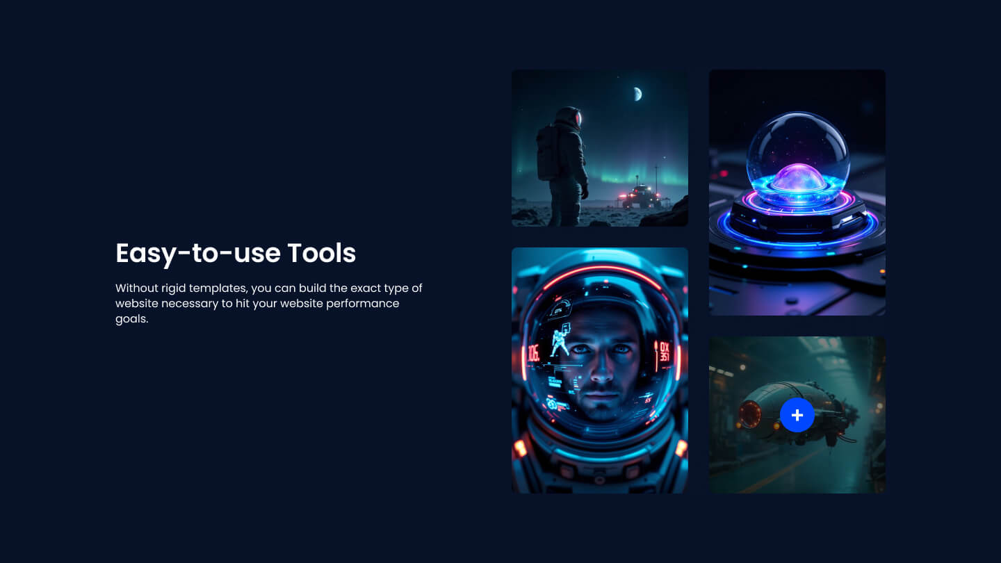
Choose it over SR Two Col Gallery 02 when the gallery needs flexible per-image placement and overlay styling, plus optional lightbox click-to-enlarge, rather than a fixed small collage pattern. It expects at least one image and works best when the images are meant to carry visual weight alongside a short pitch and call to action.
Use cases
- Product feature with image collage
- About us section with photo cluster
- Service pitch with visual gallery
- Team culture photos with intro text
- Portfolio highlight with lightbox images
- App screenshots beside value proposition
Where it fits
- Included with: Core
- Page sections: Features, Content, Gallery
Editable fields
Content tab
| Field | Type | Notes |
|---|---|---|
| Background Video | File | Repeats: min 0, default 1. Add multiple file formats in order to provide compatibility with a broad range of browsers. |
| Enabled | Boolean | |
| ID | Text | Assign a ID to the module. |
| Class | Text | Assign a CLASS to the module. |
| Description | Rich text | |
| Lead Text | Boolean | Turn on to make the Description text larger. |
| Enable Lightbox | Boolean | |
| Image Column Count | Choice | Options: 1, 2, 3, 4, 5, 6. |
| Image Column Gap | Number |
Heading Repeats: min 0, default 1.
| Field | Type | Notes |
|---|---|---|
| Heading | Text | |
| Size | Choice | HTML heading size. Options: H1, H2, H3, H4, H5, H6, P. |
| Display Size | Choice | Size that heading is displayed at. 12 options, including Auto, H1, H2. |
| Color | Choice | 13 options, including Auto, Primary, Secondary. |
| Color | Color | |
| Align | Choice | Options: Auto, Left, Center, Right. |
| CSS Class | Text |
CTA Repeats: min 0, default 0.
| Field | Type | Notes |
|---|---|---|
| CTA Type | Choice | Options: HubSpot CTA, HubSpot Payment, Button, Modal. |
| CTA Style | Choice | 24 options, including Primary, Secondary, Tertiary. |
| CTA | CTA | |
| Button Text | Text | |
| Modal Target | Text | |
| Link | Link | |
| Payment link | Payment | |
| Checkout behavior | Choice | Options: Open in a new tab, Sliding overlay. |
| CTA Size | Choice | Options: Small, Default, Large. |
| Add icon | Boolean |
CTA › Default
| Field | Type | Notes |
|---|---|---|
| Background | Color | |
| Text | Color | |
| Border | Color |
CTA › Hover
| Field | Type | Notes |
|---|---|---|
| Background | Color | |
| Text | Color | |
| Border Color | Color |
CTA › Icon
| Field | Type | Notes |
|---|---|---|
| Icon | Icon | |
| Position | Choice | Options: Left, Right. |
Images Repeats: min 1, default 4.
| Field | Type | Notes |
|---|---|---|
| Image | Image | |
| Overlay | Color | |
| Image Position | Choice | 9 options, including Top Left, Top Center, Top Right. |
Columns › Content Repeats: min 1, max 4, default 1. Columns follow a twelve column grid.
| Field | Type | Notes |
|---|---|---|
| Column Breakpoint | Choice | Options: Mobile, Tablet, Desktop, XL. |
| Column Width | Choice | 12 options, including 1, 2, 3. |
| Column Offset | Choice | 13 options, including 0, 1, 2. |
| Column Order | Number |
Columns › Gallery Repeats: min 1, max 4, default 1. Columns follow a twelve column grid.
| Field | Type | Notes |
|---|---|---|
| Column Breakpoint | Choice | Options: Mobile, Tablet, Desktop, XL. |
| Column Width | Choice | 12 options, including 1, 2, 3. |
| Column Offset | Choice | 13 options, including 0, 1, 2. |
| Column Order | Number |
Style tab
Change log
| Version | Change |
|---|---|
| 4.1.0 | Added image column count and column gap options |
| 4.0.0 | Stardust update |
| 3.2.1 | Column breakpoint fix |
| 3.2.0 | Accessibility improvements |
| 3.1.0 | Added responsive background options |
| 3.0.2 | Increase default image size |
| 3.0.1 | Added new Link options |
| 3.0.0 | Removed jQuery |
SR Two Col Features 02
Renders a heading and rich text description above a two column section, with one shared media block (image, video, form, or lottie) on one side and a stacked list of up to six feature items on the other, each item having an icon or image, a heading, and rich text.
SR Two Col Gallery 02
This module renders a two column layout with a heading, rich text description, optional CTA button, and a photo gallery of one to four images arranged in a fixed collage pattern on the right side.