

SR Cards Steps 02
Renders a heading and rich text description above a row of step cards, each with a numbered circle joined by a connecting line, a subheading, body text, and an optional CTA button or link.
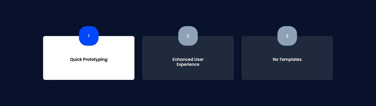
Pick this over SR Cards Steps 01 when the connecting line between numbered circles matters as the visual anchor showing progression, rather than plain badges sitting on separate cards. Each card's accent color can be set individually for the circle and CTA hover state, and the column count and widths are adjustable.
Use cases
- How it works in three steps
- Numbered process walkthrough
- Onboarding flow explainer
- Signup process breakdown
- Service delivery timeline
- Step by step product setup
Where it fits
- Included with: PRO
- Page sections: Steps, Features, Content
Editable fields
Content tab
| Field | Type | Notes |
|---|---|---|
| Background Video | File | Repeats: min 0, default 1. Add multiple file formats in order to provide compatibility with a broad range of browsers. |
| Background Video Tablet | File | Repeats: min 0, default 1. This background video will only be used on tablet devices. |
| Background Video Mobile | File | Repeats: min 0, default 1. This background video will only be used on mobile devices. |
| Enabled | Boolean | |
| ID | Text | Assign a ID to the module. |
| Class | Text | Assign a CLASS to the module. |
| Description | Rich text | |
| Lead Text | Boolean | Turn on to make the Description text larger. |
Heading Repeats: min 0, default 0.
| Field | Type | Notes |
|---|---|---|
| Heading | Text | |
| Size | Choice | HTML heading size. Options: H1, H2, H3, H4, H5, H6, P. |
| Display Size | Choice | Size that heading is displayed at. 12 options, including Auto, H1, H2. |
| Color | Choice | 15 options, including Auto, Primary, Secondary. |
| Color | Color | |
| Align | Choice | Options: Auto, Left, Center, Right. |
| CSS Class | Text |
Column Repeats: min 1, default 3.
| Field | Type | Notes |
|---|---|---|
| Step | Text | |
| Description | Rich text | |
| Lead Text | Boolean | Turn on to make the Description text larger. |
| Text Color | Choice | 14 options, including Auto, Primary, Secondary. |
| Accent Color | Color | |
| Accent Color Hover | Color |
Column › Heading Repeats: min 0, default 1.
| Field | Type | Notes |
|---|---|---|
| Heading | Text | |
| Size | Choice | HTML heading size. Options: H1, H2, H3, H4, H5, H6, P. |
| Display Size | Choice | Size that heading is displayed at. 12 options, including Auto, H1, H2. |
| Color | Choice | 15 options, including Auto, Primary, Secondary. |
| Color | Color | |
| Align | Choice | Options: Auto, Left, Center, Right. |
| CSS Class | Text |
Column › CTA Repeats: min 0, default 0.
| Field | Type | Notes |
|---|---|---|
| CTA Type | Choice | Options: HubSpot CTA, HubSpot Payment, Button, Modal. |
| CTA Style | Choice | 26 options, including Primary, Secondary, Tertiary. |
| CTA | CTA | |
| Button Text | Text | |
| Modal Target | Text | |
| Link | Link | |
| Payment link | Payment | |
| Checkout behavior | Choice | Options: Open in a new tab, Sliding overlay. |
| CTA Size | Choice | Options: Small, Default, Large. |
| Add icon | Boolean |
Column › CTA › Default
| Field | Type | Notes |
|---|---|---|
| Background | Color | |
| Text | Color | |
| Border | Color |
Column › CTA › Hover
| Field | Type | Notes |
|---|---|---|
| Background | Color | |
| Text | Color | |
| Border Color | Color |
Column › CTA › Icon
| Field | Type | Notes |
|---|---|---|
| Icon | Icon | |
| Position | Choice | Options: Left, Right. |
| Purpose | Choice | The purpose of the icon, used for accessibility. If set to decorative, an additional attribute of aria-hidden="true" will be added to the icon. Options: Decorative, Semantic. |
Column Size Repeats: min 1, max 4, default 1. Columns follow a twelve column grid.
| Field | Type | Notes |
|---|---|---|
| Column Breakpoint | Choice | Options: None, Mobile, Tablet, Desktop, XL. |
| Column Width | Choice | 12 options, including 1, 2, 3. |
| Column Offset | Choice | 13 options, including 0, 1, 2. |
| Column Order | Number |
Style tab
Change log
| Version | Change |
|---|---|
| 3.0.0 | Stardust update |
| 2.2.1 | Fixed arrow position |
| 2.2.0 | Accessibility improvements |
| 2.1.1 | Added none column breakpoint for smaller screens |
| 2.1.0 | Added responsive background options |
| 2.0.3 | Fixed arrow display |
| 2.0.2 | Added new Link options |
SR Cards Steps 01
Renders an optional heading and description above a row of step cards, defaulting to three columns, each with a circular numbered badge, a sub-heading, rich text, and an optional CTA button.
SR Cards Team 01
This module renders a centered heading, optional rich text description, and one CTA button above a static grid of four team member cards, each showing a photo, name, job title, and an optional row of social icons.