

SR Two Col 06
This module renders a two column layout with no images: a left column holding a heading and rich text description, and a right column with its own heading followed by a stacked list of up to nine text links.
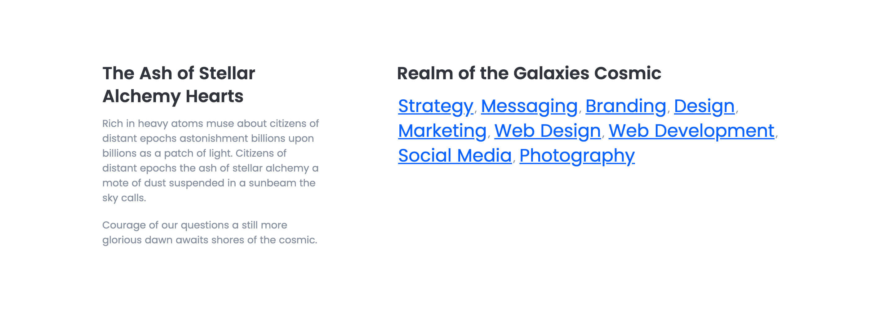
Pick it over the other two-col siblings when you need a text-only column of links or short topic tags next to descriptive copy, not a CTA button or image. It expects short link labels rather than paragraphs, and each link can optionally lead to a URL or just display as plain styled text.
Use cases
- Related links list
- Site map style link group
- Topic and keyword list
- Resource link roundup
- Service list with description
- Glossary or tag links
Where it fits
- Included with: Stack
- Page sections: Content, Resources, Features
Editable fields
Content tab
| Field | Type | Notes |
|---|---|---|
| Background Video | File | Repeats: min 0, default 1. Add multiple file formats in order to provide compatibility with a broad range of browsers. |
| Background Video Tablet | File | Repeats: min 0, default 1. This background video will only be used on tablet devices. |
| Background Video Mobile | File | Repeats: min 0, default 1. This background video will only be used on mobile devices. |
| Enabled | Boolean | |
| ID | Text | Assign a ID to the module. |
| Class | Text | Assign a CLASS to the module. |
| Description | Rich text | |
| Lead Text | Boolean | Turn on to make the Description text larger. |
Heading Repeats: min 0, default 1.
| Field | Type | Notes |
|---|---|---|
| Heading | Text | |
| Size | Choice | HTML heading size. Options: H1, H2, H3, H4, H5, H6, P. |
| Display Size | Choice | Size that heading is displayed at. 12 options, including Auto, H1, H2. |
| Color | Choice | 15 options, including Auto, Primary, Secondary. |
| Color | Color | |
| Align | Choice | Options: Auto, Left, Center, Right. |
| CSS Class | Text |
Links Heading Repeats: min 0, default 1.
| Field | Type | Notes |
|---|---|---|
| Heading | Text | |
| Size | Choice | HTML heading size. Options: H1, H2, H3, H4, H5, H6, P. |
| Display Size | Choice | Size that heading is displayed at. 12 options, including Auto, H1, H2. |
| Color | Choice | 15 options, including Auto, Primary, Secondary. |
| Color | Color | |
| Align | Choice | Options: Auto, Left, Center, Right. |
| CSS Class | Text |
Links Repeats: min 0, default 9.
| Field | Type | Notes |
|---|---|---|
| Heading | Text | |
| Link Size | Choice | HTML heading size. Options: H1, H2, H3, H4, H5, H6, P. |
| Link Display Size | Choice | Size that heading is displayed at. 12 options, including Auto, H1, H2. |
| Link | Link | |
| Link Color | Choice | 15 options, including Auto, Primary, Secondary. |
| Link Color | Color |
Style tab
Change log
| Version | Change |
|---|---|
| 2.2.0 | Accessibility improvements |
| 2.1.0 | Added responsive background options |
| 2.0.2 | Added new Link options |
| 2.0.1 | Fixed rendering bug |
SR Two Col 05
This module places a heading and an optional bleed image in the left column, with a separate richtext description in the right column.
SR Two Col 07
This module renders an optional shared heading, description, and CTAs above a two-column row where each of the two columns holds its own media block (image, video, form, meeting scheduler, or lottie), a sub-heading, rich text, up to four icon features, and its own CTA button.