

SR Tabs 02
This module renders a heading, optional description, and a card containing up to five tabs, where each tab reveals one or two side-by-side columns of image, video, or lottie media paired with a heading, rich text, and CTAs.
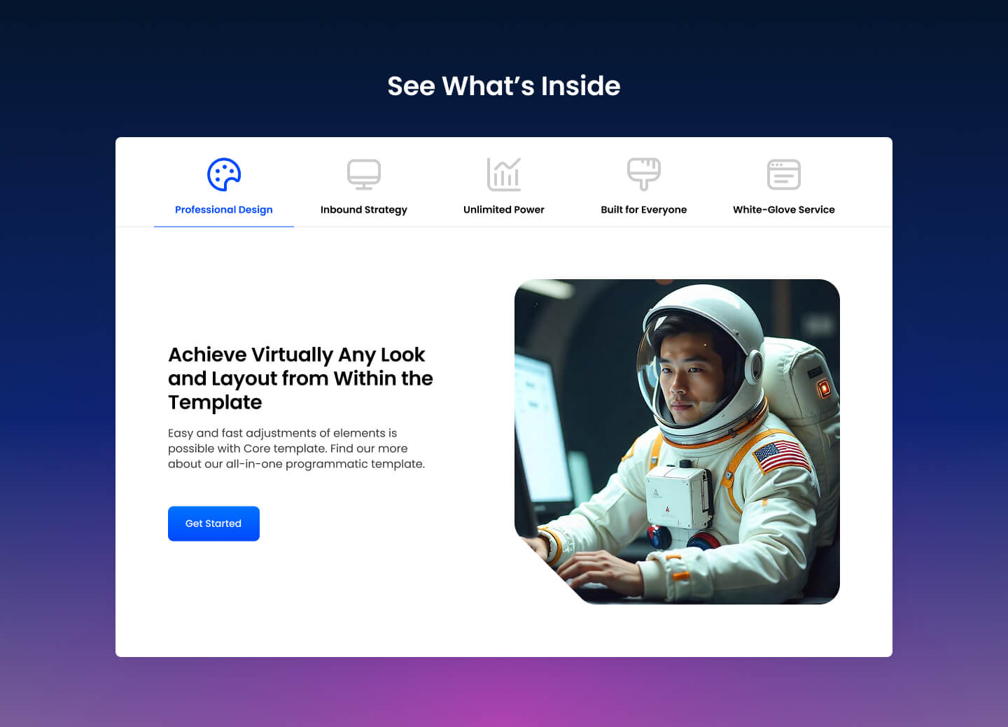
Pick it over SR Tabs 01 when each tab needs to pair visual media like screenshots or product shots with its own text and buttons, rather than plain swapping text under button-style triggers. Each tab column expects at least one media asset to look complete since the layout is built around visual content next to copy.
Use cases
- Feature tabs with screenshots
- Product tour with tab navigation
- Software feature breakdown with visuals
- Tabbed use case showcase with images
- Two-column media and text per tab
- Service overview with visual tabs
Where it fits
- Included with: Stack
- Page sections: Features, Content, Media
Editable fields
Content tab
| Field | Type | Notes |
|---|---|---|
| Background Video | File | Repeats: min 0, default 1. Add multiple file formats in order to provide compatibility with a broad range of browsers. |
| Background Video Tablet | File | Repeats: min 0, default 1. This background video will only be used on tablet devices. |
| Background Video Mobile | File | Repeats: min 0, default 1. This background video will only be used on mobile devices. |
| Enabled | Boolean | |
| ID | Text | Assign a ID to the module. |
| Class | Text | Assign a CLASS to the module. |
| Description | Rich text | |
| Lead Text | Boolean | Turn on to make the Description text larger. |
| Tabs Alignment | Choice | Options: Left, Center, Right. |
Heading Repeats: default 1.
| Field | Type | Notes |
|---|---|---|
| Heading | Text | |
| Size | Choice | HTML heading size. Options: H1, H2, H3, H4, H5, H6, P. |
| Display Size | Choice | Size that heading is displayed at. 12 options, including Auto, H1, H2. |
| Color | Choice | 15 options, including Auto, Primary, Secondary. |
| Color | Color | |
| Align | Choice | Options: Auto, Left, Center, Right. |
| CSS Class | Text |
Tabs Repeats: min 0, max 5, default 5.
| Field | Type | Notes |
|---|---|---|
| Label | Text | |
| Label Image | Image | |
| Label Image Hover | Image | |
| Label Default Color | Choice | 13 options, including Auto, Primary, Secondary. |
| Label Default Color | Color | |
| Label Hover Color | Choice | 12 options, including Primary, Secondary, Tertiary. |
| Label Hover Color | Color | |
| Column Vertical Align | Choice | Options: Top, Center, Bottom. |
Tabs › Column Repeats: min 2, max 2, default 2.
| Field | Type | Notes |
|---|---|---|
| Media Type | Choice | Options: Image, Video, Lottie, None. |
| Image | Image | |
| Image Link | Link | |
| Lottie Embed Code | Text | Set the width to 100% and remove the height. |
| Content | Rich text | |
| Lead Text | Boolean | |
| Custom Column Size | Boolean | |
| Column Mobile Order | Number | Column are sorted by ascending order. |
| CSS Class | Text | Assign a CLASS to the column. |
Tabs › Column › Video
| Field | Type | Notes |
|---|---|---|
| Video type | Choice | Options: Embed, HTML Video, HubSpot Video. |
| HubSpot Video | Video player | |
| Embed | Embed | |
| Custom Thumbnail | Image | |
| Video File | File | Repeats: default 1. Add multiple file formats in order to provide compatibility with a broad range of browsers. |
| Video Poster | Image | |
| Show Controls | Boolean | |
| Autoplay | Boolean | |
| Loop | Boolean | |
| Muted | Boolean |
Tabs › Column › Video › Style Options
| Field | Type | Notes |
|---|---|---|
| Play button color | Color |
Tabs › Column › Video › Placeholder text
| Field | Type | Notes |
|---|---|---|
| Video placeholder title | Text | |
| Video placeholder description | Text |
Tabs › Column › Heading Repeats: default 1.
| Field | Type | Notes |
|---|---|---|
| Heading | Text | |
| Heading Size | Choice | HTML heading size. Options: H1, H2, H3, H4, H5, H6, P. |
| Heading Display Size | Choice | 12 options, including Auto, H1, H2. |
| Heading Color | Choice | 15 options, including Auto, Primary, Secondary. |
| Heading Color | Color | |
| Heading Align | Choice | Options: Auto, Left, Center, Right. |
| CSS Class | Text |
Tabs › Column › CTA Repeats: min 0, default 1.
| Field | Type | Notes |
|---|---|---|
| CTA Type | Choice | Options: HubSpot CTA, Button, Modal. |
| CTA Style | Choice | 26 options, including Primary, Secondary, Tertiary. |
| CTA | CTA | |
| Button Text | Text | |
| Modal Target | Text | |
| Link | Link | |
| CTA Size | Choice | Options: Small, Default, Large. |
| Add icon | Boolean |
Tabs › Column › CTA › Default
| Field | Type | Notes |
|---|---|---|
| Background | Color | |
| Text | Color | |
| Border | Color |
Tabs › Column › CTA › Hover
| Field | Type | Notes |
|---|---|---|
| Background | Color | |
| Text | Color | |
| Border Color | Color |
Tabs › Column › CTA › Icon
| Field | Type | Notes |
|---|---|---|
| Icon | Icon | |
| Position | Choice | Options: Left, Right. |
| Purpose | Choice | The purpose of the icon, used for accessibility. If set to decorative, an additional attribute of aria-hidden="true" will be added to the icon. Options: Decorative, Semantic. |
Tabs › Column › Colum Size Repeats: min 1, max 4, default 1. Columns follow a twelve column grid.
| Field | Type | Notes |
|---|---|---|
| Column Breakpoint | Choice | Options: None, Mobile, Tablet, Desktop, XL. |
| Column Width | Choice | 12 options, including 1, 2, 3. |
| Column Offset | Choice | 13 options, including 0, 1, 2. |
| Column Order | Number |
Style tab
Change log
| Version | Change |
|---|---|
| 2.0.1 | Fixed column text color bug |
| 2.0.0 | Stardust update |
| 1.2.3 | Lottie js fix |
| 1.2.2 | Added default color option to tabs |
| 1.2.1 | Column breakpoint fix |
| 1.2.0 | Accessibility improvements |
| 1.1.1 | Updated lottie js |
| 1.1.0 | Added responsive background options |
| 1.0.1 | Fixed bug to allow the module to be used more than once on a page |
| 1.0.0 | Added module |
SR Tabs 01
This module renders an optional heading and description above a row of up to 4 button-style tab triggers, with a content panel below that swaps rich text when a tab is clicked.
SR Tabs Accordion 01
This module renders a two-column layout with a heading and description on the left and up to six expandable accordion items on the right, each with a label and rich text answer.