

SR Offer One Col 01
This module renders a single centered column with an optional heading and rich text description above an embedded HubSpot form, which carries its own heading, description, and style controls for background, text color, padding, and border.
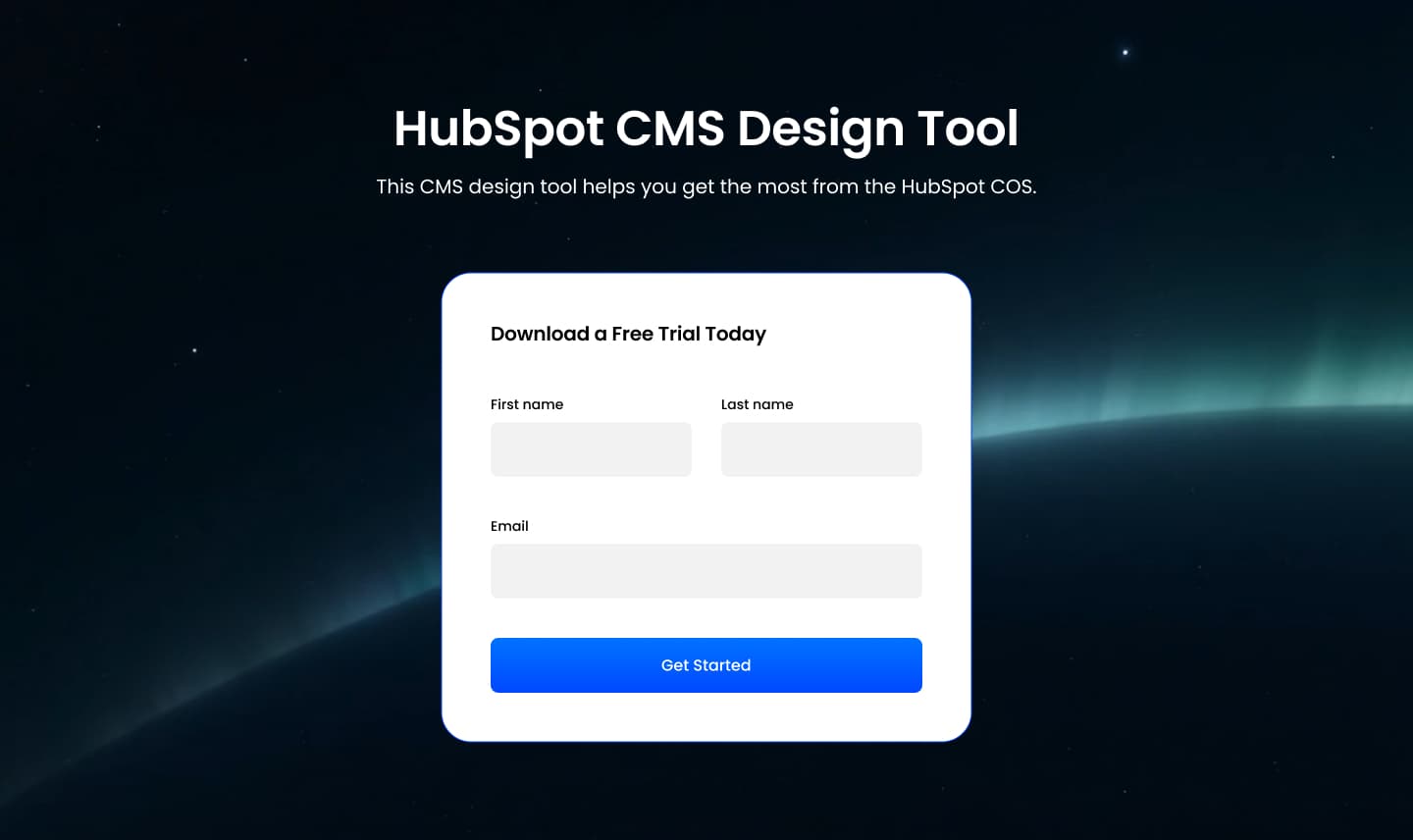
Pick it over the offer bars and gated content module when the form itself is the main content of a dedicated landing page section, not a CTA button or a triggered popup. It expects a connected HubSpot form and works best as a standalone landing page body rather than a mid-page banner.
Use cases
- Dedicated landing page form
- Free trial signup page
- Ebook download landing page
- Webinar registration section
- Newsletter signup page
- Gated whitepaper request form
Where it fits
- Included with: Free
- Page sections: Form, CTA, Content
Editable fields
Content tab
| Field | Type | Notes |
|---|---|---|
| Background Video | File | Repeats: min 0, default 1. Add multiple file formats in order to provide compatibility with a broad range of browsers. |
| Background Video Tablet | File | Repeats: min 0, default 1. This background video will only be used on tablet devices. |
| Background Video Mobile | File | Repeats: min 0, default 1. This background video will only be used on mobile devices. |
| Enabled | Boolean | |
| ID | Text | Assign a ID to the module. |
| Class | Text | Assign a CLASS to the module. |
| Description | Rich text | |
| Lead Text | Boolean | Turn on to make the Description text larger. |
Heading Repeats: min 0, default 1.
| Field | Type | Notes |
|---|---|---|
| Heading | Text | |
| Size | Choice | HTML heading size. Options: H1, H2, H3, H4, H5, H6, P. |
| Display Size | Choice | Size that heading is displayed at. 12 options, including Auto, H1, H2. |
| Color | Choice | 13 options, including Auto, Primary, Secondary. |
| Color | Color | |
| Align | Choice | Options: Auto, Left, Center, Right. |
| CSS Class | Text |
Form
| Field | Type | Notes |
|---|---|---|
| Enabled | Boolean | |
| Description | Rich text | |
| Lead Text | Boolean | Turn on to make the Description text larger. |
| Form | Form | |
| Send form notifications to specified email addresses instead of the form defaults | Boolean | |
| Email Addresses | ||
| Send a follow-up email | Boolean | To send a follow-up email, make sure the 'Set contacts created as marketing contacts’ setting is turned on. You can manage this in options. Learn more. |
| Follow-up email | ||
| Salesforce campaign | Salesforcecampaign |
Form › Styles
| Field | Type | Notes |
|---|---|---|
| Background Color | Color | |
| Text Color | Choice | Set to Auto to use the default text color. Set to Custom to set a custom text color. 15 options, including Auto, Primary, Secondary. |
| Text Color | Color | |
| Hide Field Labels | Boolean | |
| Shadow | Boolean | |
| Max Width | Number | Set the max width of the form. Set to 0 to disable. |
Form › Styles › Fields
| Field | Type | Notes |
|---|---|---|
| Style | Choice | Options: Default, Custom. |
| Height | Number | |
| Background Color | Color | |
| Border Color | Color | |
| Size | Number | |
| Radius | Number | |
| Focus | Color | |
| Field Color | Color | |
| Placeholder | Color |
Form › Styles › Button
| Field | Type | Notes |
|---|---|---|
| Style | Choice | 26 options, including Primary, Secondary, Tertiary. |
| Size | Choice | Options: Small, Default, Large. |
| Align | Choice | Options: Auto, Left, Center, Right. |
| Full Width | Boolean |
Form › Styles › Button › Default
| Field | Type | Notes |
|---|---|---|
| Background | Color | |
| Text | Color | |
| Border | Color |
Form › Styles › Button › Hover
| Field | Type | Notes |
|---|---|---|
| Background | Color | |
| Text | Color | |
| Border Color | Color |
Form › Styles › Padding
| Field | Type | Notes |
|---|---|---|
| Top | Number | |
| Bottom | Number | |
| Left | Number | |
| Right | Number |
Form › Styles › Border
| Field | Type | Notes |
|---|---|---|
| Style | Choice | Options: Gradient One, Gradient Two, None, Solid, Dotted, Dashed, Double. |
| Color | Color | |
| Width | Number | |
| Radius | Number | |
| Top | Boolean | |
| Bottom | Boolean | |
| Left | Boolean | |
| Right | Boolean |
Form › Heading Repeats: min 0, default 1.
| Field | Type | Notes |
|---|---|---|
| Heading | Text | |
| Heading Size | Choice | HTML heading size. Options: H1, H2, H3, H4, H5, H6, P. |
| Heading Display Size | Choice | Size that heading is displayed at. 12 options, including Auto, H1, H2. |
| Heading Color | Choice | 13 options, including Auto, Primary, Secondary. |
| Heading Color | Color | |
| Heading Align | Choice | Options: Auto, Left, Center, Right. |
| CSS Class | Text |
Style tab
Change log
| Version | Change |
|---|---|
| 3.0.0 | Stardust update |
| 2.2.2 | Added ability to set custom button styles |
| 2.2.1 | Added ability to use new HS form |
| 2.2.0 | Added responsive background options |
| 2.1.0 | Introduced a lazy loading feature for forms |
| 2.0.1 | Added default form padding |
SR Offer Faux Modal 01
This module renders a boxed card styled to look like a modal window sitting inline on the page, with an optional side-by-side featured image, a logo, a heading, rich text description, and an embedded HubSpot form.
SR Offer Parallax 01
This module renders one heading, a rich text description, and a single call to action button, all placed inside a styled card that floats centered on top of a full-bleed parallax background image.