

SR Offer Parallax 01
This module renders one heading, a rich text description, and a single call to action button, all placed inside a styled card that floats centered on top of a full-bleed parallax background image.
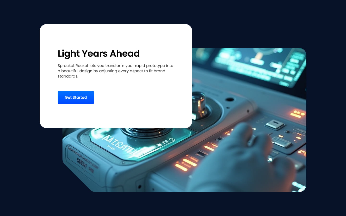
Pick it over Offer Parallax 02 when you want the entire message centered as one floating card over the image rather than split into two side by side columns with the card touching the image edge. It needs a high resolution background image since the parallax scroll effect crops and shifts it, and reads best with short heading and body copy so the card stays compact.
Use cases
- Centered promo banner over moving image
- Single cta offer section
- Product launch teaser with background photo
- Event announcement banner
- Short pitch over hero image
- Seasonal sale callout
Where it fits
- Included with: PRO
- Page sections: CTA, Hero, Content
Editable fields
Content tab
| Field | Type | Notes |
|---|---|---|
| Background Video | File | Repeats: min 0, default 1. Add multiple file formats in order to provide compatibility with a broad range of browsers. |
| Background Video Tablet | File | Repeats: min 0, default 1. This background video will only be used on tablet devices. |
| Background Video Mobile | File | Repeats: min 0, default 1. This background video will only be used on mobile devices. |
| Enabled | Boolean | |
| ID | Text | Assign a ID to the module. |
| Class | Text | Assign a CLASS to the module. |
| Description | Rich text | |
| Lead Text | Boolean | Turn on to make the Description text larger. |
| Parallax Image | Image | Recommended size: 2880x1920px. |
Heading Repeats: min 0, default 1.
| Field | Type | Notes |
|---|---|---|
| Heading | Text | |
| Size | Choice | HTML heading size. Options: H1, H2, H3, H4, H5, H6, P. |
| Display Size | Choice | Size that heading is displayed at. 12 options, including Auto, H1, H2. |
| Color | Choice | 15 options, including Auto, Primary, Secondary. |
| Color | Color | |
| Align | Choice | Options: Auto, Left, Center, Right. |
| CSS Class | Text |
CTA Repeats: min 0, default 1.
| Field | Type | Notes |
|---|---|---|
| CTA Type | Choice | Options: HubSpot CTA, HubSpot Payment, Button, Modal. |
| CTA Style | Choice | 26 options, including Primary, Secondary, Tertiary. |
| CTA | CTA | |
| Button Text | Text | |
| Modal Target | Text | |
| Link | Link | |
| Payment link | Payment | |
| Checkout behavior | Choice | Options: Open in a new tab, Sliding overlay. |
| CTA Size | Choice | Options: Small, Default, Large. |
Style tab
Change log
| Version | Change |
|---|---|
| 4.0.0 | Stardust update |
| 3.2.0 | Accessibility improvements |
| 3.1.0 | Added responsive background options |
| 3.0.1 | Added new Link options |
| 3.0.0 | Remove jQuery |
SR Offer One Col 01
This module renders a single centered column with an optional heading and rich text description above an embedded HubSpot form, which carries its own heading, description, and style controls for background, text color, padding, and border.
SR Offer Parallax 02
This module renders a two-column layout with a parallax background image on one side and a shadowed content card on the other holding a heading, rich text description, and a single CTA button.