

SR Cards Categories 01
Renders a heading and richtext intro above a row of up to 9 text-only cards, each with its own heading, description, and link, laid out in 1, 2, 3, or 4 columns with adjustable column alignment.
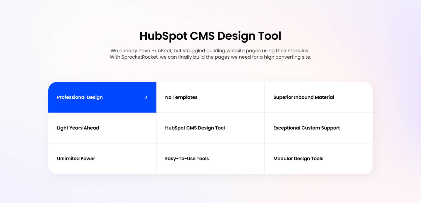
Pick it over sr-cards-grid-01 or sr-cards-image-01 when you need more tiles than a five or three card layout allows and want plain text links without buttons or images. It expects short link text and copy per card since there is no image field, so skip it when visuals are part of the pitch.
Use cases
- Category tile grid
- Topic link list
- Site section directory
- Resource topic links
- Simple text card grid
- Subpage navigation tiles
Where it fits
- Included with: Core
- Page sections: Features, Content, Resources
Editable fields
Content tab
| Field | Type | Notes |
|---|---|---|
| Background Video | File | Repeats: min 0, default 1. Add multiple file formats in order to provide compatibility with a broad range of browsers. |
| Background Video Tablet | File | Repeats: min 0, default 1. This background video will only be used on tablet devices. |
| Background Video Mobile | File | Repeats: min 0, default 1. This background video will only be used on mobile devices. |
| Enabled | Boolean | |
| ID | Text | Assign a ID to the module. |
| Class | Text | Assign a CLASS to the module. |
| Description | Rich text | |
| Lead Text | Boolean | Turn on to make the Description text larger. |
| Number of Columns | Choice | Options: One, Two, Three, Four. |
| Columns Alignment | Choice | Options: Left, Center, Right. |
Heading Repeats: min 0, default 1.
| Field | Type | Notes |
|---|---|---|
| Heading | Text | |
| Size | Choice | HTML heading size. Options: H1, H2, H3, H4, H5, H6, P. |
| Display Size | Choice | Size that heading is displayed at. 12 options, including Auto, H1, H2. |
| Color | Choice | 15 options, including Auto, Primary, Secondary. |
| Color | Color | |
| Align | Choice | Options: Auto, Left, Center, Right. |
| CSS Class | Text |
Cards Repeats: min 1, default 9.
| Field | Type | Notes |
|---|---|---|
| Description | Rich text | |
| Lead Text | Boolean | Turn on to make the Description text larger. |
| Card Link | Link |
Cards › Heading Repeats: default 1.
| Field | Type | Notes |
|---|---|---|
| Heading | Text | |
| Size | Choice | HTML heading size. Options: H1, H2, H3, H4, H5, H6, P. |
| Display Size | Choice | Size that heading is displayed at. 12 options, including Auto, H1, H2. |
| Color | Choice | 15 options, including Auto, Primary, Secondary. |
| Color | Color | |
| Align | Choice | Options: Auto, Left, Center, Right. |
| CSS Class | Text |
Style tab
Change log
| Version | Change |
|---|---|
| 4.0.0 | Stardust update |
| 3.2.1 | Added arrow icon |
| 3.2.0 | Accessibility improvements |
| 3.1.0 | Added responsive background options |
| 3.0.3 | Paragraph only hides after card has a link. |
| 3.0.2 | Added new Link options |
| 3.0.1 | Fixed link styling |
| 3.0.0 | Added card style fields |
| 2.0.2 | Minor fixes |
| 2.0.1 | Fixed card open in new tab bug, also added card number per row and column align options |
SR Cards Articles 03
This module renders a heading and description above a two-column layout, with a list of blog article cards on one side showing featured image, meta or summary text, author, tag, and a read more button, and a form panel on the other side with its own heading, description, image, and HubSpot form.
SR Cards Features 01
Renders a heading with optional intro copy above a grid of up to 12 cards, each with an image, header, rich text body, and optional CTA buttons in link, payment, or modal form.