SR Bento Grid 01
Overview
The SR Bento Grid Module is like a flexible content organizer that lets you arrange different types of content (images, text, videos, forms) in a grid layout. Think of it as creating a custom dashboard or magazine-style layout where each "box" can contain different content and be styled independently.
How it works:
You create columns (like boxes in a grid), and each column can hold different content types. The module automatically arranges these columns responsively across different screen sizes, so your content looks great on desktop, tablet, and mobile.
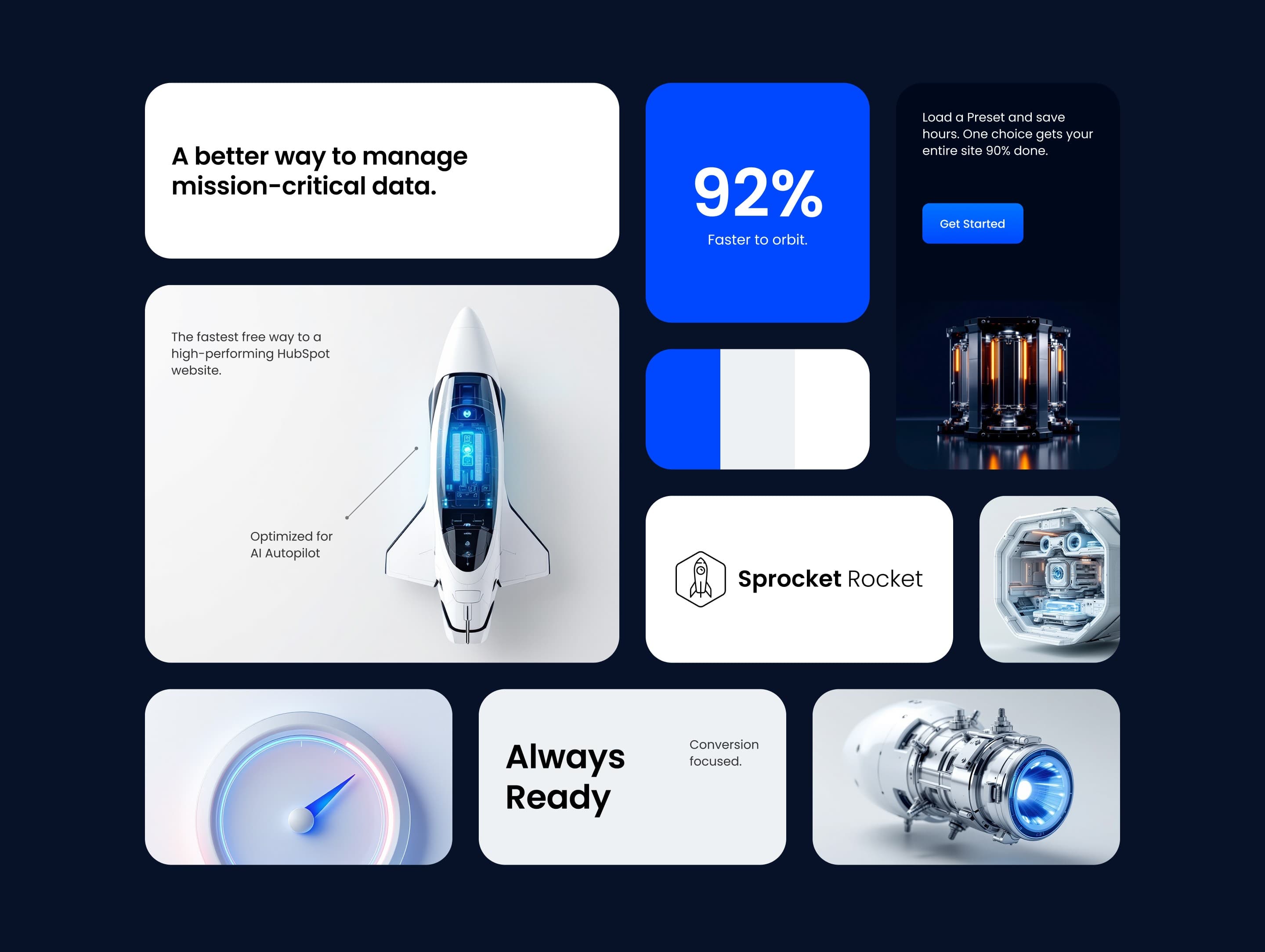
Module Structure Explained
The SR Bento Grid works in layers:
1. Grid Wrapper - The outer container that holds everything together
2. Grid Container - The actual grid system that arranges columns
3. Grid Item - Individual content boxes that can contain different media and text
4. Content - The actual content inside each column (images, text, buttons, etc.)
Visual Example:

Each grid item is completely independent - you can style one column with a blue background while another has a white background, different padding, borders, or shadows.
Configuration
Design Settings (Module Style Tab)
Grid Wrapper Styles

- Background Color: Choose the overall background
- Backdrop Blur: Adds a blur filter to the background
- Spacing: Controls padding around the entire grid
- Border: Add lines around the entire grid
- Border Radius: Round the corners of the grid
- Shadow: Add depth with drop shadows
Grid Layout Options (How Columns Are Arranged)
- XL (1200px+): Large desktop screens - usually 12 columns
- Desktop (992px-1199px): Medium desktop screens - usually 12 columns
- Tablet (768px-991px): Tablet screens - usually 8 columns
- Mobile (767px and below): Phone screens - usually 4 column
Grid Item Configuration (The Individual Content Boxes)

Column Label: Give your grid item a name (like "Product Image" or "Testimonial") - this helps you identify columns when editing
Styles

- Features Settings (When You Add Features)
- Style: List or Grid
- Item Width: Width of each feature when grid style is selected.
- Gap: Spacing between the feature items
- Icon Alignment: Position icons relative to text (left, center, right)
- Background: Set the grid item's background
- Text Color: Control text color
- Text Align: Left, center, or right alignment
- Padding: Internal spacing
- Border: Add lines around the column
- Shadow: Add depth with drop shadows
- Element Gap: Space between different content elements
- Hide Overflow: Clip content that extends beyond column boundaries
- Media Bleed: Allow images to extend beyond padding (creates edge-to-edge effect)
- Card Hover Effects (When Full Card Link is Enabled)
When users hover over the column:- Background: Change background color
- Text Color: Change text color
- Border: Modify border appearance
- Shadow: Adjust shadow effect
Layout Options

- Column Breakpoint: Select the screen size breakpoint where these column settings will apply.
- Column Span: Choose how many columns this element should span horizontally. If the grid has 12 columns total, a span of 6 would take up half the width.
The column span setting works relative to the Columns of Grid set for the different screen sizes. This means, that on tablet screens where the default columns of grid is 8, setting the column span to 4 would take up half the width of the grid on tablet screens. - Row Span: Choose how many rows this element should span vertically. Higher values will make the element taller.
- Custom Height: Enable this to set a specific height for this column instead of using the default auto-sizing behavior.
- Custom Content Width: Enable this to control the width of the content within this column, allowing for custom padding or centering.
- Height: Set a specific height in pixels for this column. This field only appears when 'Custom Height' is enabled.
- Content Width: Control the width of content within this column as a percentage. 100% uses the full column width, while lower values add padding. This field only appears when 'Custom Content Width' is enabled.
- Direction: Choose the layout direction for content within this column. Vertical stacks content top to bottom, while Horizontal arranges content left to right.
- Horizontal Alignment: Control how content is aligned horizontally within this column. Start aligns to the left, Center centers content, End aligns to the right, and Stretch makes content fill the full width.
- Vertical Alignment: Control how content is aligned vertically within this column. Start aligns to the top, Center centers content vertically, End aligns to the bottom, and Stretch makes content fill the full height.
Content Settings

- Media Type: Choose what type of media this grid item will display
- Heading: Title for the grid item
- Description: Body text that explains or describes your content
- Features: Create lists with icons (perfect for benefits, features, or steps)
- Full Card Link: Makes the entire column clickable.
Edit the hover style of the card in the styles settings. When this is enabled, the entire card becomes clickable and other links inside the card will not be clickable - CTAs: Add buttons to the grid item. Visible when Full Card Link is not enabled.
- Link: URL to redirect to after clicking the card.
- Aria Label: Descriptive text for accessibility when Full Card Link is enabled
- CSS Class: Add custom CSS classes for advanced styling