

SR Separator 01
This module renders a single horizontal divider line with one optional centered element in the middle: a short line of text, an icon, a single image, or a soft shadow effect, with configurable line style, thickness, and color.
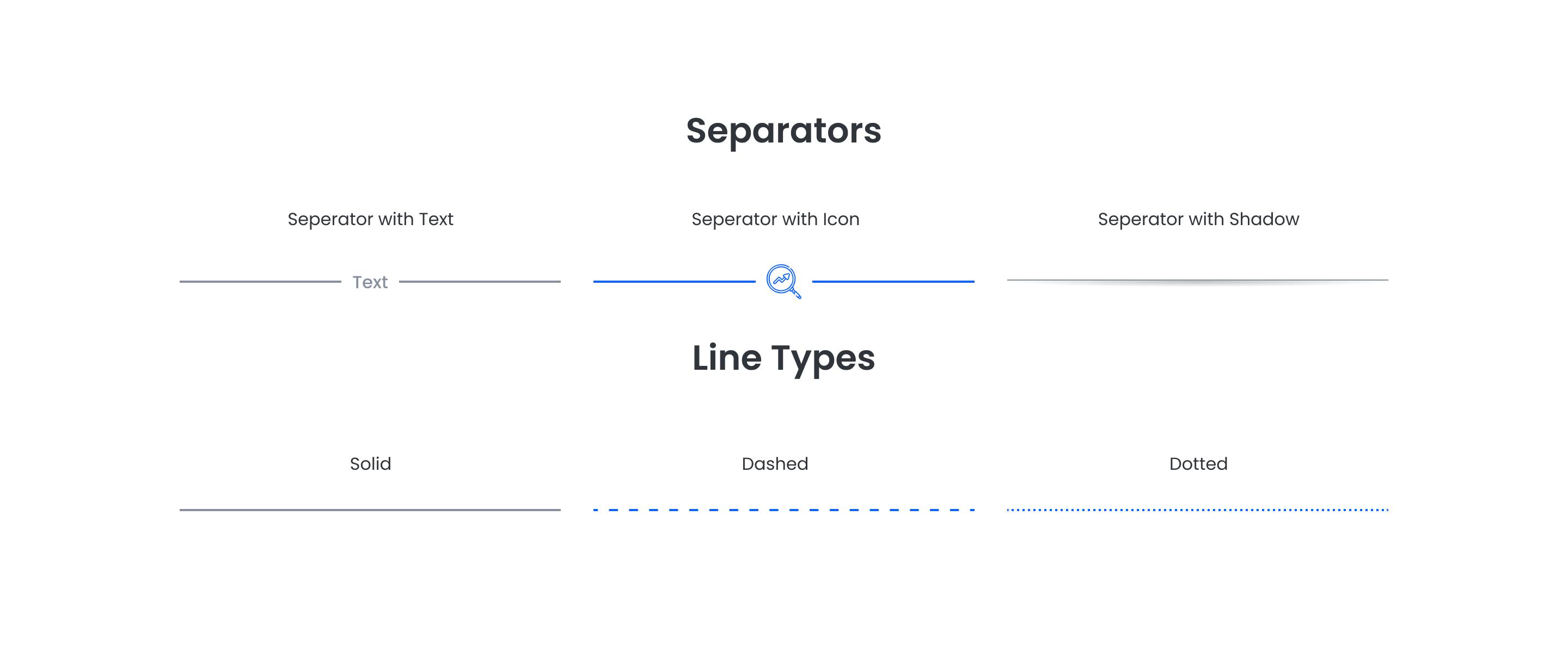
Pick it over sr-bling-graphic-01 or sr-bling-graphic-02 when you need a plain visual break between two sections rather than a standalone image or an image slider, and pick it over sr-clients-01/02 or sr-element-accordion when there is no list of logos or collapsible content to show. It takes only one field for the centered content, so it has no headers, subheaders, or repeaters.
Use cases
- Section divider line
- Dashed rule with icon
- Text divider between sections
- Subtle shadow break
- Small centered logo divider
- Dotted line separator
Where it fits
- Included with: PRO
- Page sections: Not a page section, Content, Utility
Editable fields
Content tab
| Field | Type | Notes |
|---|---|---|
| Background Video | File | Repeats: min 0, default 1. Add multiple file formats in order to provide compatibility with a broad range of browsers. |
| Background Video Tablet | File | Repeats: min 0, default 1. This background video will only be used on tablet devices. |
| Background Video Mobile | File | Repeats: min 0, default 1. This background video will only be used on mobile devices. |
| Enabled | Boolean | |
| ID | Text | Assign a ID to the module. |
| Class | Text | Assign a CLASS to the module. |
| Type | Choice | Options: Text, Icon, Image, Shadow. |
| Text | Text | |
| Text Size | Number | |
| Image | Image | |
| Icon | Icon | |
| Icon Size | Number | |
| Line Style | Choice | Options: Solid, Dashed, Dotted. |
| Line Size | Number | |
| Line Color | Choice | Set to Auto to use the default line color. Set to Custom to set a custom line color. 13 options, including Auto, Primary, Secondary. |
| Line Color | Color |
Style tab
Change log
| Version | Change |
|---|---|
| 2.0.0 | Stardust update |
| 1.1.0 | Added responsive background options |
SR Pattern 01
This module renders a single decorative SVG divider, either a wave, line, curve, triangle, slanted triangle, or arrow, positioned at the top or bottom edge of a section with configurable color, width, height, flip, and stacking order.
SR Showcase 01
This module renders a heading, an optional description, and a grid of up to 9 project cards, each showing a background image and a button that opens a modal popup.