

SR Style Guide
This module renders a full brand style guide page with a left-hand side navigation linking to sections for logo download, color swatches, typography samples, buttons, an embedded HubSpot form, and any number of custom sections you add.
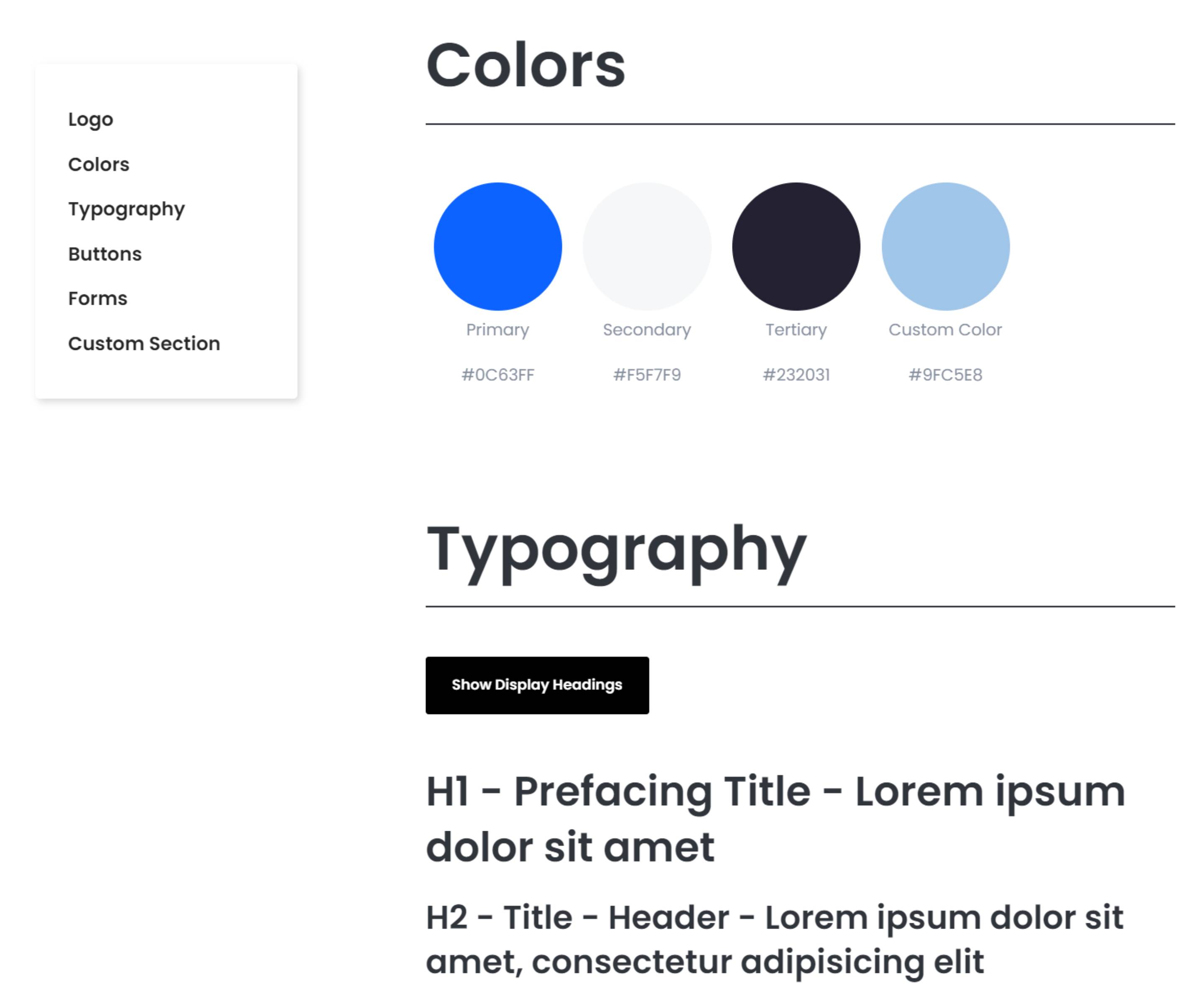
Pick it over the other bling and client modules when you need an internal reference document for brand assets rather than a marketing section meant for visitors on a live page. It expects a logo image, at least one custom color swatch, typography richtext samples, and optionally a connected HubSpot form, plus any extra custom sections with their own heading and body text.
Use cases
- Internal brand guidelines page
- Logo usage and download page
- Brand color and typography reference
- Design system documentation for clients
- Asset kit page with downloadable logo files
Where it fits
- Included with: Free
- Page sections: Not a page section, Utility, Resources
Editable fields
Content tab
Design Settings
| Field | Type | Notes |
|---|---|---|
| ID | Text | |
| Class | Text | |
| Layout | Choice | Options: Page, Full Width. |
| Container Width | Choice | Options: Minimum, Narrow, Wide, Maximum. |
| Background Option | Choice | Options: Image, Color, Custom. |
| Background Image | Image | Recommended size: 2880x1920px | Also fallback while the video is loading. |
| Background Overlay Color | Color | Recommended Width: 2880x1920px. |
| Background Color | Choice | 14 options, including Primary, Secondary, Tertiary. |
| Background Custom | Color |
Hero
| Field | Type | Notes |
|---|---|---|
| Enabled | Boolean | |
| Hero | Rich text |
Logo
| Field | Type | Notes |
|---|---|---|
| Enabled | Boolean | |
| Logo | Image | Repeats: default 1. |
| Rich text | Rich text |
Colors
| Field | Type | Notes |
|---|---|---|
| Enabled | Boolean | |
| Show Default Color | Boolean |
Colors › Color Repeats: default 1.
| Field | Type | Notes |
|---|---|---|
| Title | Text | |
| Color | Color |
Typography
| Field | Type | Notes |
|---|---|---|
| Enabled | Boolean | |
| Typography | Rich text | |
| Display Heading | Rich text |
Buttons
| Field | Type | Notes |
|---|---|---|
| Enabled | Boolean |
Form
| Field | Type | Notes |
|---|---|---|
| Enabled | Boolean | |
| Overwrite Default Form | Form |
Custom Sections › Custom Section Repeats: default 1.
| Field | Type | Notes |
|---|---|---|
| Heading | Text | |
| Rich Text | Rich text |
Change log
| Version | Change |
|---|---|
| 2.0.0 | Stardust update |
| 1.1.1 | Minor fixes |
| 1.1.0 | Updated macros styles dependency |
| 1.0.1 | Added module |
SR Stats 06
This module renders a heading and description above a row of three stat blocks, each showing a number with prefix and suffix text, a short caption, and an optional icon or image topper above the number.
SR Video Overlay 01
This module renders a full-bleed background video with a heading, rich text description, lead text option, and a row of CTA buttons layered on top, plus a play button that opens a separate video source in a modal overlay.