
Theme
Configure the shared design foundation used by Sprocket Rocket pages and modules.
The Sprocket Rocket theme gives an installation its shared design foundation: theme settings for colors, typography, buttons, forms, containers, and spacing, plus page, blog, and system templates and the global site header and footer.
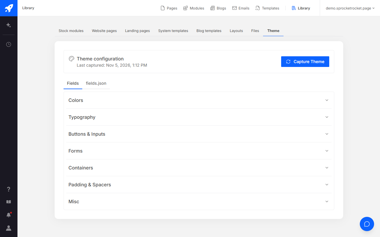
The Theme tab in the installation's Library shows the theme settings captured from HubSpot and when they were last captured. Select Capture Theme to read the current values again. The Fields tab lists each setting, and the fields.json tab has the full file with Copy fields.json. The tab is read-only. Change settings in HubSpot's theme editor, or ask Sprocket Rocket AI for a brand change.
Change the brand with Sprocket Rocket AI
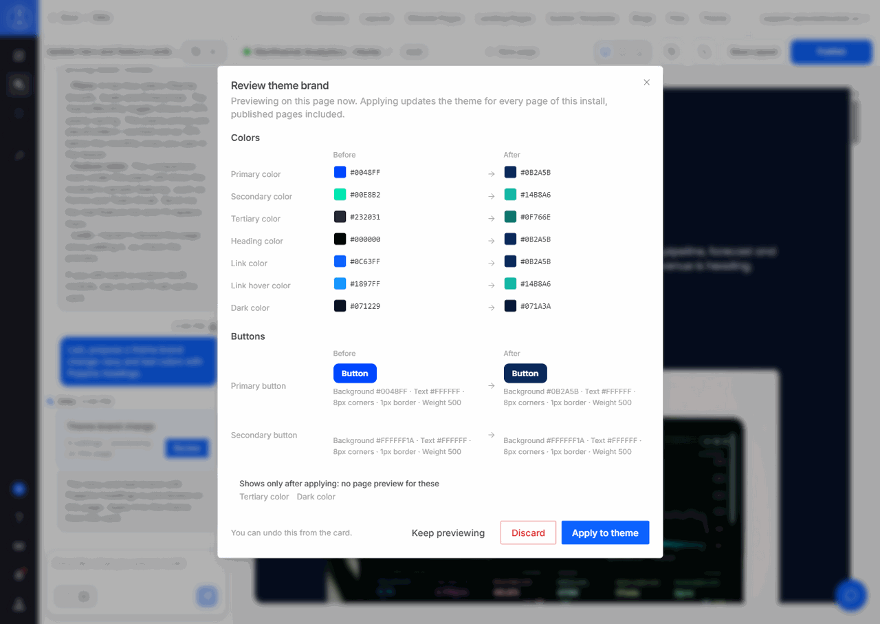
Sprocket Rocket AI can propose a new brand for the theme: colors, fonts, heading sizes, buttons, and corner radius. It previews the brand on the page you're on and shows a Theme brand change card. Select Review to compare each setting before and after, then Apply to theme, Discard, or Keep previewing. Organization owners and admins can Undo an applied brand from the card. For a brand that belongs to one page only, it sets page-only brand styles instead of changing the theme. See Change the theme brand.